
Custom publication design cheapens a premium brand when small, easily-avoided choices, thin paper, cramped layouts, stock-photo filler, inconsistent typography, signal mass production instead of craft. Every design decision in a print piece either reinforces the sense that a brand is considered and deliberate, or quietly tells readers the opposite. Avoiding these mistakes matters more than chasing trends, because readers register quality in seconds, before they read a single word.
1. Treating Custom Publication Design as a Template Exercise
Starting from a generic layout template locks in a publication’s problems before anyone has discussed the brand’s story, which is why so many branded magazines feel interchangeable.
A template is built to hold any content, which means it was never built to hold your content. Headlines, image wells, and pull quotes get sized for an average article that doesn’t exist, so real copy and real photography get cut, stretched, or ignored to fit boxes someone else designed. That works fine for a one-off flyer or a sales brochure meant to be read once and recycled. It fails for something meant to sit on a coffee table for years.
Why Custom Publication Design Differs From Generic Layout Templates
The deeper issue is sequencing. A template-first process asks “what goes in this box” before anyone has asked “what is this issue actually about.” By the time editorial strategy enters the room, the grid, the pacing, and the hierarchy are already decided, and wrong. Fixing that later doesn’t mean adjusting a few pages, it means rebuilding from the first spread forward.
Good custom publication design runs the opposite direction: a brief and an editorial point of view come first, and the layout gets built around what the brand actually needs to say. The grid serves the story, not the other way around. This is the throughline behind nearly every mistake below, custom publication design only works when strategy leads and layout follows.
2. Ignoring the Editorial Spine Before Designing Layouts
Skipping a clear editorial spine before design begins produces a stack of nice-looking pages that never add up to a coherent magazine.
An editorial spine is simply the throughline, the story, voice, and structure that every layout decision hangs on. It’s the decision, made before a single page is designed, about what this issue is arguing, how it opens, where it builds, and how it lands. Without it, a designer has no choice but to fill pages section by section: a feature here, a Q&A there, a photo essay wherever it fits. Pacing and visual hierarchy end up arbitrary because nothing upstream told the layout what to emphasize.
How a Clear Editorial Spine Changes the Design Process
This mistake shows up most often at companies that already have strong material, client stories, founder interviews, project photography, but no framework for sequencing it into something readable cover to cover. The content isn’t the problem. The absence of a structure is.
Most design-first providers start with mood boards: colors, fonts, a visual direction pulled from Pinterest-style references. That’s backwards for print, where a reader moves linearly through pages in an order someone has to plan. Rethink Publishing builds the editorial spine first, the content strategy and sequencing, then pairs copy and imagery against that plan, which is why the finished piece reads like a magazine instead of a binder of good ideas.
3. Overcrowding Pages Instead of Trusting White Space
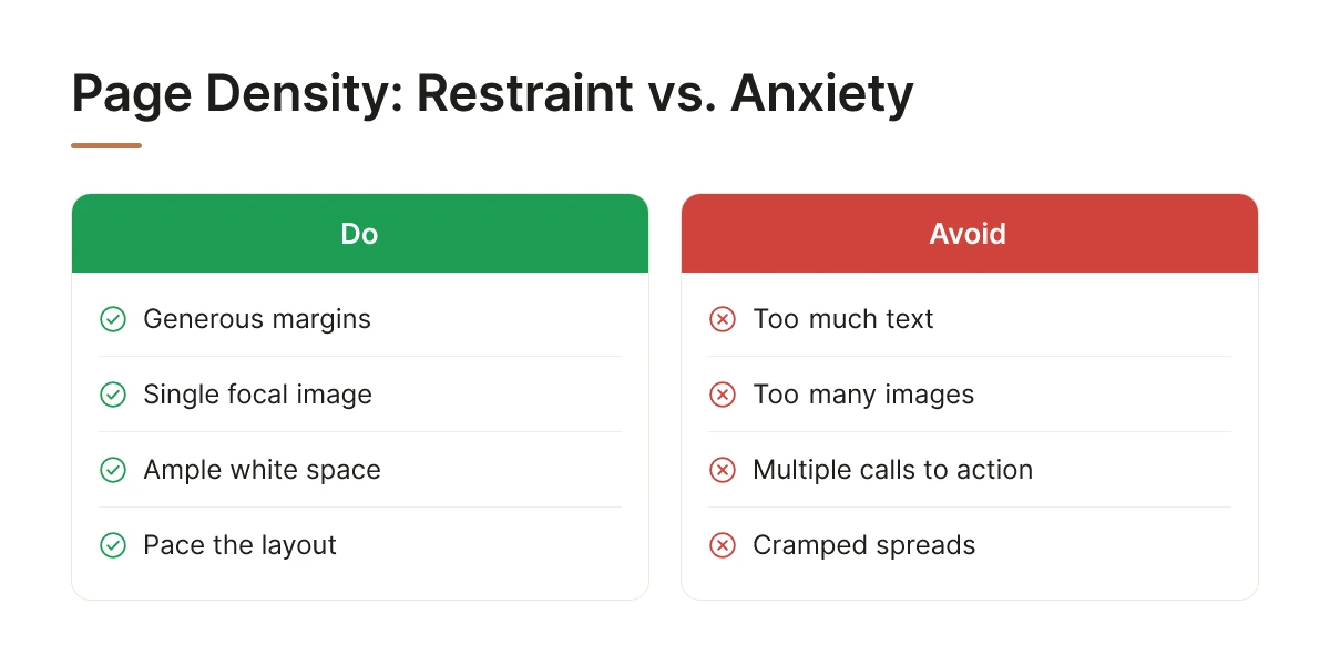
Cramming too much text, too many images, and too many calls to action onto one spread makes a page feel cheap, no matter the paper quality.
Dense pages force the eye to work to find an entry point, and readers unconsciously associate that effort with low-budget printing, the visual equivalent of a cluttered storefront. High-end editorial magazines do the opposite: generous margins, a single focal image, and enough white space that the page feels paced rather than packed. Restraint reads as confidence; density reads as anxiety about whether the content is good enough on its own.
This is the hardest habit to break for brands used to marketing collateral, where every inch of a brochure is expected to sell something. A page with five competing elements, a headline, three photos, a pull quote, and a logo lockup, asks the reader to do triage. A page with one strong image and a short caption asks nothing. It simply lets the image and the moment carry the weight.
Some of the most common overcrowding traps in custom publication design include:
- Stacking a headline, subhead, pull quote, and caption on a single spread with no breathing room between them
- Running body copy edge-to-edge with margins too narrow to let the eye rest
- Forcing multiple unrelated stories onto one page instead of letting each spread carry a single idea
- Adding a logo lockup or call to action to pages where it competes with the lead image
- Using every available photo from a shoot instead of selecting the one image that earns its place
4. Mismatching Words and Images Instead of Pairing Them With Intention
Decorative or loosely related imagery undermines a publication’s credibility fast, because print offers no scroll to soften a mismatch the way a webpage can.
On a website, a slightly off photo gets scrolled past in a second. On a printed page, the reader’s eye sits with the spread for longer, which means any gap between what the text says and what the image shows becomes obvious. An image chosen only to fill space, generic, stock-like, unconnected to the sentence next to it, quietly breaks the reader’s trust in the whole publication’s judgment. If the pairing feels careless, the reader starts wondering what else was careless. Several common pitfalls that undercut brand perception are outlined in this overview of graphic design mistakes to avoid, many of which apply directly to print pairing decisions.
Why Word-and-Image Pairing Matters More in Custom Publications Than Other Media
This mistake is common at brands that actually have strong photography, architecture firms, hospitality groups, design studios, but use those assets inconsistently across marketing materials, without anyone deciding which image belongs with which idea. The fix isn’t more photography. It’s discipline in pairing.
A caption or an image placed after a paragraph should answer a question the text just raised, not restate it. If the copy describes a renovation’s ambition, the photo that follows should show the result, not a generic shot of the building’s exterior repeated from the cover. That small discipline is one of the clearest signals of editorial rigor a reader picks up on without being able to name it. It’s also one of the fastest tells of amateur custom publication design, mismatched pairing is rarely intentional, it’s usually just unexamined.
5. Using Inconsistent or Off-Brand Typography
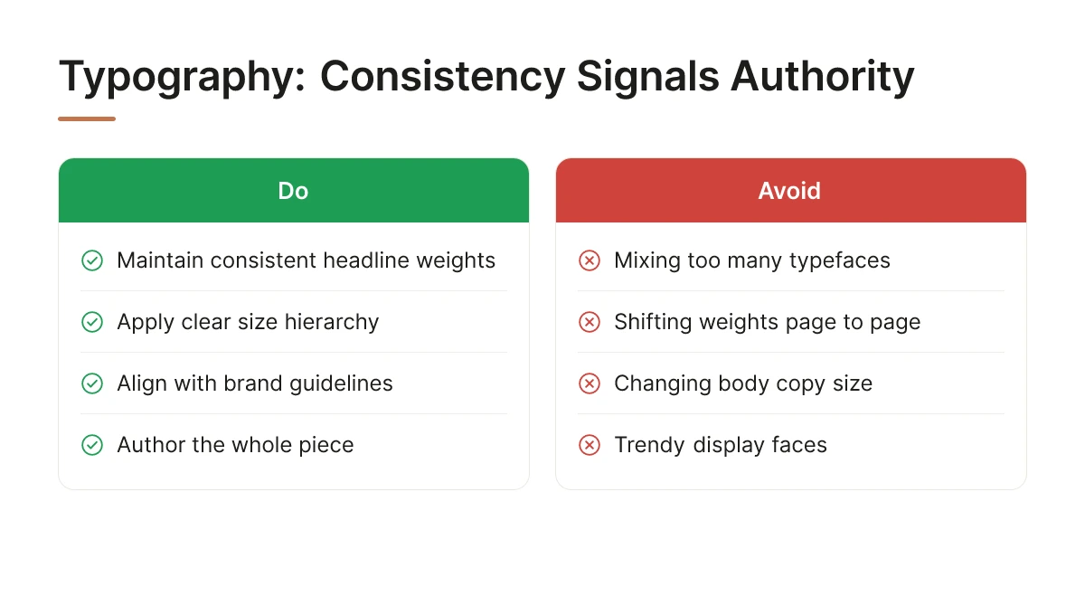
Mixing too many typefaces or ignoring size hierarchy makes a reader unconsciously question whether the publication meets any editorial standard at all.
Type inconsistency is rarely a single bad font choice, it’s headline weights that shift page to page, body copy that changes size without reason, or a trendy display face dropped in because it looked good on a moodboard. None of it is dramatic on its own. Across sixty or a hundred pages, though, it adds up to a publication that feels assembled rather than authored. A related rundown of layout and typography missteps is covered in this piece on common design disasters that hurt a brand.
This mistake shows up most at brands that already have a defined visual identity, a logo, a color palette, brand guidelines, but have never translated that identity into a print type system with real rules for headlines, body text, and captions. A limited, deliberate type palette, used the same way on page four as on page ninety, is what creates rhythm across a long publication. Worth flagging too: a typeface that looks sharp on a screen can read poorly once it hits paper stock and ink, where thin strokes and tight tracking often lose crispness that a monitor’s backlight was covering for.
6. Choosing Paper Stock and Print Specifications That Undercut the Design
Thin paper stock and cheap binding physically announce low value the moment someone picks up the piece, no matter how polished the layout looked on a screen.
A design proofed on a monitor lives in RGB light. Paper lives in CMYK ink under room light, and without proper color calibration, the rich navy that looked premium on screen can print flat and gray. This is one of the most common gaps in custom publication design, the visual direction gets approved digitally, then no one accounts for how it will physically render.
Which Print and Binding Choices Reinforce Premium Positioning
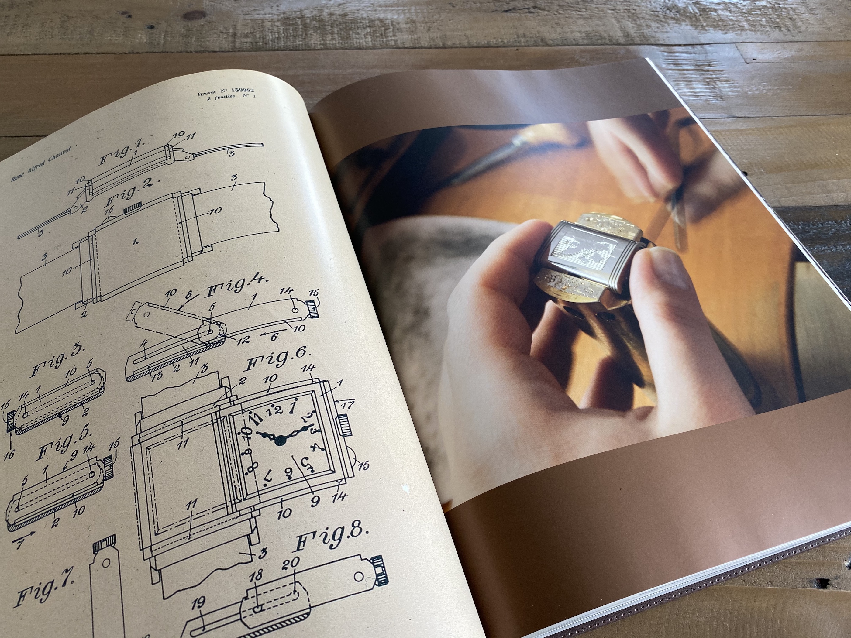
Saddle-stitching suits a slim seasonal newsletter. Perfect binding gives a magazine a bookstore-shelf feel. Hardcover, with a heavier board and often a dust jacket, signals a piece meant to be kept rather than skimmed once. The binding should match the intended lifespan of the object, not just the budget available.
How Color Profiles, Trim Size, and Paper Selection Affect Final Perception
Trim size affects how a piece feels in the hand, oversized formats read as coffee-table statements, standard sizes read as more conventional magazines. Uncoated stock feels tactile and editorial; heavy gloss feels commercial. None of these decisions are neutral, and none can be fixed after the print run ships.
This approach fits brands producing a keepsake meant to sit on a table for months, not a handout meant to be skimmed once and recycled.
7. Skipping Professional Production Oversight From Brief to Delivery
Splitting strategy, design, and print across separate vendors creates handoff gaps where the brand’s positioning quietly erodes between stages.
A publication moves through several distinct stages: an initial brief, editorial planning, design, proofing, print production, and delivery. Each transition between vendors is a place where intent gets lost, an agency hands off a design file to a printer who has never seen the brand brief, and small decisions about paper, color, or trim get made without anyone accountable for the whole picture.
What to Expect in Timeline From Concept to Final Delivery
A well-run publication moves through planning, drafting, design, and proofing in stages, with print production and shipping added at the end. Rushing any single stage tends to show up later, either in editorial quality or in print quality. Companies should expect a process measured in months, not days, and should be skeptical of any provider promising to compress that without cutting a corner somewhere.
Who Should Handle Strategy, Editorial, Design, and Production Together
Rethink Publishing runs this as one managed process rather than a chain of separate vendors, strategy, writing, layout, image sourcing, print production, and delivery under a single point of accountability. That structure exists specifically for companies without an internal creative team who need one person answering for the whole outcome, not a different explanation from each contractor along the way.
8. Designing Without a Way to Measure Whether It’s Working
A publication succeeds when recipients keep it, display it, or pass it along, not simply when the design looks good in a final PDF review.
Aesthetics matter, but they aren’t the finish line. The real signals are behavioral: does the piece sit on a reception desk, does it open a conversation at a client meeting, does someone mention it weeks later. A magazine that ends up on a coffee table or in a waiting room is still doing its job long after distribution, unlike a brochure, which typically gets scanned once and discarded [5].
What Signals Show a Magazine Is Staying in People’s Hands and Homes
Watch for requests for extra copies, mentions in follow-up calls, or the piece showing up in a client’s office on a later visit. These are qualitative outcomes tied to relationship depth and referral conversations, not print-run totals or download counts, which say nothing about whether anyone actually kept the thing.
This framing suits brands treating the publication as part of a long-term relationship strategy, not a one-time campaign asset measured and forgotten after launch.
How to Choose the Right Partner for Custom Publication Design
Choose a partner whose process starts with editorial strategy, has verifiable print production experience, and fits how long you need the piece to last.
Every mistake covered above traces back to one root decision: whether the process is editorial-first or design-first. A provider that starts with layout templates and fills in copy later tends to produce something that looks like a brochure with better photography. A provider that starts with an editorial spine, the story, the audience, the reason the piece exists, tends to produce something people keep.
Portfolio visuals only tell part of the story. Ask how a prospective partner manages paper selection, color calibration, and binding decisions, since design skill on screen doesn’t guarantee production skill on press. Nathalie Grolimund built Rethink Publishing’s process around this exact gap, refined across 20+ years and 80+ high-end magazines and coffee-table books produced end to end.
Which Industries Benefit Most From Custom Publication Design
Hospitality groups, real estate developers, architecture firms, and professional services firms tend to see the clearest fit, since each depends on long client relationships and visual trust rather than transactional purchases. Fit isn’t universal, and forcing a publication onto a low-consideration, price-driven business rarely pays off. Brand identity and perceived value are closely linked in consumer psychology, a dynamic examined in this peer-reviewed research on brand identity and consumer perceived value, which underscores why craft-level custom publication design pays off most for relationship-driven brands.
Questions worth asking before committing to a partner for custom publication design:
- Does the process start with editorial strategy, or does it jump straight to visual mood boards?
- Can they show finished, printed samples, not just digital mockups, of past work?
- Who manages paper selection, color calibration, and binding, and is that person accountable end to end?
- What is the realistic timeline from brief to delivery, and does it match the scope of the project?
- Does their portfolio include brands in a similar relationship-driven category, hospitality, real estate, architecture, or professional services?
Weigh investment level, budget-friendly, mid-range, or premium, against how long the piece needs to last and how it will be distributed. A leave-behind for a single sales meeting has different requirements than an annual keepsake mailed to a client list. Price positioning itself sends a signal about brand quality, a point explored further in this discussion of what price positioning says about a brand.
Not every company needs a print publication. Honestly, some don’t, and that’s a fine, defensible answer if your brand’s relationships already live somewhere else.
Frequently Asked Questions
What makes a publication feel like a keepsake rather than a standard marketing piece?
An editorial spine, a clear point of view and story structure, is what separates a keepsake from a brochure. Brochures sell; magazines earn attention through writing, pacing, and image selection that respect the reader’s intelligence. Paper stock, binding, and print quality matter too, but they support the editorial decision, not replace it. When the content has nothing to say, no amount of gloss fixes that, which is the core argument for treating custom publication design as a strategic investment rather than a cosmetic one.
Can small design choices change how a brand is perceived?
Yes, price and quality signals shape perception before anyone reads a word, the same way a $50 bottle of wine is assumed better than a $15 one [2]. A cramped layout, mismatched fonts, or inconsistent branding reads as amateur regardless of the writing inside [5]. Small choices compound fast, which is exactly why custom publication design decisions can’t be delegated to whoever has the least context on the brand.
Who should be involved in reviewing a design before it goes to print?
The brand executive who owns positioning, plus one editorial lead who can defend content decisions, should review before anything ships. Too many reviewers dilutes a clear editorial voice into committee-approved mush. A tight review loop, one decision-maker, one editorial authority, catches real problems without sanding off the point of view that made the piece worth making.
Is print still worth the investment compared to digital-only brand content?
For brands trying to build lasting client relationships, yes, print offers a physical permanence digital channels structurally cannot. Digital content is cheap to produce and gone in 48 hours; a well-made magazine sits on a coffee table for years. Luxury brands are reinvesting in print precisely because digital saturation has eroded attention, making scarcity a strategic asset rather than a nostalgic choice. It is not a replacement for digital, it is a different kind of asset entirely.
What outcomes should a premium custom publication deliver beyond looking good?
It should change how clients talk about the brand, prompting them to share it, keep it, and associate the company with taste and authority. Beauty without editorial substance is decoration. The real test: does a client hand it to a colleague unprompted, months after receiving it? That’s the outcome that justifies the investment.
Conclusion
Every design decision in a custom publication is a perception decision first and an aesthetic one second. Get the editorial spine right, keep the review loop small and decisive, and treat print quality as proof of the brand’s standards rather than a finishing touch. The brands that get this right don’t produce magazines, they produce artifacts clients keep.
If you’re weighing whether your brand has a real editorial story worth telling in print, start there before you start sketching layouts. Rethink Publishing, led by Nathalie Grolimund with 20+ years and 80+ magazines produced, builds that spine first, talk through your brand’s story at rethink-publishing.com.
Sources & References
- How Branding Improves Perceived Value and Justifies Higher Prices
- Design Disasters: 5 common graphic design mistakes that hurt your brand | Source Brand Solutions
Recommended Articles
Explore more from our content library: