
Understanding a tactile publications brand strategy is essential. Luxury brands invest in high-quality printed magazines because a well-made publication becomes a physical extension of the brand that a screen can’t replicate, something a customer keeps, displays, and returns to. The weight of the paper, the precision of the print, and the pacing of the editorial content all signal a level of care that digital content struggles to convey. This tactile presence builds trust and emotional recall over time, turning a one-time read into a lasting object of association with the brand. That’s the real link between a tactile publications brand and its identity: the object itself carries the message long after the moment it was handed over.
Why Do Luxury Brands Build Their Identity Through Tactile Publications?
A magazine occupies a coffee table, a waiting room, a bookshelf, physical territory a banner ad or email newsletter never gets to hold.
That’s the first reason a tactile publications brand strategy works when everything else in marketing has gone digital. A well-made print magazine sits in a client’s home or office for months, sometimes years, getting picked up again on a slow afternoon or handed to a guest who asks about it. No app notification, no social post, no email competes with that kind of ambient, repeated exposure, because none of them survive past the scroll.
How does print fit into a long-term brand strategy when digital channels dominate?
Print isn’t a replacement for digital, it does a different job entirely, and that’s the point.
Digital channels win on reach and speed: a campaign can hit thousands of inboxes in a morning and adjust its message by afternoon. Print wins on durability and presence. It’s the difference between a conversation and an heirloom. A CEO deciding where to put next year’s brand budget shouldn’t be asking print or digital, the honest question is which job needs doing. If the goal is instant reach, digital wins. If the goal is a client remembering the brand a year from now, without a single retargeting ad reminding them, print is doing work digital structurally cannot.
What measurable impact do high-end publications have on brand perception and customer loyalty?
The mechanisms are straightforward even without a manufactured statistic attached to them. A printed magazine gets read more slowly than a webpage, dwell time stretches because there’s no next tab to jump to. It gets seen more than once, by the client and by whoever visits their home or office next. And it travels by word of mouth in a literal sense: someone picks it up off a table, asks who made it, and now the brand has a referral it didn’t have to buy.
A private members’ club, a boutique hotel group, a luxury goods maker, these are the kinds of businesses that benefit most, because their entire proposition rests on perceived quality and taste. A glossy PDF or a templated brochure signals the opposite of what they’re selling. Disposable marketing reads as disposable; a bound, well-printed publication reads as an object worth keeping, which is exactly the association a premium brand needs its audience to make.
Interestingly, the same tactile principles that make a luxury magazine memorable also apply in fields far removed from marketing. Educational resources for readers with visual impairments rely on similar logic: texture, weight, and physical detail carry meaning that a flat screen cannot. Organizations that produce tactile books for students with visual impairments understand that touch creates a form of engagement and retention that print shares with no other medium, digital included.
How Does a Tactile, High-Quality Publication Create Emotional Connection?
A reader feels a heavy page before they register a single word on it, weight, texture, and print technique do the emotional work that a screen simply can’t replicate.
That’s the physical mechanism behind every tactile publications brand decision Rethink Publishing makes before a single word is written. Paper choice isn’t a production afterthought; it’s part of the story.
What role does paper quality, printing technique, and design precision play in reader experience?
Paper stock sets the emotional register before the reader reaches page one. A heavier stock, in the 150-200 GSM range typical of premium coffee-table books, resists in the hand and turns with a slower, quieter sound than a standard magazine page, that resistance signals permanence. Uncoated stock absorbs ink and holds a matte, almost velvety finish; coated stock reflects light and makes photography pop with sharper contrast. Neither is better. The right choice depends on whether the story needs quiet intimacy or visual punch.
Printing technique adds a second layer of depth. A few of the most common techniques used to reinforce a tactile publications brand identity include:
- Embossing: raises a logo or headline off the page so a fingertip can trace it, adding a physical signature to the brand.
- Spot varnish: creates a gloss highlight against a matte background, drawing the eye without adding a single word.
- Foil stamping: introduces a reflective, metallic accent that signals craftsmanship on covers and section openers.
- Debossing: presses an image or type into the page rather than raising it, creating a subtler, more restrained texture.
These techniques cost more to execute well, and that’s precisely why they get misused, a brand that embosses everything to look expensive ends up with a publication that feels loud rather than considered. The technique has to serve the story on that specific page, not just the client’s budget line.
How do intentional pairings of words and images strengthen the emotional impact of a magazine?
A well-built spread works the way a well-edited film scene works: pacing controls feeling. A single striking photograph given a full page, with generous white space and a short caption, forces the reader to slow down and sit with it. A dense, text-heavy spread two pages later picks the pace back up. That sequencing, quiet, then dense, then quiet again, builds a rhythm no infinite scroll can produce, because a screen offers no physical pause between sections, no weight shift, no texture change to mark the transition. The page turn itself becomes part of the storytelling.
What Makes a Printed Magazine Feel Like a Keepsake, Not Disposable Marketing?
A keepsake survives because every page was built to be read again next year, while disposable marketing survives exactly as long as the offer inside it stays valid.
That’s the whole test, honestly. Open any brochure sitting in a client’s recycling bin and you’ll usually find a discount code, a seasonal promotion, or a call to action tied to a date. Once that date passes, the object has no reason to exist. A magazine built around a profile of a master craftsman, a photo essay on a property’s design history, or a long-form interview with a founder doesn’t expire. Someone can pick it up eighteen months later and it still reads as relevant, because it was never trying to sell something with a deadline.
How should a publication be designed so it stays in people’s homes and hands long-term?
Design for permanence, not for the current design trend cycle. Trend-driven layouts, the color palette that screams “this year,” the typeface that was everywhere on Instagram last spring, date a publication within a season. We favor typography and grid systems with a longer visual life: classic serif treatments, generous white space, layouts that would look as considered in 2030 as they do today. This is the discipline behind building a tactile publications brand rather than producing a one-off print piece, every design decision gets weighed against a multi-year shelf life, not a single print run.
What editorial and design choices distinguish a keepsake publication from standard marketing collateral?
Editorially, the difference is the horizon: a keepsake is written for years, marketing collateral is written for a campaign. A few of the choices that separate the two include:
- Commissioning original photography instead of licensing whatever stock image fits the layout.
- Choosing interview subjects for what they reveal about the brand’s values rather than what they’re currently promoting.
- Treating the cover and spine as the object’s most-used surface, not just its first impression.
- Selecting binding and cover stock that hold up under repeated handling, not just a single read-through.
A magazine meant to sit face-up on a coffee table gets looked at daily, so every one of these choices compounds over time, reinforcing rather than eroding the object’s value.
How Should a Brand Approach Strategy Before Commissioning a Custom Publication?
Strategy comes before a single layout is sketched: define the editorial spine, the format, and the audience who’ll actually keep the object. Skip this step and you get an expensive brochure with better paper.
What does it mean to build a publication around a clear editorial spine?
An editorial spine is the point of view and the recurring themes that hold every issue together, not a loose stack of company updates dressed up in glossy paper. Think of it as the reason someone opens page 40 in an issue with no cover story to remind them why. A hospitality brand’s spine might be “the craft behind quiet luxury”; a law firm’s might be “the people who built the industries we advise.” Neither mentions quarterly earnings or a new hire.
Without that spine, a magazine drifts into a stapled-together set of press releases. Readers notice immediately, even if they can’t name why the issue feels hollow. A genuine tactile publications brand earns its place on a coffee table because it has something to say issue after issue, not because it’s printed on heavy stock.
How do you determine the right format, frequency, and content strategy for a custom brand magazine?
Format and frequency should follow the brand’s actual rhythm, not a default quarterly calendar borrowed from consumer publishing. A real estate developer opening one flagship property every few years is better served by a single, dense coffee-table book timed to that launch. A private club with a constant flow of member stories and events might sustain a biannual magazine without straining for content. There’s no universal cadence, there’s only the cadence a brand’s story can honestly fill.
This is where the honest disqualifier belongs. Some companies don’t have enough of a story, or a big enough audience who’d genuinely want to keep the object, to sustain a publication at any frequency. Forcing one anyway produces expensive filler, beautifully printed, thinly read, and quietly abandoned by issue three. If that’s the case, the right advice is to save the budget, not the pitch.
Content strategy has to start with who keeps the object and why, the client on a side table, the prospective member in a waiting room, the journalist deciding what to feature, not with what the company wants to announce. Rethink Publishing builds this editorial spine before any design work starts, precisely because getting the strategy wrong is the single most common reason a publication underperforms.
What Separates a Standard Corporate Magazine From a Lasting Brand Asset?
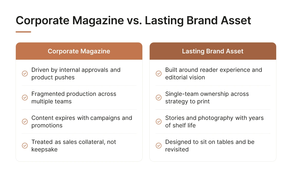
A standard corporate magazine is built to please internal stakeholders and push products; a lasting brand asset is built to hold a reader’s attention on its own terms.
Walk into most executive offices and you’ll find the first kind stacked in a drawer somewhere, half-read. It exists because marketing needed a Q3 deliverable, not because anyone thought hard about why a client would want to pick it up twice.
How does design-led, editorially curated approach change the outcome of a publication?
A design-led publication starts with the reader’s experience, not the org chart’s approval chain. Instead of asking “which products do we need to feature this quarter,” the question becomes “what would make someone want to keep this on their coffee table.” That single shift changes the writing, the pacing, the photography, and the sequence of pages, everything bends toward a reading experience instead of an internal wish list.
The difference shows up in small, cumulative ways: a headline that reads like a magazine instead of a press release, a photo chosen for mood instead of product placement, white space that lets a page breathe. None of it is dramatic on its own. Together, it’s the difference between a document and a tactile publications brand people actually hold onto.
Why does end-to-end control over strategy, editorial, design, and print matter for brand publications?
Fragmented production, one team on strategy, another on layout, a separate print vendor executing specs it didn’t help develop, introduces small inconsistencies at every handoff. A tone that shifts halfway through, a layout choice that fights the editorial rhythm, a print run that doesn’t match the design intent. Readers won’t name any of these individually. They’ll just sense that something feels off, and put the magazine down sooner than they would otherwise.
Single-team ownership avoids that erosion. When the same group carries the editorial spine from initial concept through final bound copy, decisions made in strategy still make sense by the time ink hits paper. That continuity is precisely what Rethink Publishing’s fully managed model protects, one point of accountability across writing, design, image rights, and print production, so nothing gets diluted at the seams.
This level of craft is a long-term investment, not a low-cost shortcut. Budget alternatives that skip editorial direction or split production across vendors tend to look the part on delivery day and age poorly, pages that feel dated within a year, print quality that doesn’t survive repeated handling. A publication meant to last in someone’s home or boardroom has to be built for that, from the first page.
For a real-world sense of how specialized this kind of production can get, some community discussions, such as this request for help finding a printer capable of producing a tactile sensory book, show just how few vendors are genuinely equipped to combine tactile finishing with editorial quality at a high standard.
Frequently Asked Questions
Is print worth the investment when most audiences are online?
Yes, because scarcity is what makes it work. Every competitor is fighting for the same six inches of screen; a printed magazine sits on a coffee table for months, gets picked up unprompted, and carries weight a feed post never will. Digital saturation is precisely why print now stands out.
How often should a brand publish a custom magazine to maintain impact?
Most clients publish annually or twice a year, frequency matters less than consistency and quality. A rushed quarterly issue erodes the prestige a magazine is meant to build. One well-made issue a year, tied to a real moment, a launch, an anniversary, outperforms four thin ones.
Can a smaller or younger company justify a custom print publication?
Sometimes, but honestly, not always. If you’re still proving product-market fit, that budget likely belongs elsewhere. A print magazine earns its cost once you have a real story, a loyal client base worth deepening, and a brand identity strong enough to fill 60-plus pages without padding.
What industries benefit most from a branded print publication?
Hospitality, real estate, law, architecture, and design see the clearest returns, though the pattern extends further. Any business with an affluent, relationship-driven clientele, even cybersecurity firms we’ve worked with, can use print to build the kind of trust a PDF never earns.
Are the principles behind a tactile publications brand relevant outside luxury marketing?
Yes. The same reasoning that makes a tactile publications brand memorable, that touch and texture create engagement a screen can’t match, shows up in accessibility-focused publishing too. Groups producing tactile books for blind children rely on the exact same principle: physical texture carries meaning and builds connection in ways flat digital content structurally cannot.
The parallels are worth summarizing. A few things both fields share:
- Touch and texture create memory and engagement that screens cannot replicate.
- Physical objects survive in a home or bag long after a single use, unlike most digital content.
- Design decisions, weight, finish, layout, are made deliberately rather than as an afterthought.
- The object itself becomes part of the message, not just a container for it.
Conclusion
A tactile publication earns its place on a coffee table by being genuinely worth keeping, that means an editorial spine, not a brochure dressed up in better paper. Three things matter most: define the story before the design, commit to quality over frequency, and reserve the investment for a brand that can sustain 60-plus pages of real content.
If you’re weighing whether this fits your brand, start smaller than you think: sketch the editorial concept for a single issue built around one real event, a launch, an anniversary, a flagship opening, before committing to an annual cadence. Whether the goal is luxury marketing or accessible publishing, the lesson from every tactile publications brand success story is the same: the object has to be worth holding onto.
Recommended Articles
Explore more from our content library: