
Understanding visual storytelling print publications is essential. Carefully composed imagery in print creates emotional connection that digital struggles to match because holding a physical object engages memory and attention differently than scrolling does. A printed page demands a slower, single-focus read, there’s no notification competing for attention, no infinite scroll diluting the moment. That physical permanence means readers absorb a brand’s visual narrative more deeply and return to it repeatedly, which is why luxury brands still invest in print magazines and coffee table books to build lasting brand perception rather than fleeting impressions.
Why Do Visual Storytelling Print Publications Create Emotional Connection Digital Can’t Match?
A printed page holds a reader’s full attention for minutes at a stretch, while a screen splits that same attention across notifications, tabs, and an endless scroll. That single difference explains most of what makes print feel different in the hand than it does on a feed. This is the foundation of why visual storytelling print publications remain a distinct medium rather than a legacy format waiting to be replaced.
Scroll behavior trains the eye to move fast and commit to nothing. A phone screen shows one image for a second or two before the thumb moves again, and the brain barely has time to register a composition, let alone feel something about it. A magazine page has no “next” button pulling the reader forward. The photograph, the layout, the white space around it, all of it gets seen, because there’s nothing else competing for the eye in that moment. For a closer look at how imagery functions as narrative rather than decoration, this piece on visual narratives in photography and advertising is a useful companion perspective.
What Makes the Tactile Experience of Holding a Printed Magazine Different From Scrolling?
Paper has weight, texture, and resistance that a screen cannot replicate at any resolution. A heavy matte stock feels deliberate in the hand; a glossy spread catches light differently as the page turns; the thickness of a coffee-table book signals substance before a reader even opens it. These are sensory inputs a smartphone simply doesn’t have, no screen can be soft, or dense, or smell faintly of ink. That physical weight becomes part of how the brand behind it gets perceived, often before a single word is read.
How Does Print’s Permanence Affect How Readers Remember a Brand’s Visual Story?
An object left on a coffee table gets picked up again, a social post scrolled past once rarely does. Memory strengthens with repetition, and a printed magazine sitting in a living room or a waiting area invites a second and third look over weeks or months, reinforcing the same images each time. A digital impression, by contrast, is usually a single exposure that competes with dozens of others in the same five minutes.
For luxury brands, that slower consumption pattern isn’t incidental, it’s the point. A reader who spends ten minutes with a printed piece associates that unhurried attention with the brand itself, reinforcing exactly the deliberateness and taste a premium brand wants attached to its name. Several qualities tend to separate memorable print pieces from forgettable ones:
- A single strong image per spread rather than a cluttered collage competing for attention
- Consistent visual voice across every page, so the piece reads as one story instead of a scrapbook
- Deliberate pacing that rewards a second and third read instead of exhausting itself on the first pass
- Paper and print choices that match the emotional tone of the imagery rather than fighting it
How Do Luxury Brands Use Design and Visual Composition to Build Lasting Brand Perception?
Luxury brands build authority on the page through restraint: generous white space, disciplined typography, and deliberate pacing across spreads, not decoration piled on top of the content.
What Role Does White Space, Typography, and Layout Precision Play in Communicating Brand Authority?
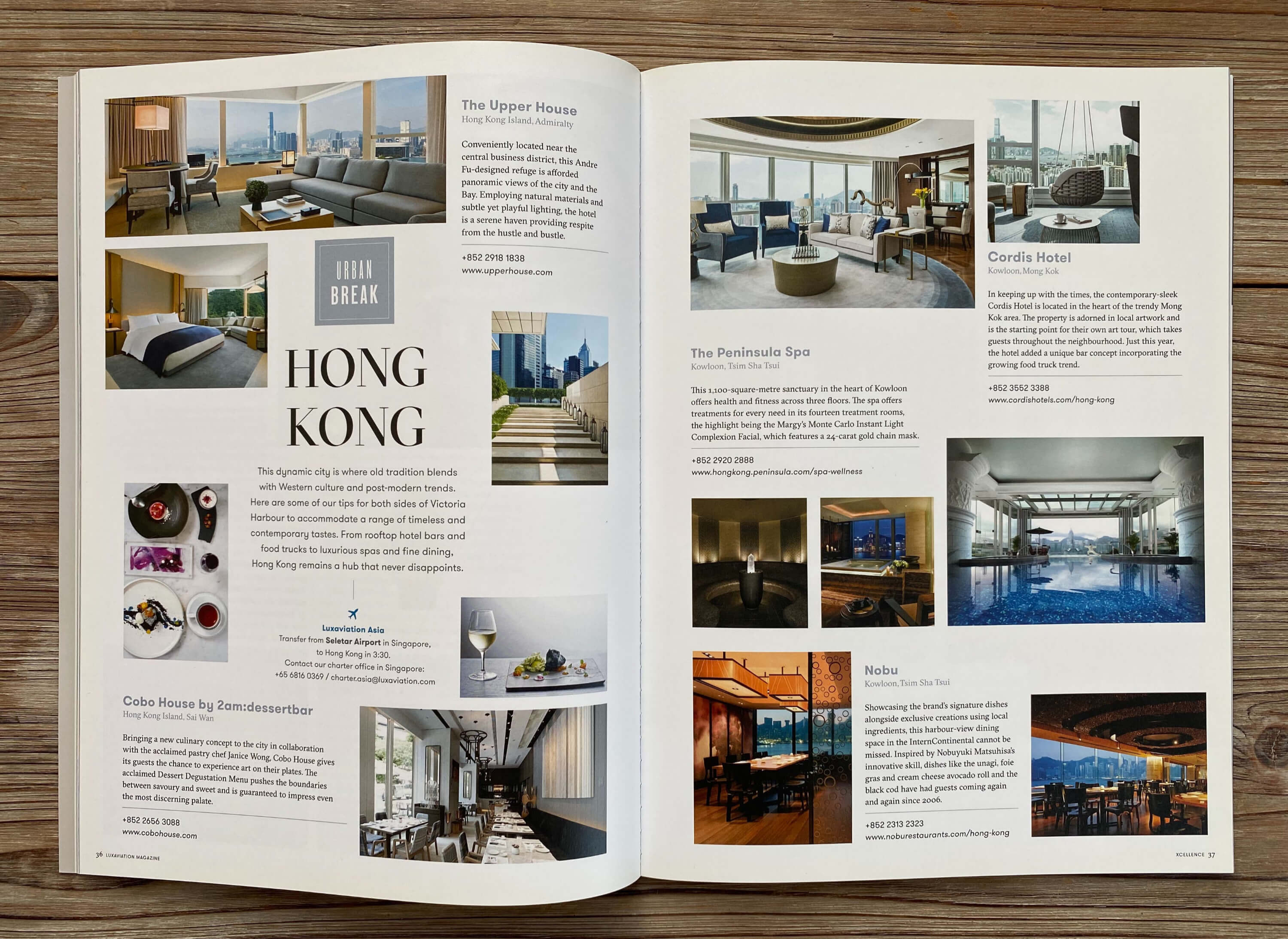
A page that breathes reads as confident. A page crammed with text, logos, and call-out boxes reads as anxious, like the brand doesn’t trust the reader to stay interested without being shouted at. Luxury hospitality groups and design firms tend to favor spreads with a single strong image and a short caption over a page trying to say six things at once. The empty margin is doing work; it tells the reader this brand doesn’t need to prove itself twice.
Typography carries the same weight, quietly. A consistent type family, disciplined weight hierarchy, and deliberate letter spacing signal editorial control the way a firm handshake signals composure, readers absorb it without naming it. Inconsistent fonts, mismatched sizes, or type crammed against images do the opposite: they read as unfinished, regardless of how good the photography is. Visual storytelling in print publications depends on this kind of typographic discipline as much as it depends on the images themselves.
How Has Thoughtful Visual Composition Strengthened Brand Perception for Companies?
Quality compounds across a sequence. One striking photo is a nice asset; twenty images paced deliberately across spreads, alternating full-bleed moments with quieter detail shots, build a cumulative sense of craft a single image can’t. This is sequencing, the editorial decision of what the reader sees on page 12 versus page 40, and how that rhythm builds anticipation instead of exhausting attention.
Clients who move from ad hoc brochures to a properly sequenced magazine tend to describe the same shift: internal teams start treating the brand differently, sales conversations open with the publication instead of a pitch deck, and the piece stays on a desk or coffee table instead of the recycling bin. That’s the qualitative marker of success, not a metric, but a change in how people handle the object. Rethink Publishing builds that editorial spine and image sequence before a single spread is laid out, precisely because pacing decided late never reads as intentional.
What Is the Relationship Between Editorial Strategy and Visual Storytelling in a Magazine People Keep?
Editorial strategy determines what a photograph means; without it, even striking images sit on the page as decoration rather than argument. Visual storytelling print publications only works when someone decided, before a single photo was taken, what the issue is trying to say.
That’s the real gap between a magazine and a brochure with good pictures. A brochure assembles content around a product or service; a magazine builds around an editorial spine, a defined point of view that every article and image has to serve. This has nothing to do with budget. A client can spend heavily on photography and still end up with a glossy brochure if no one planned what the pictures were for.
How Do You Pair Words and Images So They Work Together Instead of Competing?
Pairing happens at the planning stage, not after the photographer delivers files. When a writer and an art director work from the same brief from day one, the photo shoot gets built to answer specific narrative questions, not to produce a folder of options someone edits down later. Skip that step and you get two products competing for the reader’s attention: text explaining one thing, images showing another, both fighting for the same half-second of eye contact.
What Makes a Magazine Feel Like a Keepsake Worth Keeping on a Coffee Table?
A keepsake has a narrative arc across the whole issue, a reason page 12 leads to page 40, not just a handful of beautiful spreads scattered between filler. Consider the difference between an image chosen because it fills empty space nicely and one chosen because it’s the only shot that shows a hotel’s renovation mid-process, proving a claim the copy makes on the facing page. The first is decoration. The second is evidence. Readers keep the second kind of magazine.
How Do You Select and Source Imagery That Serves Your Brand’s Story in Print?
Choose images by what they do for the story, not by how they look on a page, the format you’re producing determines whether you commission, license, or pull from archive. Successful visual storytelling print publications tend to follow a consistent sourcing logic depending on format:
- Luxury lifestyle magazines: commissioned photography, shot specifically for the issue, with one photographer or small team holding a consistent visual voice
- Annual reports: a mix of documentary-style imagery and archival material, since the narrative is often about process or legacy over time
- Coffee-table retrospectives: genuine archival photography that lends credibility a staged reshoot cannot replicate
- Product or property brochures: tightly commissioned shoots supplemented with selective licensing to fill coverage gaps
What’s the Difference Between Sourcing Visuals for a Luxury Magazine Versus an Annual Report or Coffee Table Book?
A luxury lifestyle magazine usually needs commissioned photography, shot specifically for that issue, with one photographer or a small team holding the visual voice consistent from cover to back page. A hotel brand’s quarterly magazine, for instance, benefits from a single photographer capturing the property, the food, and the guests in one continuous style, mixing sources here reads as disjointed even to a casual reader.
An annual report or a coffee-table book often works differently. These formats can lean on archival material, documentary-style imagery, or historical photography, because the narrative is frequently about time, legacy, or process rather than a single polished moment. A hospitality group’s 30-year retrospective coffee-table book gains credibility from real archival photos, not staged ones.
How Do Budget and Production Constraints Shape Which Imagery Makes It Into Print?
Budget-friendly projects lean toward fewer shoot days, single locations, and selective licensing to fill gaps around a smaller set of commissioned images. Mid-range productions can support multi-day shoots across two or three locations, giving an editorial team enough coverage to build a real visual arc. Premium productions allow for extended shoots, travel, and a dedicated creative director on set, the kind of investment that shows up as consistency across every spread.
None of this is about spending for its own sake. It’s about matching the shoot plan to the story the publication needs to tell.
Stock imagery is the shortcut that undermines all of it. It dilutes the specificity that makes visual storytelling print publications feel owned by a brand rather than borrowed from a library everyone else can access too.
The test for any image: does it move the story forward, or does it just fill space? If it only illustrates a paragraph, cut it.
What Production Decisions Shape How Your Visual Story Lands With Readers?
Production choices decide whether a photograph reads as intended or arrives flattened, muddy, or emotionally off, long before a reader ever opens the cover.
How Do Resolution, Color Accuracy, and Printing Method Affect the Emotional Impact of Your Visuals?
A screen and a printed page render color differently, and if nobody manages that gap early, the image loses the mood it was shot for. Screens display light in RGB; presses lay down ink in CMYK, a narrower range that can’t reproduce certain vibrant blues, deep greens, or neon tones. An image that glows on a monitor can arrive dull, gray, or shifted in hue on paper if it isn’t converted and proofed before the print run, not after.
Paper stock changes the emotional register of the same photograph. A glossy coated sheet makes colors pop and skin tones look crisp, good for architecture, product shots, or anything that needs punch. An uncoated matte stock softens the same image, muting contrast and giving it a quieter, more intimate feel, often the better choice for portraiture or narrative editorial spreads where the goal is warmth over spectacle. Neither is objectively better. The choice has to match the story the brand is telling.
Resolution is not a spec sheet item, it’s a mechanism that determines whether an image survives the jump from screen to physical page. A file that looks sharp at thumbnail size or on a laptop display can fall apart once blown up to a full magazine spread or double-page coffee-table format, revealing pixelation or softness invisible at smaller sizes. This is why file preparation and image sourcing happen early in a well-run production process, not as an afterthought once layout is finished. A short checklist worth running before any file goes to press:
- Confirm resolution is sufficient for the largest planned reproduction size, not just the layout preview
- Convert and soft-proof colors from RGB to CMYK before final approval
- Test paper stock samples against the actual images, not generic swatches
- Review a physical proof under real lighting conditions before the full print run
What Emerging Approaches Are Changing How Brands Think About Visual Storytelling in Print?
Two directions are shaping how brands extend visual storytelling print publications beyond the page itself. The first is sustainable paper and printing choices, recycled or responsibly sourced stock, lower-impact inks, which matter increasingly to clients whose own brand values include environmental responsibility. The second is hybrid print-digital integration: QR codes linked to video, extended interviews, or behind-the-scenes footage, giving a printed piece a doorway into richer content without diluting the physical object itself. Used well, these additions extend the story. Used carelessly, they read as a gimmick bolted onto a beautiful object that didn’t need it.
Frequently Asked Questions
Does print visual storytelling still matter when most brand attention happens online?
Yes, because scarcity of attention is exactly what print now offers that digital can’t. A social post competes with hundreds of others in a feed and disappears within a day or two. A well-designed magazine sits on a coffee table for months, gets picked up repeatedly, and carries a physical weight that signals the brand invested in the relationship, not just the transaction.
How long does a printed magazine typically stay in a reader’s home compared to a digital campaign’s lifespan?
A quality print piece often stays in a home or office for months, sometimes years, versus a day or two for a typical social post. That difference in shelf life is the entire argument for print as a brand investment rather than a marketing expense.
Can a small or mid-sized company justify a custom print magazine, or is it only for large luxury brands?
Size matters less than whether the brand has a real story and an audience worth impressing repeatedly. A boutique law firm or a single-property hotel group can justify a magazine if it’s using the piece to deepen relationships with a defined, high-value audience, clients, referral partners, or prospective buyers, rather than chasing broad reach. The budget scales with ambition, not company size.
What’s the difference between a corporate brochure and a real editorial print publication?
A brochure sells a product; an editorial publication tells a story readers choose to keep. Brochures are built around features and calls to action. A magazine has an editorial spine, a point of view, a narrative arc, imagery chosen to support a feeling, which is why people put it on a coffee table instead of a recycling bin.
How do you know if your company’s story is strong enough to sustain a full print publication?
If your brand has depth beyond its product, people, craft, place, or philosophy worth exploring, it’s likely strong enough. Honestly, not every company needs one. But if clients already ask about the story behind the business, that’s a signal worth testing with an editorial team before committing budget.
Conclusion
Visual storytelling print publications work because they slow readers down and ask for their full attention, something no feed can replicate. The brands that get it right treat the magazine as an editorial product with a clear spine, not a brochure with better paper. Before starting one, get honest about whether your story can sustain 60-plus pages and whether your audience is the kind that keeps things.
If those answers are yes, the next step is a conversation about editorial direction, not design templates. Rethink Publishing has managed that process end to end for over 20 years, visit rethink-publishing.com to start with a strategy conversation, not a quote.
Recommended Articles
Explore more from our content library: