
Readers notice luxury magazine design within seconds, through details that signal real editorial craft rather than marketing material: heavy, textured paper stock, deliberate white space, typography that holds a consistent voice across pages, and finishing touches like foil, embossing, or a spine that lies flat. These details matter because they’re what turn a magazine from something flipped through once into something kept on a coffee table for years. The strongest signal isn’t any single element, it’s consistency between editorial content and physical production, so the object feels as considered as the words inside it.
1. Paper Stock That You Can Feel Before You Read a Word
A reader’s thumb registers the weight of a page before their eyes register a single headline, which makes paper stock the first design decision that actually matters.
Heavier GSM stock creates a sense of permanence. Thin, flimsy pages signal disposability, the kind of print a reader scans once and recycles. A magazine printed on substantial stock behaves differently in the hand: it doesn’t flop, it doesn’t feel like an afterthought, and that physical sturdiness gets transferred, consciously or not, to how the reader judges the brand behind it.
The choice between uncoated and coated stock changes the emotional register entirely. Matte, uncoated paper reads as understated and confident, a fit for private wealth managers or heritage hospitality brands that don’t need to shout. Gloss suits categories built on high-shine visual drama, like fashion or automotive. Touch is processed before content, so paper stock pre-frames every expectation a reader brings to the pages that follow.
This detail matters most for hospitality groups, fashion houses, and private wealth firms, where a tactile first impression often outweighs the opening paragraph. Most competitors treat “premium paper” as a generic upgrade. The differentiator is pairing stock to the brand’s specific emotional register, not defaulting to the heaviest sheet available.
2. Luxury Magazine Design That Starts With an Editorial Spine, Not a Template
Luxury magazine design works backward from a defined editorial idea, not forward from a layout template, the concept dictates the grid, not the other way around.
Why Editorial Strategy Shapes Design Decisions First
When a magazine starts with a clear editorial angle, every downstream choice, grid structure, type scale, how images get cropped and placed, follows from that angle. A publication built around craftsmanship and provenance calls for wide margins and long-form photography. One built around speed and innovation calls for tighter grids and kinetic type. Retrofitting content into a stock template produces the opposite: pages that look fine individually but share no connecting logic.
This is also the fastest way to spot a brochure dressed up as a magazine. A brochure pushes one message as hard as it can; a magazine with a real point of view has restraint, range, and a reason for each section to exist. The design tells you which one you’re holding before you read a word.
Recurring sections and a consistent narrative thread give designers something to build rhythm around issue after issue, a column, a profile format, a recurring visual motif. That’s why this approach fits companies with a real story across multiple issues, not a single product they want to showcase once.
3. Typography Systems That Hold a Single Voice Across Every Page
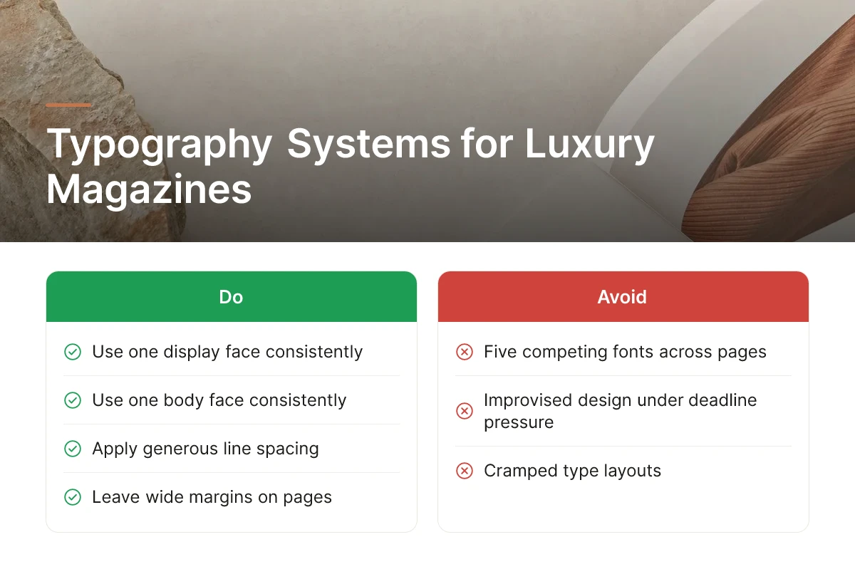
A disciplined type system, one display face, one body face, used consistently, reads as confident, while five competing fonts read as improvised.
Restraint is the signal here, not variety. A limited, deliberate type hierarchy gives every spread the same voice, so a reader flipping quickly through 80 pages still feels one coherent publication rather than a patchwork of design decisions made under deadline pressure.
Generous line spacing and wide margins do similar work. A brand willing to leave space on the page is a brand that isn’t afraid of silence, a detail luxury readers register even if they can’t name it. Cramped type and tight margins, by contrast, read as budget-constrained no matter how good the paper stock is.
Type pairing should match brand register, not personal taste. A serif-led system suits heritage brands, private clubs, legacy law firms, established hospitality names. A cleaner sans-driven system suits modern tech companies or contemporary hospitality brands positioning themselves as forward-looking. This approach fits any brand that wants pages to feel consistent even flipped through at speed, which is how most readers actually encounter a magazine the first time.
4. Color Palettes Restrained Enough to Feel Intentional
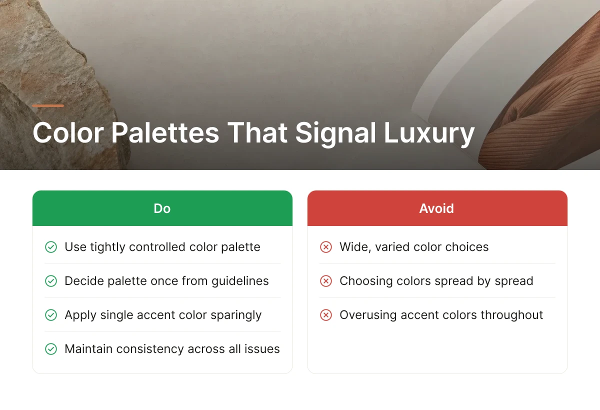
A tightly controlled color palette reads as deliberate, while a wide, varied one reads as improvised, color discipline signals luxury more reliably than color abundance.
The palette should come from brand guidelines, decided once, rather than chosen spread by spread based on what photo happens to be on the page. That consistency is what makes an issue recognizable at a glance and makes issue three feel like the same publication as issue one.
A single accent color, used sparingly across an issue, on a folio number, a pull quote, a section marker, creates a visual signature readers start to associate with the brand itself. Overuse erases that effect; restraint is what makes it memorable.
The detail most pages skip: color doesn’t print the same on every stock. A deep burgundy that looks rich on gloss can read muddy on matte, and palette decisions in strong luxury magazine design always account for the paper stock they’ll actually run on, not just a screen proof.
5. Finishing Techniques That Make a Cover Worth Picking Up
Foil stamping, embossing, and spot UV give a cover a reason to be touched, not just looked at, which is what separates a keepsake from a standard print run.
How Printing and Finishing Choices Enhance Perceived Quality
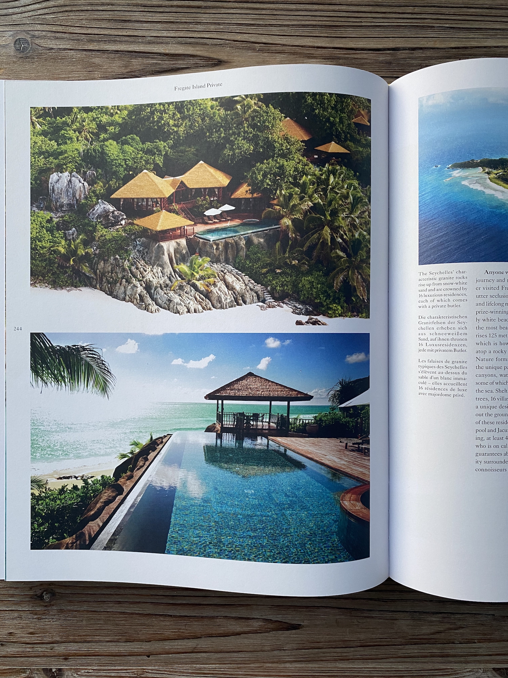
Foil catches light at an angle a flat print never can. A deboss adds texture a reader feels before they read the title. Spot UV creates contrast between matte and gloss on the same surface, drawing the eye to a logo or headline without adding a single extra color. Each technique works because it engages a different sense, light, touch, contrast, layered onto the same cover.
Binding matters just as much as surface finish. Perfect binding suits a thicker, book-like issue; saddle-stitching suits something slimmer and more immediate; a binding engineered to lie fully flat changes how a reader experiences a double-page spread, especially for photography-led issues. Each choice affects how the object behaves in the hand, not just how it looks on a shelf.
Finishing should be used sparingly. A cover with foil, emboss, and spot UV all competing for attention flattens the impact of all three, the technique works because it’s rare on the page, not because it’s everywhere. This approach fits flagship issues, anniversary editions, or any publication built to function as a keepsake rather than a routine quarterly update, the kind of object Rethink Publishing builds end to end, from editorial concept through print production, for clients who need the physical object to carry the weight of the brand.
6. Layouts Built on Visual Hierarchy, Not Just Pretty Pages
Good luxury magazine design tells the eye where to land first, second, and third, without a single caption or arrow doing the work. That’s the difference between a spread that reads as a collection of nice images and one that reads as a story.
Scale, placement, and contrast carry the weight. A full-page portrait next to a small supporting image signals importance before a reader processes a single word. Headline size, white space around a pull quote, the position of a caption relative to the fold, all of it is a set of instructions the reader follows without realizing they’re following anything.
How to Keep a Layout Cohesive While Still Allowing Surprise
A consistent grid system across the issue gives readers a sense of order, margins, column widths, and type treatments that repeat enough to feel familiar. The exceptions matter just as much: a handful of spreads built outside the grid for a signature feature or a striking photograph create the moments readers remember.
Full-bleed photography paired with controlled white space creates pacing, alternating density with calm so the eye gets a rest between heavier editorial sections. The differentiator is designing for the spread, not the page, readers absorb two facing pages as one visual unit in print, moving left to right in a way no single digital screen replicates.
7. Print-First Decisions That Don’t Translate From Digital
Print demands decisions be right before the press runs, because unlike a webpage, a printed page can’t be edited after it ships.
That permanence changes how editorial teams work. A headline, a caption, a color choice, once it’s on paper, it’s final, which means more scrutiny happens upfront rather than through quick revisions after launch. Color itself behaves differently in print: CMYK reproduction and the way ink absorbs into paper stock produce results that look nothing like the RGB glow of a screen, so color calibration has to be built into design decisions early, not corrected later [1].
Some content simply performs better on paper. Long-form narrative and photo essays hold attention without scroll fatigue or a browser tab competing for focus, a reader with a printed magazine in hand isn’t one swipe away from email [4]. That sustained attention is the asset: a print object gets read start to finish, shared physically with a colleague or guest, and kept rather than closed. Luxury magazine design works because it respects that difference instead of treating print as a PDF export of a web layout.
8. Details That Make a Magazine Double as a Marketing Asset
The right design choices let a magazine keep representing a brand long after the first read, sitting in a waiting room or office rather than a recycling bin.
Consistent brand presence across covers and interior pages, a recurring typeface, color palette, or logo placement that never overwhelms the page, makes an issue instantly recognizable without feeling like a brochure. A magazine placed in a hotel suite, a reception area, or an executive’s office keeps working passively, picked up by people the brand never directly marketed to.
Editorial content that reads as genuine storytelling, not advertising, earns longer attention and more trust than sales collateral ever will [4]. That distinction is what separates a magazine from a brochure: one gets read, the other gets discarded. This approach suits companies that see print as a long-term relationship-building tool rather than a one-off campaign piece, the kind of client Rethink Publishing builds each issue for, with an editorial spine designed to outlast a single distribution cycle.
How to Choose the Right Luxury Magazine Design Approach for Your Brand
Ask whether the editorial concept came before the layout, whether the paper stock matches your brand’s register, and whether finishing touches are used with intent rather than everywhere.
Those three questions expose most of the difference between a considered publication and a decorated one. A studio that starts with design templates and fills them with content later tends to produce something that looks polished but reads as generic. Ask to see the actual workflow, concept, editorial direction, layout, print proofing, rather than just final renders; a process with no visible proofing stage is a process that hasn’t accounted for how color and paper behave in the real world [1].
Success is better judged qualitatively than by circulation count alone: do people keep the issue, reference it months later, leave it displayed in an office or home. Those are the signals that the publication earned its place as a kept object, not a discarded one.
Not every brand needs a maximalist design with heavy finishing and dense editorial sections. A quieter, more restrained approach, generous white space, minimal typography, fewer but stronger images, often suits a brand whose authority comes from understatement rather than spectacle. The right luxury magazine design choice is the one that matches how the brand already behaves in the room, not the one with the most embellishment.
Frequently Asked Questions
What are the defining characteristics of luxury magazines across different industries?
Across industries, luxury magazines share heavy paper stock, restrained typography, and an editorial spine rather than a sales pitch. A hospitality brand’s publication and a law firm’s coffee-table book look different on the surface, but both prioritize image quality, generous white space, and a point of view over a product catalog. Architectural Digest and Condé Nast Traveler set the visual bar that private brands now borrow from [5].
What specific design details make readers want to hold onto a magazine?
Paper weight, cover finish, and binding quality are what make someone set a magazine on a table instead of a recycling bin. Uncoated stock with a tactile texture, French-folded covers, and deckle-edged pages signal craftsmanship before a reader opens to page one. Deliberate pacing between dense text and full-bleed photography also keeps attention longer than a cluttered layout.
What does the design process look like for a custom luxury publication, from concept to print?
The process moves from editorial strategy to layout to print production, in that order, not the reverse. At Rethink Publishing, the team defines an editorial spine first, then sources imagery and writes copy before any page is designed, so the layout serves a story instead of filling space. Production, proofing, and delivery follow under a single managed workflow, so the client reviews rather than coordinates vendors.
How do you evaluate whether a luxury magazine design is actually working?
A luxury magazine design works if recipients keep it rather than discard it, which you can track through direct feedback and repeat requests for copies. Watch whether clients reference specific stories in meetings or display the issue in offices and lobbies. Low production cost and fast turnaround are warning signs, not advantages, in this tier.
Why do some luxury publications work better in print than in digital formats?
Print holds attention because it has no scroll, no notification, and no competing tab. A physical magazine sits on a coffee table for months, while a digital post disappears within days [2]. For brands selling trust and permanence, that physical staying power carries more weight than reach metrics.
Conclusion
Luxury magazine design comes down to three decisions: choosing paper and binding that reward touch, building an editorial spine before anyone opens a layout program, and resisting the urge to make every page a sales pitch. Brands that get this right end up with an object clients keep, not content they scroll past. The ones that skip the editorial strategy step usually produce something that looks expensive but reads like a brochure. If you’re weighing whether your brand is ready for this, start by auditing what currently sits on your clients’ coffee tables, then visit rethink-publishing.com to talk through what an editorial spine for your brand could look like.
Sources & References
- LUXURY MAGAZINE | DESIGN
- 8 digital magazine examples worth studying – Maglr
- 5 luxury print magazine strategies
- 9 Luxury Magazines to Showcase Your Brand | MediaMax
Recommended Articles
Explore more from our content library: