
Understanding brand magazine cover design is essential. A magazine cover earns its place on the coffee table when it’s designed as a brand asset first and a visual object second, meaning the strategy, the editorial angle, and the material choices all signal what the company stands for, not just what it sells. Digital touchpoints disappear in a scroll; a printed cover sits in a home or a reception area for years, doing quiet work every time someone picks it up. That’s the real difference between decoration and a keepsake: one looks good once, the other keeps meaning something.
Define What the Cover Needs to Say Before You Design It
A cover designed before the editorial strategy exists will look fine and say nothing, competent typography wrapped around a message nobody defined. That’s the mistake worth naming before any discussion of brand magazine cover design even starts.
Most companies treat the cover as a styling decision: pick a strong image, add the logo, choose a typeface that looks “premium.” That order of operations produces a brochure with better paper stock. A brochure cover sells something, a property, a service, a season’s offering. A magazine cover sets up an editorial spine, a point of view the reader can expect to find inside [1]. One is a pitch. The other is a promise about what kind of company made this.
What role does editorial strategy play before you even start designing the cover?
Editorial strategy decides what the magazine is actually about, the angle, the audience, the recurring voice, before a single layout gets built. Skip it, and the design team is left guessing at tone, which shows up as a cover that borrows visual cues from competitors instead of stating a position of its own.
This is where positioning does its work. Who is this publication for, and what does the company holding it want to be known for in that reader’s eyes? A law firm building trust with institutional clients needs a different cover language, restrained typography, documentary photography, muted color, than a hospitality brand selling an aspirational lifestyle. Positioning should settle those choices before anyone opens a design file. Imagery, color palette, type weight, all of it follows from who the reader is and what the brand values, not from what looks striking in isolation [3].
Treating the cover as a brand asset changes the question entirely. Instead of asking what will perform this quarter, the right question is what a client, partner, or prospective hire will think of the company when they pick this up off a coffee table three years from now. That’s a different design brief than a campaign asset built for a 90-day cycle, and it’s the reason editorial direction has to come first, not last, in any serious approach to brand magazine cover design.
Align the Brand Magazine Cover Design With Your Positioning
Brand magazine cover design works only when every visual choice traces back to a position the company already holds in the market, not to what looks good in isolation. A cover is a statement of what the brand values, made before a single word is read.
Start by asking what the magazine needs to prove. A private bank and a boutique hotel group are both “premium,” but they are not premium in the same way, and a cover that doesn’t distinguish between those two kinds of premium has failed before it reaches print.
How do luxury brands, tech companies, and hospitality firms approach cover design differently?
A luxury brand typically pulls back, one image, generous white space, a wordmark instead of a headline stack. Restraint signals that the brand doesn’t need to shout, which is itself a positioning claim.
A technology company earning trust through precision usually leans the opposite direction: tighter grids, a single confident sans-serif, color used sparingly so it reads as intentional rather than decorative. A hospitality brand selling warmth and belonging often does the reverse again, richer color, a human face or a lived-in scene, a typeface with enough weight to feel inviting rather than clinical. None of these are universal rules. They’re starting hypotheses to test against the brand’s actual three or four core values, not a template to copy.
Color, paper texture, and type weight carry meaning before a reader processes a single sentence. A matte stock with a deep ink saturation reads as considered and exclusive; a brighter gloss with high-key photography reads as energetic and accessible. A heavier type weight suggests authority; a lighter, wider-tracked serif suggests editorial calm. None of this requires copy to land, which is exactly why it has to be chosen deliberately rather than left to whatever the designer finds appealing that week [5].
A workable test: list the brand’s three core values, then ask whether the cover concept visually expresses at least one of them without relying on a headline to explain it. If the cover needs a caption to justify the choice, the design hasn’t done its job yet.
Watch for the most common failure in this process, designing a cover that mirrors the homepage. A website is built for scrolling and clicking; a magazine is held, kept, and revisited months later. Rethink Publishing treats the two as separate design problems entirely, building the editorial spine and cover concept around what works as a printed object first, then letting brand consistency follow rather than lead.
Design the Cover to Be Kept, Not Just Looked At
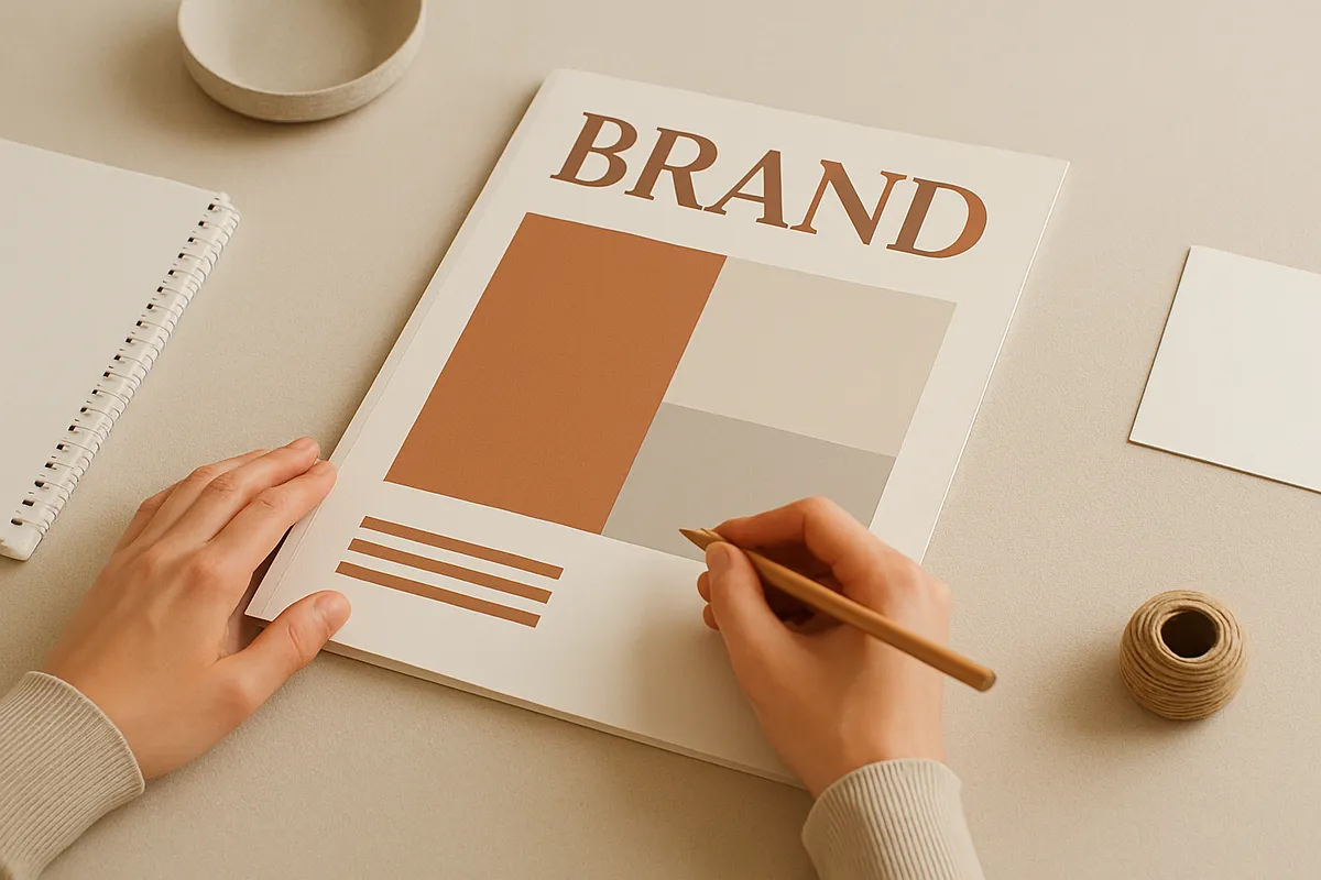
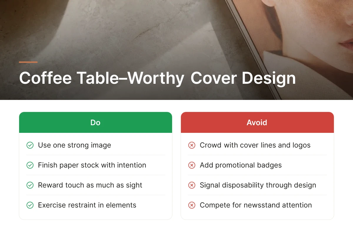
A cover survives on a coffee table when it restrains itself to one strong image, finishes the paper stock with intention, and skips anything that signals disposability. That’s the whole discipline of brand magazine cover design: fewer elements, better decisions, and materials that reward touch as much as sight.
What design choices make people want to keep a magazine on their coffee table?
Restraint is the first decision, and it’s the one most in-house teams get wrong. A cover crowded with cover lines, logos, and promotional badges reads like a retail product competing for attention at a newsstand, not an object someone chooses to display. Strip it back to a single photograph or idea, give it room to breathe, and the cover starts behaving like art rather than advertising [5].
- Choose one dominant visual, a portrait, a space, a product, and let contrast and scale do the work of drawing the eye, rather than stacking multiple competing focal points [5].
- Add a finishing touch that can be felt, not just seen: spot UV varnish on a title, an uncoated matte stock with a soft hand-feel, or a foil detail that catches light differently depending on where the magazine sits.
- Cut anything that dates quickly, seasonal references, topical taglines, or seasonal color trends that will look wrong on a shelf in three years.
How do you design a cover that stays relevant and valuable over time?
Longevity comes from choosing imagery and typography that reflect the brand’s identity rather than a passing design trend, so the cover reads the same way in year five as it did on release day. A magazine tied to a brand’s values, its architecture, its craftsmanship, its point of view, ages better than one chasing whatever typeface or color is fashionable this quarter [3]. At Rethink Publishing, that longevity test happens before a single layout is approved: Nathalie Grolimund’s team builds the editorial spine first, so the cover direction grows out of brand positioning rather than a trend board.
The balance to strike is between beauty and function. A cover that’s purely decorative fails as a brand touchpoint; one that’s purely promotional fails as an object worth keeping. The strongest covers carry a brand’s visual identity, color palette, typography, imagery style, clearly enough that a reader recognizes the company without a logo dominating the page [2][3].
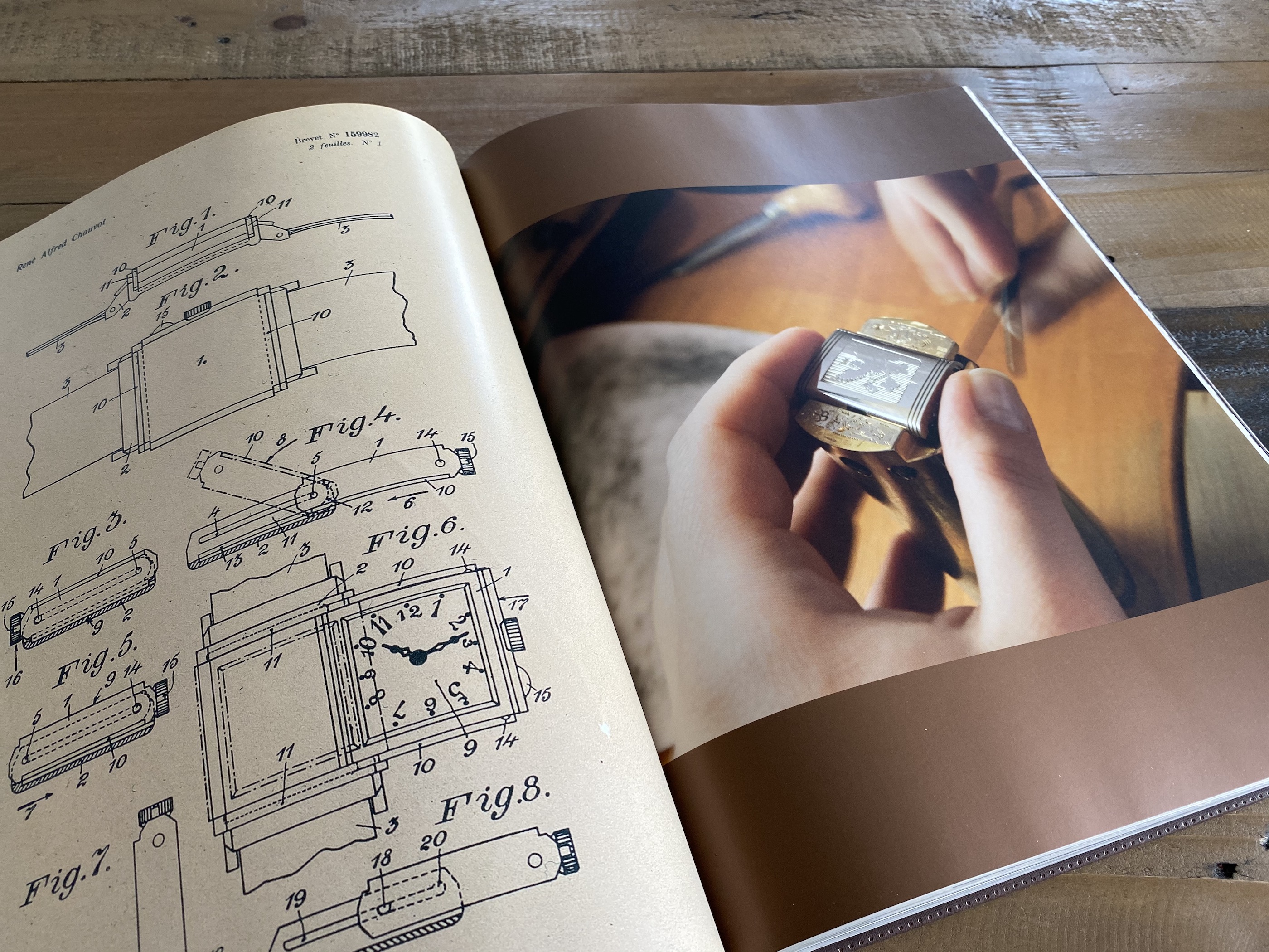
Paper weight and binding do work that design alone cannot. A heavier stock, a sewn or case-bound spine, and a matte or soft-touch finish communicate premium positioning before anyone reads the first page, the same instinct that makes a hardbound coffee-table book feel like an heirloom rather than a handout [4]. That tactile signal is often the difference between a cover that gets skimmed and recycled, and one that earns a permanent spot in a client’s home or boardroom.
Build a System for Consistent Covers Across Issues
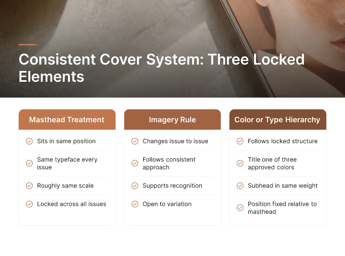
A consistent cover system locks three elements, masthead treatment, imagery rule, and color or type hierarchy, while leaving everything else open to change issue by issue.
Readers should recognize your magazine from across a room by issue twelve, not just issue one. That recognition comes from repetition, not sameness. The masthead sits in the same position, in the same typeface, at roughly the same scale, every time. The color palette or type hierarchy follows a locked structure, maybe the title is always one of three approved colors, or the subhead always sits in the same weight and position relative to the masthead. Everything else, the photograph, the headline, the mood, can shift with the story the issue is telling.
This is the difference between a magazine and a one-off brochure. A brochure gets redesigned from scratch each time someone new touches it. A magazine has a system.
Document that system in writing. A one-page style guide covering masthead placement, approved color combinations, type sizing rules, and photography tone gives any designer or agency a reference point years later. Without it, drift happens quietly, a new art director nudges the masthead down ten pixels, swaps the color for something “closer to the new logo,” and three issues later the family resemblance is gone. Brand magazine cover design holds up over a decade only when the rules are written down somewhere other than one designer’s memory.
Can you show examples of how brands have evolved their cover design while staying true to their identity?
The most durable approach is gradual evolution around fixed anchors, not periodic reinvention. A magazine might shift from illustration-led covers to photography over several years, or warm its palette as the brand matures, while the masthead position, logo lockup, and grid structure stay exactly where readers expect them. The visual style breathes; the skeleton doesn’t move. This mirrors how core brand elements like typography and color are meant to function across any touchpoint, as a recognizable system, not a fixed image [3].
Before briefing a new cover, pull the last six to eight issues and lay them side by side. This single step catches accidental drift before it compounds, a palette creeping warmer without intention, a masthead shrinking issue over issue. At Rethink Publishing, this review happens before every new cover brief, precisely so change stays a deliberate editorial decision rather than something that happened by accident between designers.
Common Mistakes to Avoid When Designing a Brand Magazine Cover
Most failed covers share one root cause: someone treated the cover as a final design task rather than the output of an editorial and positioning decision made weeks earlier.
Here are the five mistakes we see most often when a company approaches brand magazine cover design without a process behind it.
1. Designing the cover before the editorial spine is set
A cover is the last decision, not the first. If you brief a designer on colors and imagery before you’ve settled what the issue is actually about, its theme, its lead story, its point of view, you get a cover that looks good and says nothing. The design should express an editorial decision already made, not substitute for one that was skipped.
2. Chasing a visual trend instead of a timeless approach
A cover built around a trending typeface, filter, or layout style looks dated within a couple of years, and a brand magazine is meant to sit on a shelf or coffee table far longer than that. Trend-driven covers age the fastest precisely because they were built to look current rather than correct.
3. Letting every issue look like a different publication
Readers and clients build recognition through repetition, a consistent logo lockup, grid, and color logic across issues. Without that system, each issue reads like it has a different owner, which undercuts the sense of an established, credible publication rather than a one-off brochure.
4. Undercutting the design with cheap production
A well-designed cover printed on flimsy stock with a bargain finish feels disposable the moment someone holds it. Paper weight, coating, and binding are part of the design decision, not a line item to trim after the fact, they’re what signal the object is worth keeping rather than recycling.
5. Skipping stakeholder alignment before the brief
When the CEO, the CMO, and the brand lead haven’t agreed on what the publication stands for before a designer starts work, the result is a cover revised by committee, diluted, generic, and expensive to fix after the fact. Alignment on brand values belongs in the brief, not in round four of revisions.
These are the same failure points Rethink Publishing’s editorial-first process is built to avoid, strategy and positioning come before a single layout decision, which is why the studio defines the editorial spine before design work begins.
Frequently Asked Questions
Why is print magazine design a long-term brand investment, not a one-time project?
Because a magazine cover works for years on a coffee table, not for 48 hours in a feed, its return compounds the longer it stays in a client’s hands. A single issue gets picked up repeatedly, shown to visitors, and remembered in ways a social post never is. That staying power is why the cover deserves the same budget discipline as any other brand asset, not the leftover of a marketing line item.
How does a well-designed magazine cover function differently than digital brand touchpoints?
A magazine cover sits in a physical space your audience controls, while digital touchpoints compete for attention inside a feed you don’t control. There’s no scroll, no algorithm, no next post pushing it aside. That’s the structural difference: digital content is rented attention; a printed cover on a coffee table is owned real estate in someone’s home or office.
What’s the real difference between a magazine cover and a brand keepsake?
A cover becomes a keepsake when someone chooses to keep it after the business reason for reading it has passed. A brochure gets read once and discarded; a well-made cover gets displayed, shared with colleagues, or shelved for later. That decision happens in seconds, which is why the cover carries more weight than any single page inside.
How do you balance aesthetic beauty with functional brand messaging on a cover?
Beauty earns the pickup; messaging earns the keep, both have to work, but in sequence, not competing for the same square inch. A striking image or composition gets someone to open it. Clear positioning, through imagery and typography rather than taglines, makes sure they remember whose brand they’re holding.
What production and material choices signal premium quality to an audience?
Paper stock, binding, and print finish tell an audience more about brand quality than any headline on the cover. A heavier matte stock, a sewn binding, and color accuracy in reproduction all signal that the company invested in getting details right, the same signal clients look for in the business itself.
Conclusion
A magazine cover built as a brand asset works on three fronts at once: it earns the pickup through design, it carries your positioning without a sales pitch, and it survives long enough to become a keepsake rather than clutter. Get the paper stock, binding, and image direction right, and the cover does more brand work sitting on a coffee table than most campaigns do in a quarter. Before your next issue goes to print, pull three covers you admire from your own shelf and ask what made you keep them, that answer should shape your brief. For a second opinion on that brief, Rethink Publishing reviews concepts at www.rethink-publishing.com.
Sources & References
- How a brand magazine can be the missing link in your content marketing
- What Are Brand Assets? + Examples to improve Your Branding Strategy – MARMIND
- Elements Of Branding: The 10 Essentials For Visual Branding | VistaPrint US
- Positioning the Coffee Table Book for wedding magazine clients
- Magazine Layout and Design Tips | Cover Story Language Arts
Recommended Articles
Explore more from our content library: