
Understanding what is editorial design is essential. Editorial design is the strategic use of layout, typography, and visual hierarchy to tell a brand’s story through print, the way a magazine, not a brochure, organizes words and images so readers move through a narrative rather than scan a sales pitch. Standard graphic design solves single, isolated problems: a logo, a flyer, a web banner. Editorial design builds a system that holds together across 60, 100, or 150 pages, pairing an editorial spine with pacing, white space, and typographic rhythm so the publication reads like a story your audience chooses to keep.
What Is Editorial Design and How Does It Differ From Standard Graphic Design?
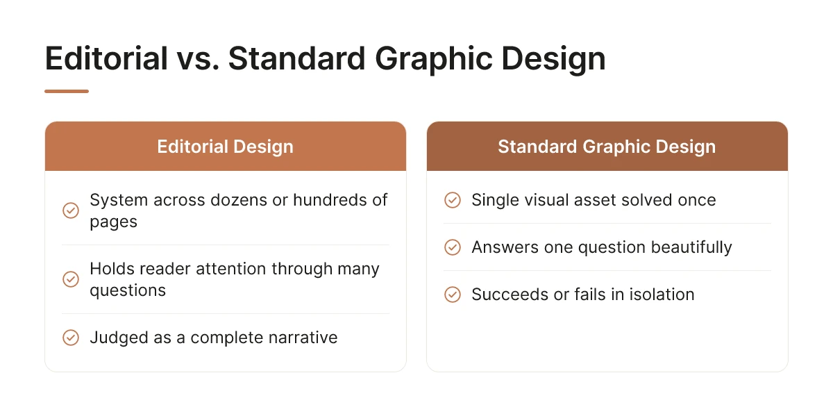
Editorial design is a system built across dozens or hundreds of pages, not a single visual solved once and shipped. It’s the difference between answering one question beautifully and holding a reader’s attention through a hundred pages of them.
Ask a graphic designer to solve a brief and you’ll typically get one asset tied to one message: a logo mark, an event flyer, a landing-page banner. The work succeeds or fails on its own terms, judged in isolation. Editorial design works differently because the brief is different. It has to carry a reader from an opening spread through a middle section that builds momentum, to a closing page that lands with intention. That’s a reading journey, not a single deliverable, and it’s why the people who ask what is editorial design are usually circling a bigger question: how do you make 120 pages feel like one coherent object instead of 120 separate decisions?
What Is the Difference Between Editorial Design and Publication Design?
Publication design is the technical umbrella, grids, layout mechanics, print specifications, the production machinery that makes a magazine physically exist [3]. Editorial design is the storytelling discipline that operates inside that umbrella. A publication designer sets the grid and the margins. An editorial designer decides where a story needs to breathe with a full-bleed image, where the pacing should slow for a long-form feature, and where a pull-quote should interrupt the rhythm to re-engage an attention that’s drifting. One builds the frame. The other decides what the frame is for.
Confusing the two terms is common, partly because publication design frameworks cover the mechanical ground, grids, hierarchy, legible type systems [2], without addressing the narrative decisions that make a reader keep turning pages. Standard graphic design, meanwhile, sits outside both: it’s built for single-use assets, not sequences [1].
What Defines Editorial Design in the Context of Custom Brand Magazines?
For a custom brand magazine, editorial design means the publication has to carry a company’s story across an entire issue, and ideally across years of issues, not just look sharp on the cover. That requires an editorial spine, a defined point of view that every feature, image, and layout choice supports, decided before any page gets designed.
The stakes of skipping this step are concrete. A brand that hires a graphic designer instead of an editorial team ends up with individual pages that each look polished, but a publication that doesn’t add up to anything a reader keeps. Rethink Publishing builds the editorial spine first, then pairs copy and imagery against it, precisely because that sequencing is what separates a magazine from a well-designed stack of pages.
How Do Layout, Typography, and Visual Hierarchy Tell a Brand Story Through Print?
Layout, type, and hierarchy work as one system: hierarchy decides what the reader sees first, layout paces how they move through the story, and typography carries the tone underneath every word. Separate them and you get a page that looks fine but says nothing. This is what is editorial design in practice, not decoration layered onto content, but the mechanics that turn a stack of pages into a story someone chooses to keep reading.
How Do Layout and Visual Hierarchy Guide a Reader Through Your Brand Narrative?
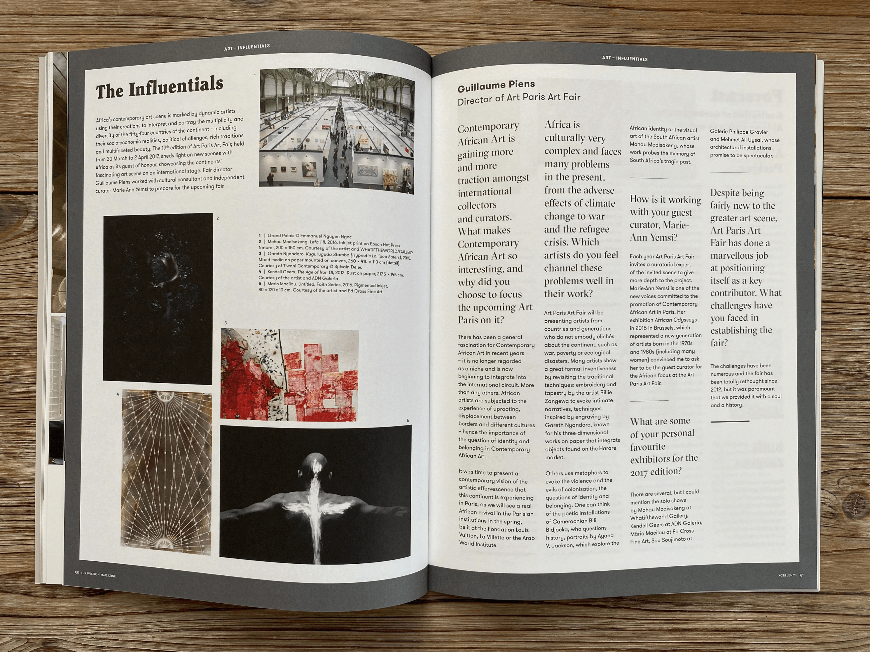
Visual hierarchy is a sequencing decision: what the eye lands on first, second, and third on a spread, engineered through scale, placement, and contrast rather than left to chance. A headline set at a dominant size pulls the eye first. A strong image or pull quote catches it second. Body copy, captions, and supporting detail come third, once the reader has already committed.
Grid and layout choices control pacing the way a director controls a scene. A dense spread, tight columns, small margins, multiple text blocks, slows the reader down and signals depth: this is the page where the real argument lives. An open spread with generous white space does the opposite. It tells the reader to pause, breathe, and look at the image rather than read. A 100-page magazine needs both rhythms, alternated deliberately, or every page starts to feel the same weight and nothing feels important.
Why Does Typography Choice Matter When Designing for Print Magazines?
A typeface is a tone of voice before a single word is read, which is why it can’t be chosen for looks alone. A serif with history-rich letterforms signals heritage and craft, the right choice for a 100-year-old law firm or a legacy hospitality brand. A geometric sans signals modern precision, closer to what a tech company or a design-forward real estate developer needs. That choice then has to hold steady across every section, feature, and caption in the issue, or the brand’s voice starts to contradict itself page to page.
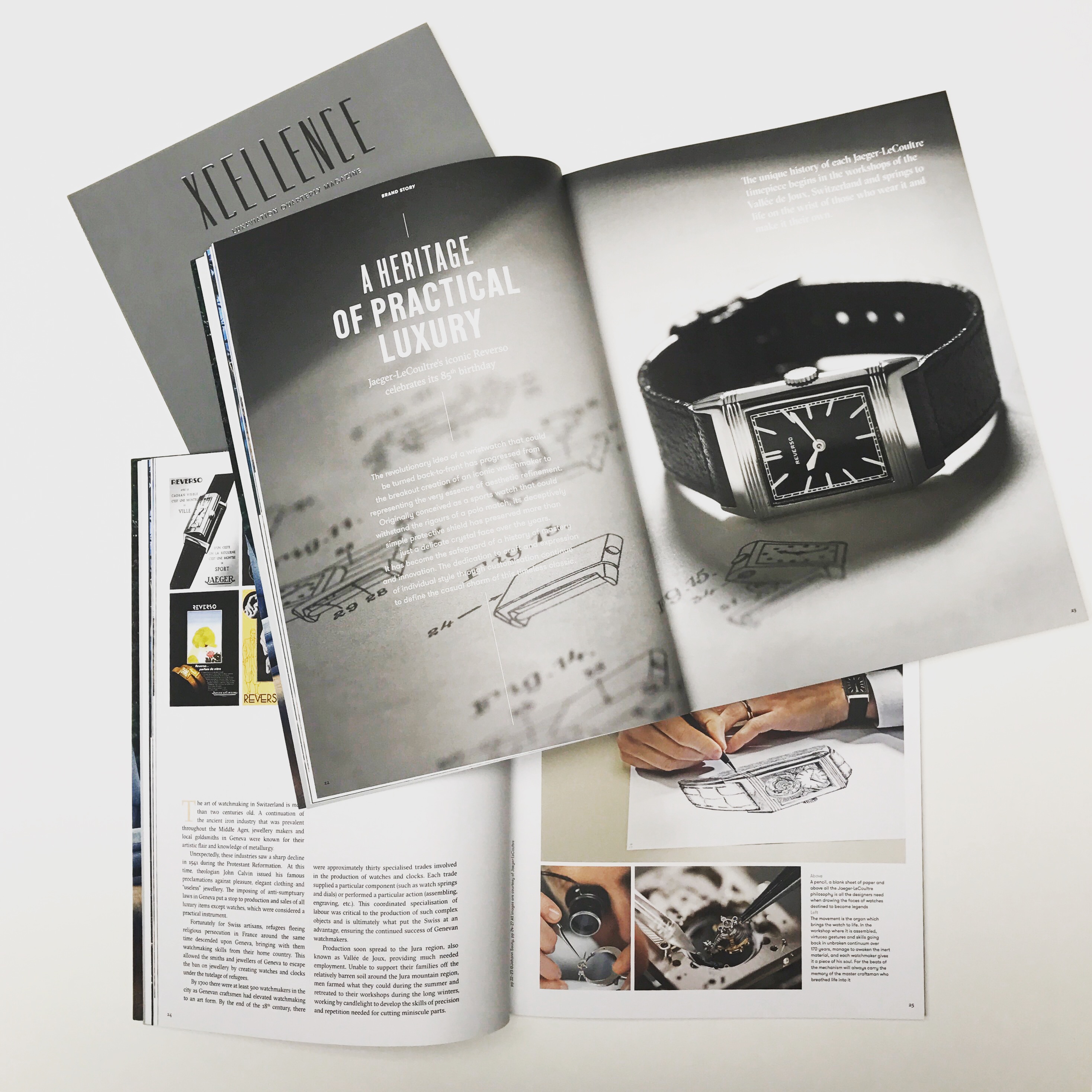
Consider one spread: a bold pull quote breaks up a dense column of text and gives a skimming reader a reason to slow down. An image bleeds to the edge of the page, pulling the eye without a border to stop it. A short caption underneath grounds the image in fact. None of those three elements does the work alone, together, they carry a reader from headline to final paragraph without the reader noticing the architecture underneath.
A single web banner needs one hierarchy decision, made once. A full magazine needs that same discipline held consistently across dozens of spreads while still feeling varied enough that no two pages feel repetitive, the harder craft, and the one most in-house teams underestimate.
What Makes Editorial Design a Strategic Marketing Asset for Your Brand?
Editorial design earns its keep by changing how long a brand stays in front of a client and how credible it looks while it’s there. That’s the return on what is editorial design when it’s done with intent rather than treated as a layout afterthought.
What Is Editorial Design For, as a Long-Term Brand Investment?
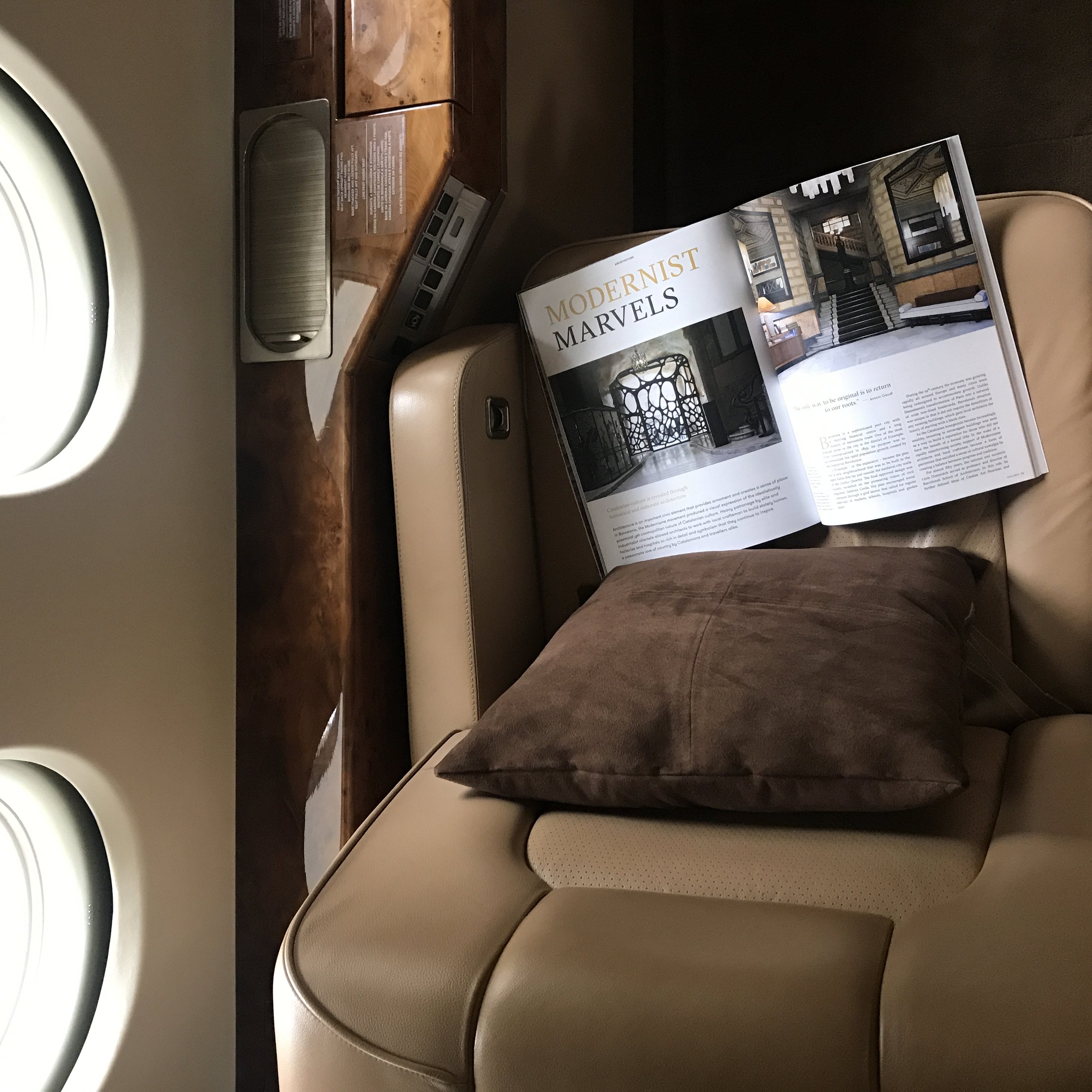
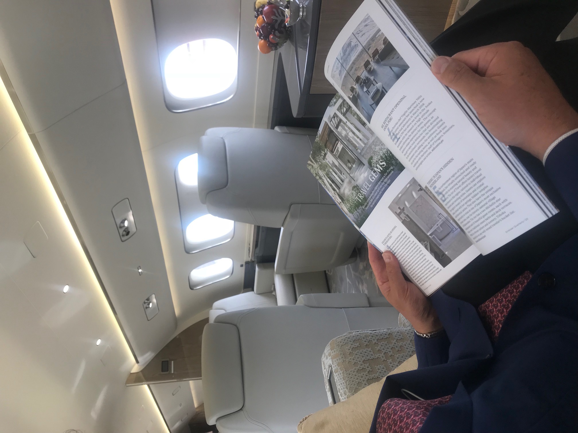
A brochure gets read once and filed away. A well-made magazine gets picked up again, on a Tuesday afternoon, during a slow week, by someone who wasn’t your target audience the first time around. That re-reading is the entire economic case for treating editorial design as an investment rather than a one-off expense.
Digital impressions are measured in seconds. A social post has a lifespan of about a day or two before it disappears into a feed. A magazine placed in a hospitality lobby, a law firm’s reception, or a real estate office’s waiting area keeps working for months, no media spend required to keep it visible, no algorithm deciding whether it gets shown. Every person who picks it up is an impression the brand didn’t have to buy twice.
How Does Pairing Words and Images Create a Keepsake That Stays in People’s Homes?
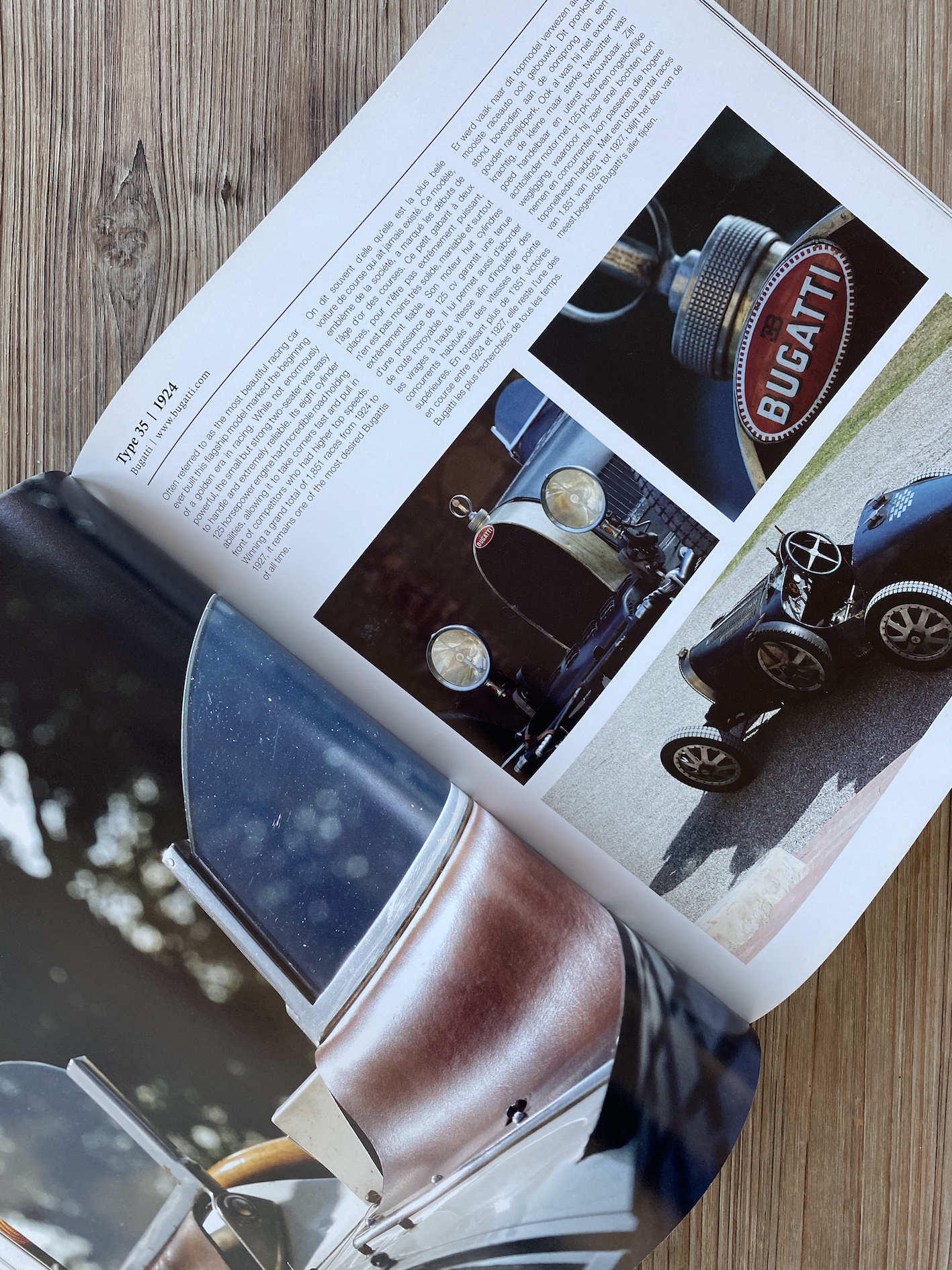
Objects that pair considered words with considered images get placed on coffee tables, not thrown in the recycling. The pairing matters more than either element alone, strong writing with careless layout reads like a report, and striking photography with thin copy reads like a lookbook. Neither gets kept.
What makes something worth keeping is the same thing that makes it worth re-reading: a layout that rewards a second look, pacing that lets a story breathe across spreads instead of cramming it into a single page. The paper stock, the white space, the type choices, these signal the quality of the company behind the publication before anyone reads a single word. That’s brand perception management happening at the level of touch and sight, before argument or copy ever enters the picture.
This is also where editorial design for brands diverges sharply from editorial design applied to an artist’s portfolio or a publisher’s own magazine content. The subject isn’t a designer’s aesthetic point of view or a newsroom’s editorial agenda, it’s a company’s story, positioned to build trust with a specific client base over years, not news cycles.
None of this means every company needs one. A business with a transactional, low-touch client relationship, a quick-turnaround retailer, a commodity service provider, will struggle to justify the production effort. Rethink Publishing turns away conversations like that regularly, because pretending a custom magazine suits everyone undermines the case for the brands it’s actually built for: the ones whose relationships are long, whose trust is earned slowly, and whose clients have a coffee table worth being on.
How Do You Approach Editorial Design From Concept to Finished Magazine?
What is editorial design in practice is a six-stage process, strategy, content gathering, layout, proofing, print, and delivery, run as one continuous discipline rather than a series of handoffs.
What Does an End-to-End Editorial Design Process Look Like, From Spine to Print Delivery?
Every magazine starts before a single page is laid out. The first stage is defining the editorial spine, the throughline of themes and sections that will hold a 100-page publication together. Without it, a magazine becomes a pile of unrelated articles stapled to a cover. With it, a reader moves from a founder profile to a product feature to a client story and feels like they’re reading one coherent narrative, not three disconnected assignments.
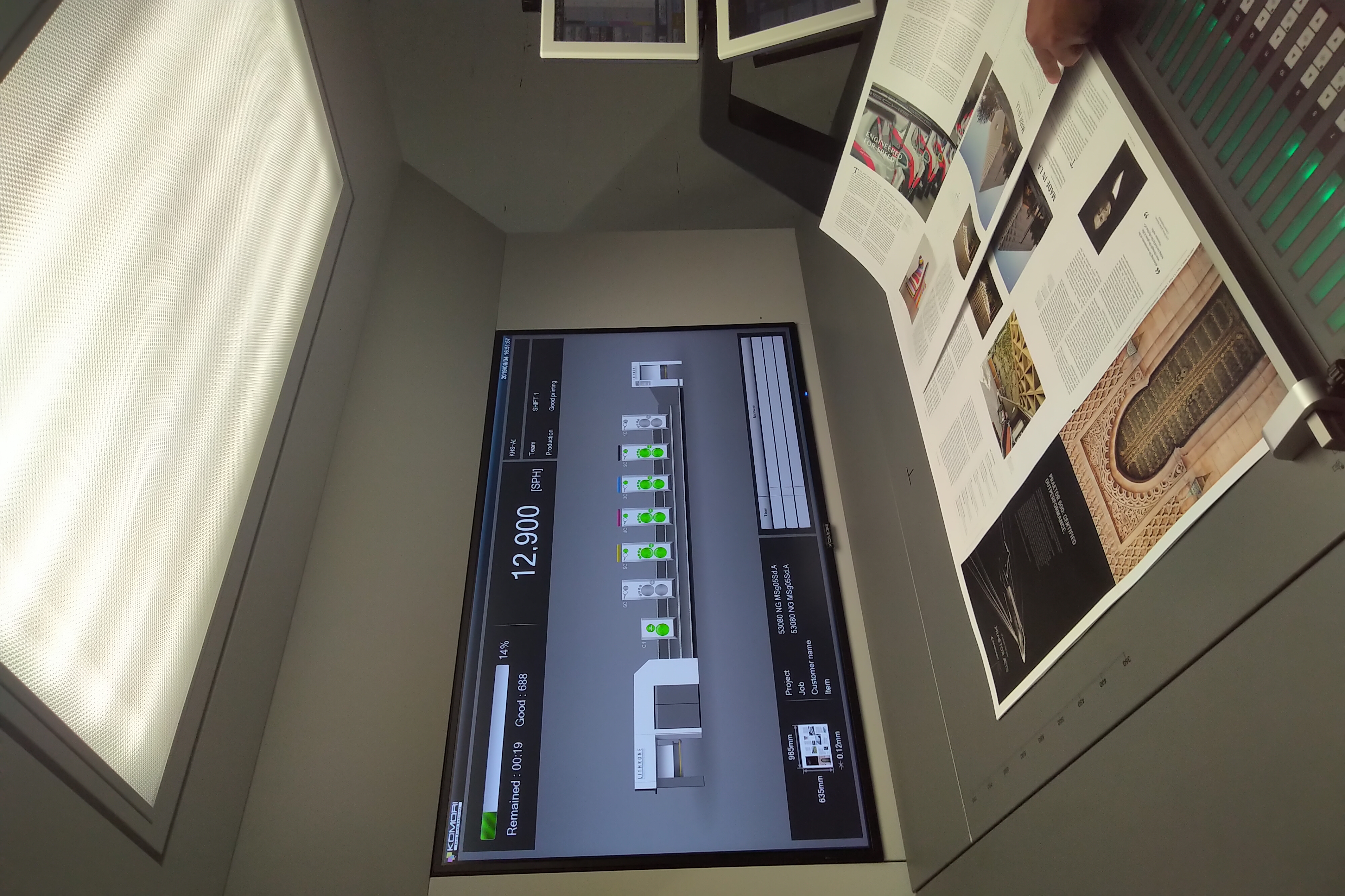
Once the spine is set, content and image gathering follow, writing, interviews, and sourcing photography that matches the tone the spine demands. Only then does layout begin: building the typographic system, grid, and pacing that will carry that content across every spread. Proofing comes next, checking not just spelling but whether the visual rhythm still holds at page 40 the way it did at page 4. Print production and delivery close the process, paper selection, color calibration, binding, and getting finished copies into hands.
At Rethink Publishing, this entire sequence runs as one managed process, not a relay between a strategy consultant, a freelance writer, a design agency, and a separate printer. Strategy, editorial, design, print, and delivery stay in the same hands from first conversation to final delivery, a structure built over 20+ years and reflected in 80+ magazines produced this way.
What Do Real-World Examples of Editorial Design Transforming a Brand’s Story Look Like?
Picture a hospitality group with three decades of history, a founder with a distinct point of view, and a handful of flagship properties. Treated as raw material, that’s a lot of disconnected facts. Treated through an editorial spine, it becomes three deliberate chapters: an opening section on origin and philosophy, a middle section profiling the people who run the properties day to day, and a closing section on where the brand is headed next. Pacing matters as much as content, a dense history section needs a visual breather before the next chapter, which is why layout and typography decisions are made in service of the narrative, not as decoration applied afterward.
Design software, grid systems, type libraries, color tools, is the instrument here, not the discipline itself. The judgment about which story leads, which image earns a full spread, and where a reader needs to pause is what separates editorial design for brands from a well-formatted document. That judgment is built from repetition across hundreds of projects, not from a template.
What Role Does Editorial Design Play in Creating Publications That Last?
Editorial design matters most where trust is the product being sold, it turns a brand’s credibility into something a reader can hold, reread, and keep on a shelf for years.
Why Does Editorial Design Matter for Hospitality, Architecture, and Luxury Real Estate?
These industries sell decisions that take months to make and carry real financial weight, a hotel stay, a building commission, a property purchase. A digital ad can’t carry that weight. A magazine that sits in a lobby, a sales office, or a client’s home signals the business plans to be around for a while, and that perceived permanence is part of what convinces someone to sign.
This is the practical answer to what is editorial design in a commercial context: not decoration applied after the fact, but the structuring of story, pacing, and image so a brand’s permanence is felt on the page before a client ever asks a question. A firm pitching a ten-year real estate development or a hospitality group opening a third property needs the same confidence embedded in its printed materials. That is a different brief than a product brochure, and it calls for a different kind of design thinking from the start.
How Does a Calm, Precise Process Translate Into Magazines That Feel Like Keepsakes?
A rushed production schedule shows up on the page, mismatched pacing, cover stock that feels thin, a spine that cracks after one read. A disciplined process, with editorial direction locked before layout begins, writing and image sourcing proceeding in sequence rather than in parallel panic, is what prevents that. Rethink Publishing builds each issue this way: strategy and editorial spine first, then design, then production, with no stage skipped to hit a deadline.
Paper stock and binding are durability decisions, not aesthetic ones, a heavier stock and a sewn or case-bound spine survive repeated handling in a way saddle-stitched brochures don’t. Pacing matters just as much: a magazine built with deliberate rhythm, room to breathe between dense spreads, gives a reader a reason to pick it back up a year later instead of recycling it after one sitting.
That is the commercial payoff. A magazine on a coffee table or in a waiting room keeps representing the brand long after a paid campaign has stopped running, no renewal, no media spend, just the object doing its job quietly.
Frequently Asked Questions
Is editorial design the same as graphic design?
No, editorial design is a specialized branch of graphic design focused on sequencing content across pages rather than single standalone visuals [1]. A poster or logo lives in one moment; editorial design has to build rhythm, pacing, and a narrative arc across dozens of spreads, which calls for a different set of decisions entirely.
Does a company need design experience in-house to commission a custom magazine?
No, and most companies in this position don’t have it, that’s the point of working with a studio that handles it end-to-end. Rethink Publishing manages strategy, writing, layout, image sourcing, and print production, so you give direction and feedback without hiring a single writer or art director.
How is editorial design different from branding or logo design?
Branding establishes fixed identity marks like logos and color palettes; editorial design applies that identity across changing content, page after page. A brand guide tells you what your blue looks like, editorial design decides how that blue behaves across a 96-page story arc, where it leads the eye, and when it recedes so the photography or copy can carry the moment.
Can editorial design work for digital formats as well as print?
Yes, the same hierarchy and pacing principles apply to digital publications, though the physical object changes the calculation [3]. A printed magazine asks for a different kind of attention than a scrollable report: paper weight, binding, and page turns create pauses a screen can’t replicate. Rethink Publishing works primarily in print because that physical permanence is what makes a brand publication worth keeping rather than closing a tab on.
What makes a magazine different from a branded brochure?
A magazine has an editorial spine, a content strategy and narrative point of view, while a brochure is built to sell a product or service directly. Brochures get skimmed once and filed away; a well-made magazine gets kept on a coffee table and picked up again. That distinction is structural, not cosmetic, and it changes every decision from the writing to the layout.
Conclusion
Editorial design earns its name because it does something graphic design alone doesn’t: it builds a sequence, a pace, and a point of view across an entire publication. For brand leaders, that means the difference between a piece people glance at and one they keep. The companies getting this right treat their magazine as an editorial product with a spine, not a brochure with better photography, and they hire specialists who’ve done it repeatedly, not generalists learning on the job.
If you’re weighing whether your brand has a story worth this kind of treatment, start by auditing what physical brand touchpoints your best clients currently have on their coffee tables. If the answer is none, that’s your next step.
Sources & References
- What Is Graphic Design? | Figma
- Designing Visual Hierarchies: Guiding the Viewer’s Eye Through Composition – RMCAD
- Publication design that works for your brand and audience – TGDH
Recommended Articles
Explore more from our content library: