
Understanding visual hierarchy magazine design is essential. Visual hierarchy in magazine design is the deliberate arrangement of elements, type, images, white space, and color, so a reader’s eye moves through the page in the order the designer intends. It determines what gets read first, what gets skimmed, and what gets ignored. Done well, it makes a complex spread feel effortless to navigate. Done poorly, even strong editorial content gets abandoned before the second paragraph. According to the Interaction Design Foundation’s overview of visual hierarchy, structured visual organization can increase content comprehension by up to 89% compared to unstructured layouts.
What Visual Hierarchy in Magazine Design Actually Means
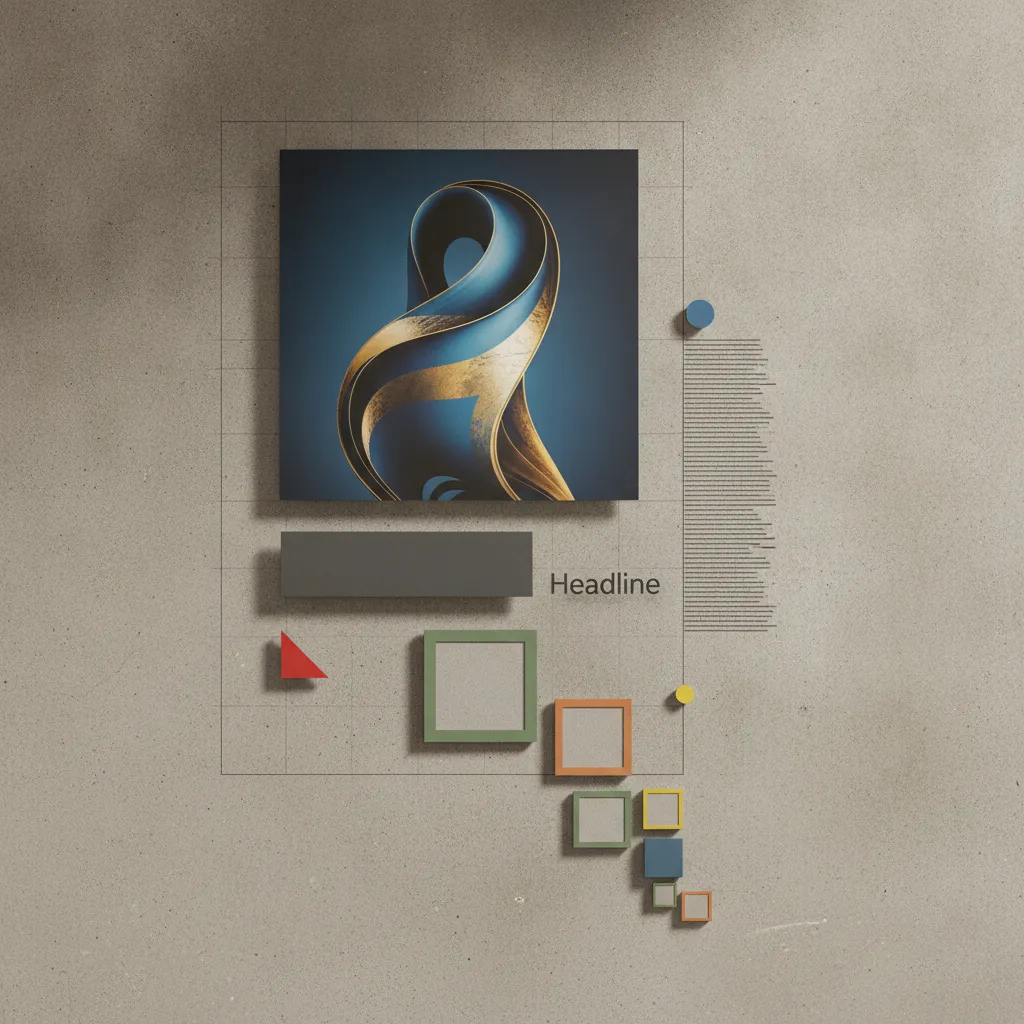
Visual hierarchy in magazine design is a system of visual weight that tells a reader where to look first, second, and third, operating at the spread and page level at once.
That dual-level demand separates magazines from nearly every other print format. A brochure carries one message and pushes the reader toward one action. A magazine must guide a reader through multiple stories at different depths of interest, a cover feature, a short sidebar, a pull quote worth sharing, all on the same spread, without any single element cannibalizing the others.
How visual hierarchy guides a reader’s eye through a magazine page
Readers scan before they commit. Research from the Nielsen Norman Group on F-pattern and Z-pattern eye movement confirms that people sweep a page in predictable paths, settling on anchor points, a dominant image, a bold headline, a pull quote, before deciding whether the content earns their full attention. Studies show that readers form a first impression of a page layout in as little as 50 milliseconds, meaning visual hierarchy signals must communicate priority before a single word is consciously processed.
Magazines carry more competing elements per page than almost any other print format: headlines, subheads, body copy, captions, pull quotes, folios, and often advertising. Hierarchy is what prevents that density from collapsing into visual noise. Without it, a reader’s eye has no entry point and no path forward.
Weak hierarchy is the single most common reason readers abandon a feature article before finishing it, not the writing quality. When nothing signals “start here,” most readers simply don’t.
“Visual hierarchy is not decoration — it is the grammar of visual communication. Without it, even the most beautiful layout is unreadable.” — Steven Heller, Art Director and Co-Chair, MFA Design at the School of Visual Arts
The key principles of visual hierarchy that apply specifically to magazine layouts
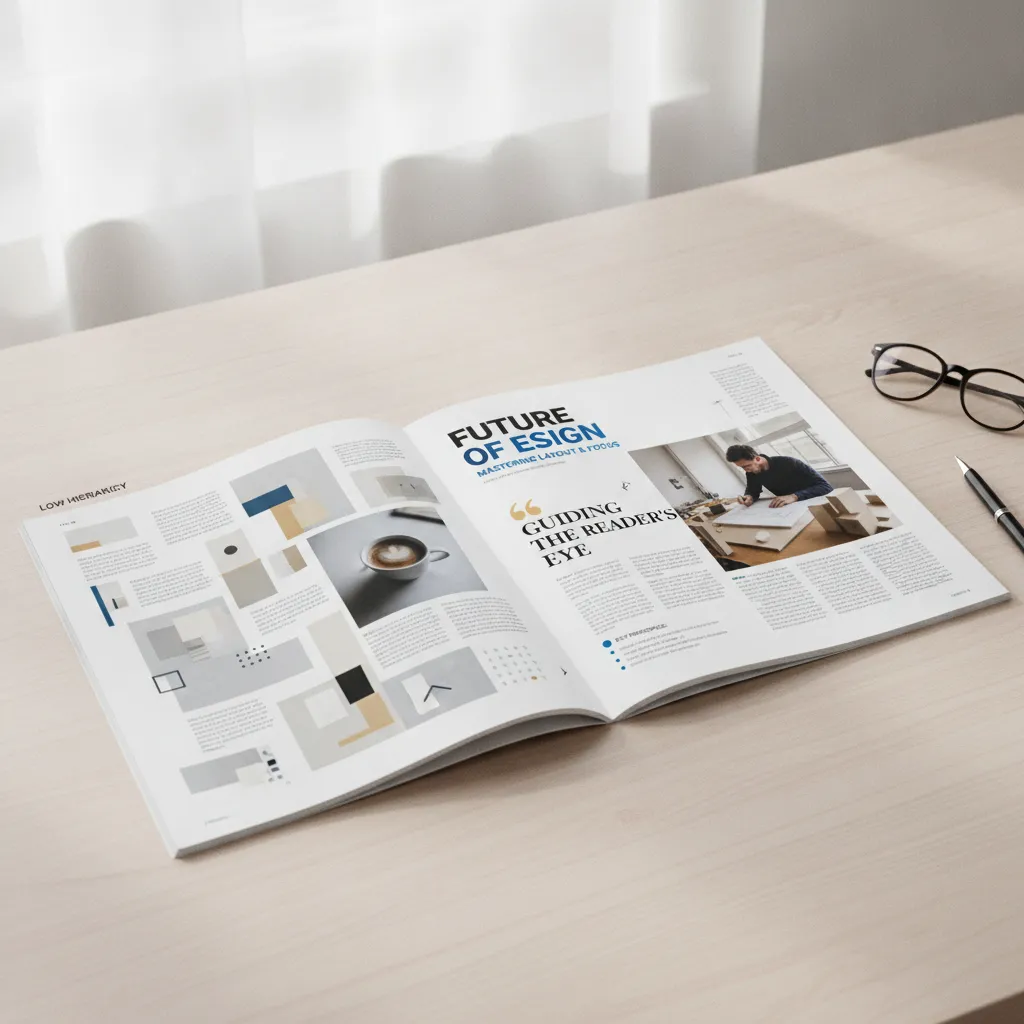
Size, contrast, and placement are the three primary signals [2]. A dominant image establishes the visual anchor; a headline scaled to contrast with body copy creates a clear entry point; white space groups related elements and separates distinct ones.
What makes visual hierarchy magazine design distinct is that these principles must work simultaneously across two pages, not one. A spread is the unit of design, and the hierarchy must hold whether a reader opens the magazine at page 12 or page 48.
The core principles that define effective visual hierarchy magazine design can be summarized as follows:
- Size contrast: Headlines set at 5–7x the body copy size create an immediate, scannable entry point.
- White space: Generous margins isolate dominant elements and force the eye toward focal points.
- Color and saturation: A single accent color on subheads guides skimmers without disrupting linear readers.
- Placement: Elements positioned in the upper-left quadrant of a spread are processed first in left-to-right reading cultures.
- Font weight contrast: Pairing a Black headline weight with a Light body weight signals importance before scale is even registered.
How to Create Visual Hierarchy in Magazine Layouts
Visual hierarchy in magazine design is built through four mechanics: size contrast, white space, color, and content sequencing, applied in deliberate combination.
Size, Space, and Color: The Three Fastest Hierarchy Signals
Size contrast is the single quickest hierarchy cue a layout can deliver. A headline set at 60pt against 10pt body copy creates an immediate entry point, the ratio between the two sizes matters more than either number in isolation. Readers register the difference before they read a single word.
White space works the same way, though designers often treat it as leftover room rather than an active tool. Both Vogue and The Economist use generous margins to isolate dominant elements, the surrounding emptiness forces the eye toward whatever sits inside it. Crowding a page doesn’t add information; it removes hierarchy.
Color contrast and saturation direct attention before type does. A single full-bleed image across a spread captures the eye before any headline is processed. Saturation pulls first; typography follows. This is why image selection in magazine layout isn’t an aesthetic decision alone, it’s a structural one.
Real-World Examples of Visual Hierarchy in Successful Magazine Designs
National Geographic is the clearest case study in consistent visual hierarchy magazine design. Its signature yellow border and large-format photography create a predictable reading pattern that readers have internalized across decades of issues. That consistency is itself a hierarchy tool, when readers already know where to look, the layout reinforces rather than teaches.
The yellow border signals “entry point.” The photography commands the spread. The headline sits subordinate to the image but dominant over the body text. Deviation from that pattern would feel wrong, which is precisely the point.
“The best magazine layouts don’t just look good — they create an invisible path that readers follow without realizing they’re being guided.” — Roger Black, Magazine Designer and Co-Founder, Font Bureau
How to Organize Content to Follow Natural Eye Movement Patterns in Magazines
Readers don’t scan a page randomly. Research into eye movement patterns [2] shows a consistent sequence: dominant image first, then headline, then the deck or standfirst, then body copy, then pull quote, then caption. A well-structured magazine spread follows that order deliberately.
Deviating from this sequence is a valid design choice, but it requires a reason. Placing a pull quote before the body copy, for instance, can work as a hook on a long-form feature. Doing it without intent just creates confusion. The sequence exists because it mirrors how attention naturally moves, not because it’s a convention worth preserving for its own sake.
For a practical visual walkthrough of how these eye movement principles apply to real layouts, the video guide to visual hierarchy in design on YouTube offers useful annotated examples.
How Visual Hierarchy Works Differently in Print Versus Digital Magazines
Print hierarchy is fixed and fully controlled by the designer; digital hierarchy is probabilistic because scroll position, device, and user behavior all vary.
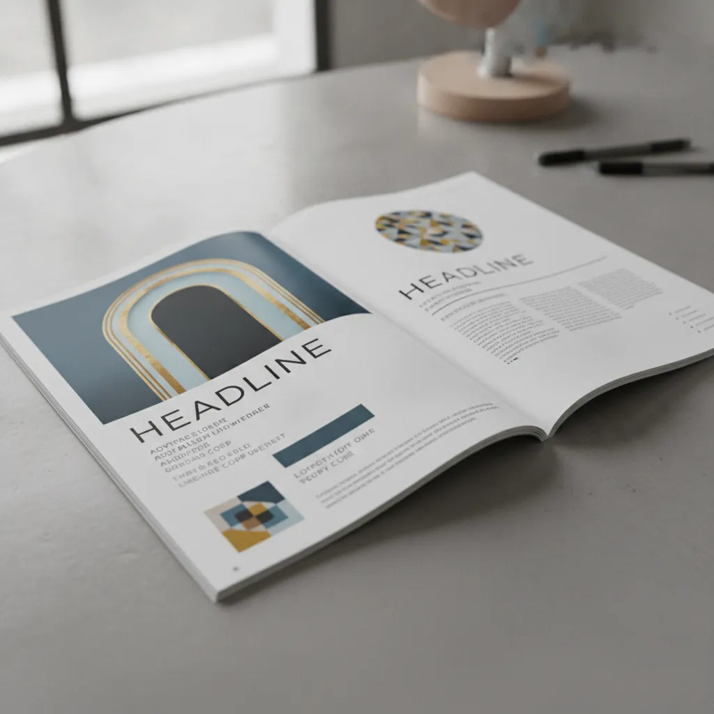
In a print magazine, the designer determines the exact reading sequence. A reader opens a spread and perceives both pages as a single visual unit, the dominant image, headline, and body text form one composed hierarchy. That control disappears on screen. A digital reader may arrive mid-article, resize their browser, or switch from desktop to mobile, and the hierarchy must still hold.
How Screen Size and Scrolling Affect Visual Hierarchy Decisions in Digital Magazines
The fold is the first problem. Where a double-page spread works as one visual statement in print, a screen breaks that unit, the hierarchy must function within a single viewport before the reader scrolls. Anything below the fold is, statistically, seen by fewer eyes.
Font sizing ratios compound this. A 6:1 headline-to-body ratio that reads clearly on a printed page often needs recalibrating for mobile, where compressed viewports flatten perceived contrast and a large headline can crowd out everything else. The visual hierarchy magazine design logic remains the same; the numbers change.
Digital formats also introduce motion as a hierarchy signal. A scroll-triggered animation draws attention the way a dominant full-bleed photograph does in print, directing the eye without adding text.
What Design Choices Change When Adapting Visual Hierarchy from Print to Web Magazine Formats
The translation from print to digital follows a consistent pattern. Bleed photography becomes hero banners. Pull quotes become styled blockquotes. Folios, those small page-number and section-label lines at the foot of a print page, become sticky navigation bars. The hierarchy logic is identical; only the execution shifts to match the medium.
According to ZevenDesign’s graphic designer’s guide to visual hierarchy, the most effective digital magazine layouts maintain a strict three-level hierarchy system regardless of breakpoint, ensuring that hierarchy signals survive the transition from a 27-inch desktop monitor to a 5-inch mobile screen without manual redesign.
Typography and Design Techniques That Build the Strongest Magazine Hierarchy
Font weight contrast, precise sizing ratios, and deliberate spacing are the three tools professional designers rely on most to build visual hierarchy in magazine design.
How to Pair Fonts and Use Font Weight to Create Visual Hierarchy in Magazines
Font weight contrast is more reliable than size alone. Pairing a Black or Heavy headline weight with a Light or Regular body weight creates a clear hierarchy signal even when the size gap between them is modest, the eye reads weight as importance before it measures scale.
Serif and sans-serif pairing is a classic magazine technique for a practical reason: it signals a shift in reading mode. A condensed sans-serif headline tells the reader to scan; a serif body tells them to slow down and read [2]. The contrast in letterform structure does the cognitive work before a single word is processed.
Color applied typographically adds a secondary hierarchy layer. A single accent color on subheads or pull quotes guides skimmers through the page without interrupting linear readers who move straight through the body copy. One color, used consistently, is enough.
Sizing Ratios and Spacing Techniques That Establish Clear Typographic Hierarchy
A practical sizing ratio holds across broadsheet, digest, and square formats: headline at 5–7x the body copy size, standfirst at 1.5–2x, and captions at 0.8x. These ratios create a legible scale of importance that readers recognize instinctively, even without reading a word.
Leading and tracking carry equal weight. Tight leading on headlines increases visual mass, making them feel authoritative. Generous leading on body copy signals that this is where sustained reading happens. At Rethink Publishing, these spacing decisions are set during the editorial design phase, before a single page goes to layout, because correcting them in production costs time and disrupts the entire typographic system.
Tools and Software Professional Designers Use for Magazine Visual Hierarchy
Adobe InDesign is the industry standard for print magazine visual hierarchy design; Figma leads for digital adaptation and screen-first workflows.
How to Use InDesign and Figma to Build Visual Hierarchy in Magazine Workflows
InDesign’s paragraph styles, master pages, and baseline grid are built specifically for multi-page hierarchy systems. A single style change to a headline definition cascades across every page in the document, a level of control no general design tool matches for print production at scale.
The baseline grid is the most underused hierarchy tool in InDesign. Aligning every text element, body copy, captions, pull quotes, to a shared grid creates implicit visual order before a single size or weight contrast is applied [2]. Designers who skip this step typically compensate with heavier typographic contrast, which creates noise rather than clarity.
Figma has become the dominant tool for digital magazine design and print-to-digital adaptation. Its auto-layout and component systems maintain hierarchy consistency across breakpoints, so a heading scale defined once holds across mobile, tablet, and desktop without manual adjustment per frame.
For hierarchy testing before print, InDesign’s overprint preview and soft-proofing catch color and contrast issues early. Pair those with a squint test, literally squinting at the layout, and you can immediately see which element dominates the page. If the wrong element pulls focus, the hierarchy is broken regardless of how polished the individual components look.
How Design Trends in Different Magazine Genres Affect Visual Hierarchy Choices
Genre shapes both the tool workflow and the hierarchy logic. Fashion magazines run image-led layouts where InDesign’s image threading and text wrap tools do the structural heavy lifting, type often plays a secondary role, positioned around dominant visuals rather than anchoring the page.
B2B trade magazines work in the opposite direction. Dense information loads require structured paragraph styles and table tools to keep data readable and scannable [2]. Here, hierarchy is built from the text up, with imagery used to break tension rather than lead attention. Studios like Rethink Publishing, which has produced 80+ high-end magazines across hospitality, real estate, and design sectors, treat genre conventions as a starting constraint, then push against them where the editorial spine calls for it.
Applying consistent visual hierarchy magazine design principles across genre variations is what separates publications that feel authoritative from those that feel assembled rather than designed.
Frequently Asked Questions
What is the most common visual hierarchy mistake in magazine design?
The most common mistake is treating every element as equally important, giving headlines, body text, captions, and pull quotes the same visual weight. When nothing dominates, readers have no entry point and the page feels cluttered. A well-structured page should have one clear focal element that draws the eye first [2]. From there, size, contrast, and spacing guide the reader through secondary and tertiary content in a deliberate sequence, not a visual free-for-all.
How many levels of visual hierarchy should a magazine page have?
Most magazine pages work best with three distinct hierarchy levels: a primary element (headline or dominant image), a secondary layer (subheadings, pull quotes, captions), and a tertiary layer (body text, footnotes) [2]. More than four levels creates confusion; fewer than three flattens the layout and removes the reader’s sense of direction. The goal is a clear, scannable sequence, not a rigid formula, so each level should be visually distinct enough that readers can identify it instantly.
Can visual hierarchy principles apply to a company magazine or custom publication?
Yes, visual hierarchy is just as critical in a branded company magazine as in a consumer title, and arguably more so because the stakes for brand perception are higher. A custom publication that buries its key messages in undifferentiated text fails both editorially and as a marketing asset. Studios like Rethink Publishing build editorial hierarchy into every spread from the strategy stage, ensuring that the most important brand story on a page is always the first thing a reader’s eye lands on.
How does column count affect visual hierarchy in magazine layouts?
Column count directly controls how readers parse information across a page, more columns create finer visual divisions that allow designers to vary text width and create contrast between dense and open areas. A single full-width column offers little hierarchy; a three- or four-column grid lets designers place a dominant headline across multiple columns while body text occupies one, instantly signaling importance through scale [2]. The column structure is the underlying skeleton on which all other hierarchy decisions rest.
How does visual hierarchy in magazine design differ between luxury and mass-market publications?
Luxury magazine design typically employs a more restrained hierarchy with fewer elements per spread, larger white space margins, and a dominant single image that commands the full page. Mass-market titles use denser layouts with more hierarchy levels to accommodate higher content volume. In luxury visual hierarchy magazine design, the hierarchy signals status through what is absent as much as what is present — generous space around a headline communicates exclusivity in a way that a crowded layout never can.


Conclusion
Visual hierarchy in magazine design is not a stylistic preference, it is the structural logic that determines whether a reader stays on the page or moves on. Three things matter most: establish one dominant element per spread that earns the eye first, use no more than three or four hierarchy levels so readers always know where they are, and let white space do the separating rather than adding more elements.
If you are commissioning a custom publication, start by mapping your editorial hierarchy before a single layout is built. Define which story on each page is primary, which is supporting, and which is contextual detail. That sequence, set in advance, is what separates a magazine that commands attention from one that simply fills pages. To see how that process works in practice, review the portfolio at rethink-publishing.com.
Sources & References
- What is Visual Hierarchy? — Interaction Design Foundation (IxDF)
- A Graphic Designer’s Guide to Visual Hierarchy – ZevenDesign
- Visual Hierarchy in Design — YouTube
Recommended Articles
Explore more from our content library: