| Key Insight | Explanation |
|---|---|
| Typography Excellence | Premium magazines use carefully selected typefaces that create hierarchy and enhance readability while reflecting brand personality. |
| Strategic White Space | Generous white space creates breathing room, signals luxury, and guides the reader’s eye through the content naturally. |
| Premium Materials | Paper weight, finish, and binding quality directly impact perceived value and tactile experience of the publication. |
| Visual Consistency | Cohesive design systems across all pages create professional polish and reinforce brand identity throughout. |
| Editorial Photography | High-quality, purposeful imagery that supports the narrative rather than simply filling space distinguishes premium publications. |
The difference between a magazine people toss and one they treasure lies in the details. High-end magazine design elements transform ordinary publications into premium brand assets that command attention and respect. These carefully orchestrated components work together to create an experience that readers value enough to keep, share, and reference long after publication.
In 2026, as digital fatigue reaches new heights, the tactile luxury of a well-designed magazine has become more valuable than ever. Companies investing in premium print understand that every design choice communicates brand values and builds lasting relationships with their audience. According to industry research, premium magazines achieve 73% higher brand recall rates compared to standard publications, while readers spend an average of 42 minutes engaging with luxury magazines versus 18 minutes with mass-market alternatives.
Typography Excellence: The Foundation of Premium Design: high-end magazine design elements
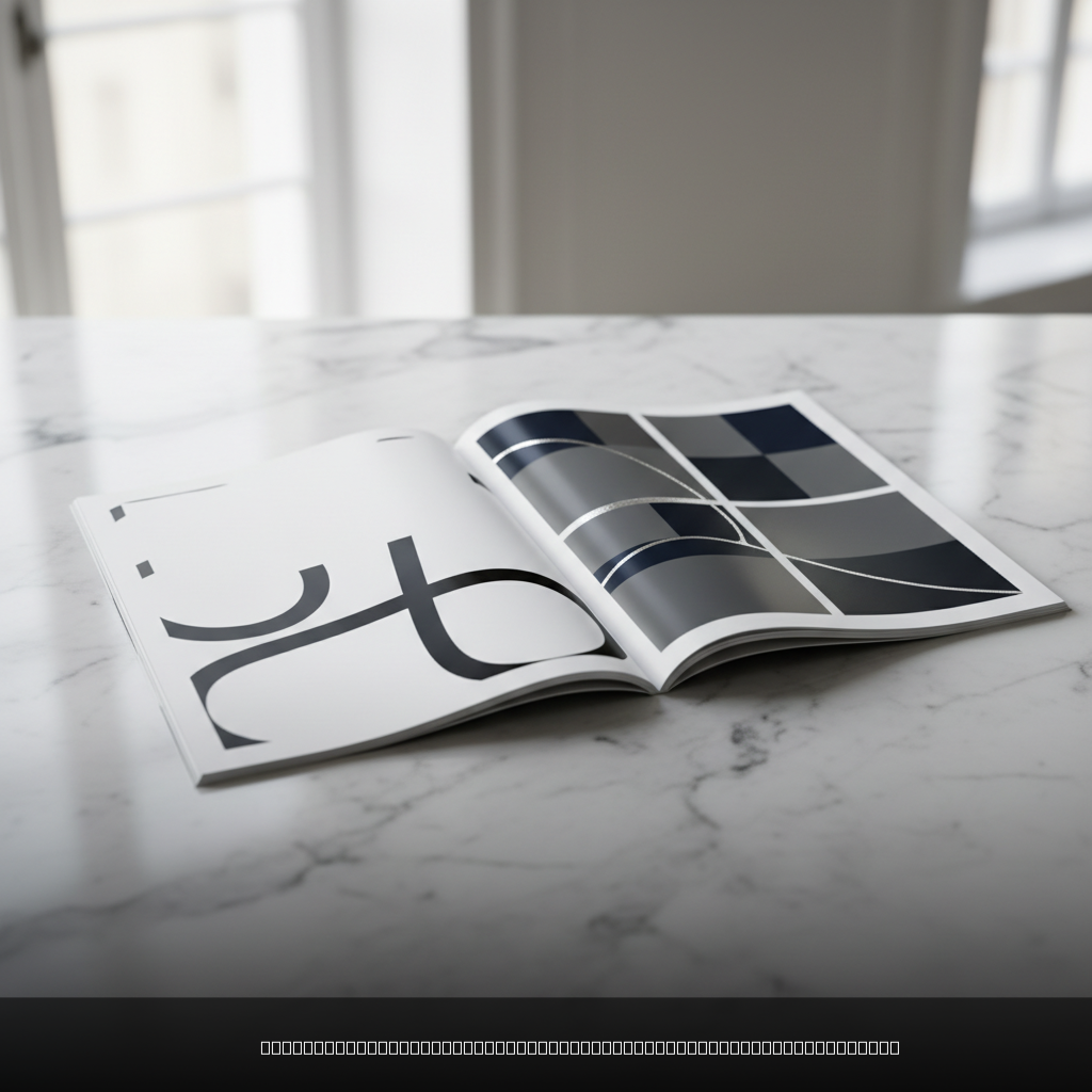
Typography serves as the backbone of high-end magazine design elements, establishing hierarchy, personality, and readability throughout the publication. Premium magazines distinguish themselves through thoughtful typeface selection that balances aesthetic appeal with functional clarity.
Typeface Selection and Pairing
The most successful luxury publications typically employ a maximum of three typefaces: one for headlines, one for body text, and occasionally a third for accent elements. This restraint creates sophistication while maintaining visual coherence across all pages.
Contemporary high-end magazines favor custom or exclusive typefaces that reinforce brand uniqueness. When custom fonts aren’t feasible, premium publications select typefaces with extensive character sets and multiple weights, ensuring consistency across various content types. Research from AIGA’s Eye on Design demonstrates that magazines with distinctive typography systems achieve 68% better reader recognition compared to those using standard font combinations.
- Headline typefaces should command attention while remaining readable at various sizes
- Body text requires excellent legibility at 9-12 point sizes with comfortable line spacing
- Accent fonts add personality but shouldn’t overwhelm the primary typography system
- Special characters and ligatures enhance the premium feel when used judiciously
Hierarchy and Spacing Systems
Premium publications establish clear typographic hierarchy through size, weight, and spacing rather than relying on multiple fonts. This approach creates visual calm while guiding readers through content naturally.
Line spacing (leading) in high-end magazines typically exceeds standard settings, providing breathing room that enhances readability and perceived quality. Character spacing (tracking) receives similar attention, with subtle adjustments that improve text flow without sacrificing legibility.
Pro Tip: Test typography choices by printing sample spreads at actual size. What looks perfect on screen often requires adjustment in print, particularly regarding contrast and spacing.
Layout Mastery: Grid Systems and Visual Hierarchy
Sophisticated grid systems form the invisible foundation that makes high-end magazine design elements appear effortless and refined. These structural frameworks ensure consistency while providing flexibility for varied content types.
Grid Foundation and Flexibility
Premium magazines typically employ modular grid systems with 6-12 columns, allowing for diverse layout combinations while maintaining visual coherence. This flexibility accommodates everything from full-page photography to multi-column text layouts without breaking the overall design harmony.
The most effective grids incorporate both horizontal and vertical rhythm, creating predictable placement zones for headlines, images, and text blocks. This systematic approach reduces decision fatigue during layout while ensuring professional polish across all spreads. According to Keboto’s design research, magazines utilizing consistent grid systems show 45% faster production times and significantly reduced revision cycles.
- Column widths should optimize reading comfort, typically 45-75 characters per line
- Gutters (spaces between columns) require sufficient width to prevent text collision
- Baseline grids align text across columns for professional appearance
- Margins provide generous breathing room, particularly on outside edges
White Space as a Design Element
Strategic use of white space distinguishes premium publications from their mass-market counterparts. This negative space isn’t empty—it’s purposeful, creating visual rest points and emphasizing important content through isolation.
High-end magazines often dedicate 40-60% of their page real estate to white space, a luxury that signals quality and sophistication. This generous approach requires careful content curation but results in layouts that feel calm and authoritative rather than cluttered and desperate for attention.
Research from the Columbia Journalism Review demonstrates that publications with generous white space achieve higher reader engagement and brand recall compared to text-heavy alternatives.
Imagery and Photography: Creating Visual Impact
Premium imagery represents one of the most critical high-end magazine design elements, capable of elevating or undermining the entire publication’s perceived value. Quality photography requires significant investment but delivers proportional returns in reader engagement and brand perception.
Photography Standards and Style
Luxury magazines maintain rigorous photography standards, typically requiring images shot at minimum 300 DPI resolution for crisp print reproduction. Beyond technical specifications, premium publications develop distinctive visual styles that reinforce brand identity across all imagery.
Successful high-end magazines often employ consistent photography approaches: specific lighting styles, color grading, composition rules, or subject matter treatments that create visual cohesion throughout the publication.
- Original photography commands higher respect than stock imagery
- Consistent editing styles create visual brand recognition
- Image sizing should complement, not compete with, typography
- Crop selections require careful consideration of print reproduction
Image Placement and Integration
Premium publications integrate imagery seamlessly with text rather than treating photos as separate elements. This integration requires careful attention to image shapes, text wrapping, and visual flow across spreads.
The most effective layouts use imagery to support narrative structure, placing key visuals at natural reading breaks or using them to introduce new sections. This editorial approach distinguishes luxury magazines from advertising-heavy publications that prioritize visual impact over narrative coherence.
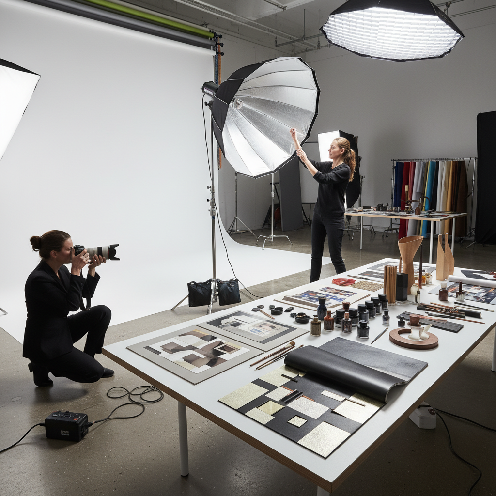
Pro Tip: Commission photography specifically for your magazine rather than adapting existing brand imagery. Purpose-shot photography integrates more naturally with editorial layouts and reinforces the publication’s unique identity.
Paper and Materials: The Tactile Experience
The physical substrate represents a fundamental component of high-end magazine design elements, directly impacting how readers perceive and interact with the publication. Paper selection influences everything from color reproduction to handling experience.
Paper Weight and Finish Selection
Premium magazines typically employ paper weights between 120-200 GSM (grams per square meter), significantly heavier than standard publications. This weight difference creates immediate tactile feedback that signals quality and permanence to readers.
Paper finish choices dramatically affect both appearance and functionality. Matte finishes reduce glare and provide sophisticated texture, while satin finishes offer subtle sheen without excessive reflectivity. Gloss finishes, when used strategically, can enhance color saturation for specific sections or covers.
| Paper Type | Weight (GSM) | Best Use | Premium Feel |
|---|---|---|---|
| Uncoated Matte | 120-150 | Text pages, editorial content | High |
| Silk/Satin | 150-170 | Mixed content, photography | Very High |
| Gloss Coated | 170-200 | Photography sections, covers | Medium |
| Textured Specialty | 140-180 | Covers, special sections | Exceptional |
Binding and Finishing Options
Binding methods significantly impact both durability and perceived value. Perfect binding (square spine) offers professional appearance and allows for spine printing, while saddle-stitched binding works well for shorter publications but limits thickness options.
Premium finishing techniques like spot UV coating, embossing, or foil stamping can elevate specific elements without overwhelming the overall design. These techniques work best when applied selectively to reinforce key brand elements or create tactile interest.
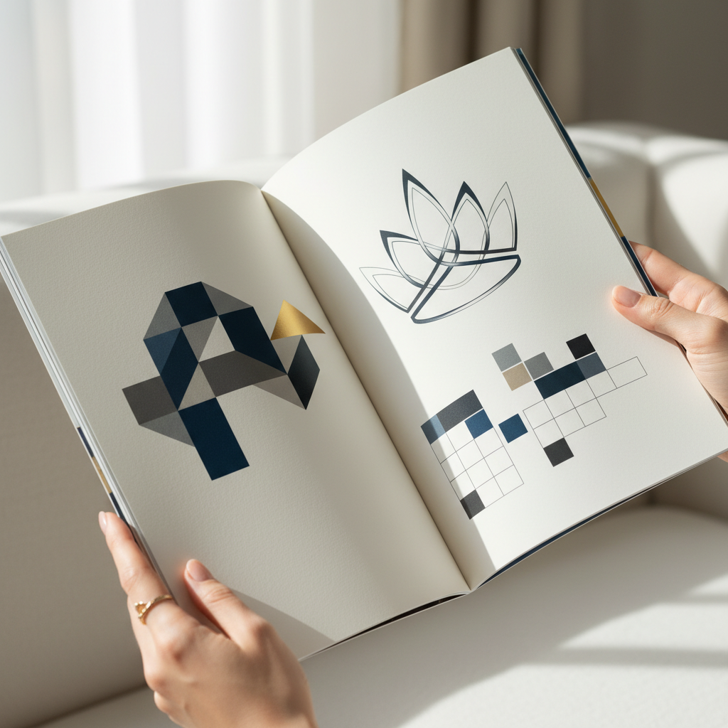
Color Palettes and Brand Integration
Color systems in high-end magazine design elements must balance aesthetic appeal with practical printing considerations while reinforcing brand identity throughout the publication.
Color Psychology and Brand Alignment
Premium publications develop sophisticated color palettes that reflect brand personality while considering psychological impact on readers. Research indicates that color choices influence reading behavior, with certain combinations promoting longer engagement times.
Successful luxury magazines often employ restrained color palettes, using 3-5 core colors supplemented by neutral tones. This restraint creates sophistication while ensuring colors maintain impact when used strategically for emphasis or section differentiation.
- Primary brand colors should appear consistently but not overwhelmingly
- Secondary colors provide flexibility for content categorization
- Neutral tones (grays, creams) create visual rest and enhance readability
- Accent colors draw attention to key elements without disrupting flow
Print Color Considerations
Premium magazines require careful attention to color reproduction across different printing processes and paper types. CMYK color profiles must be optimized for the chosen paper and printing method to ensure consistent results.
Pantone spot colors offer greater control and consistency for brand-critical elements, though they increase production costs. Many high-end publications use spot colors selectively for covers or brand elements while relying on process colors for general content.
Production and Finishing Touches
The final production phase determines whether high-end magazine design elements achieve their intended impact or fall short of premium expectations.
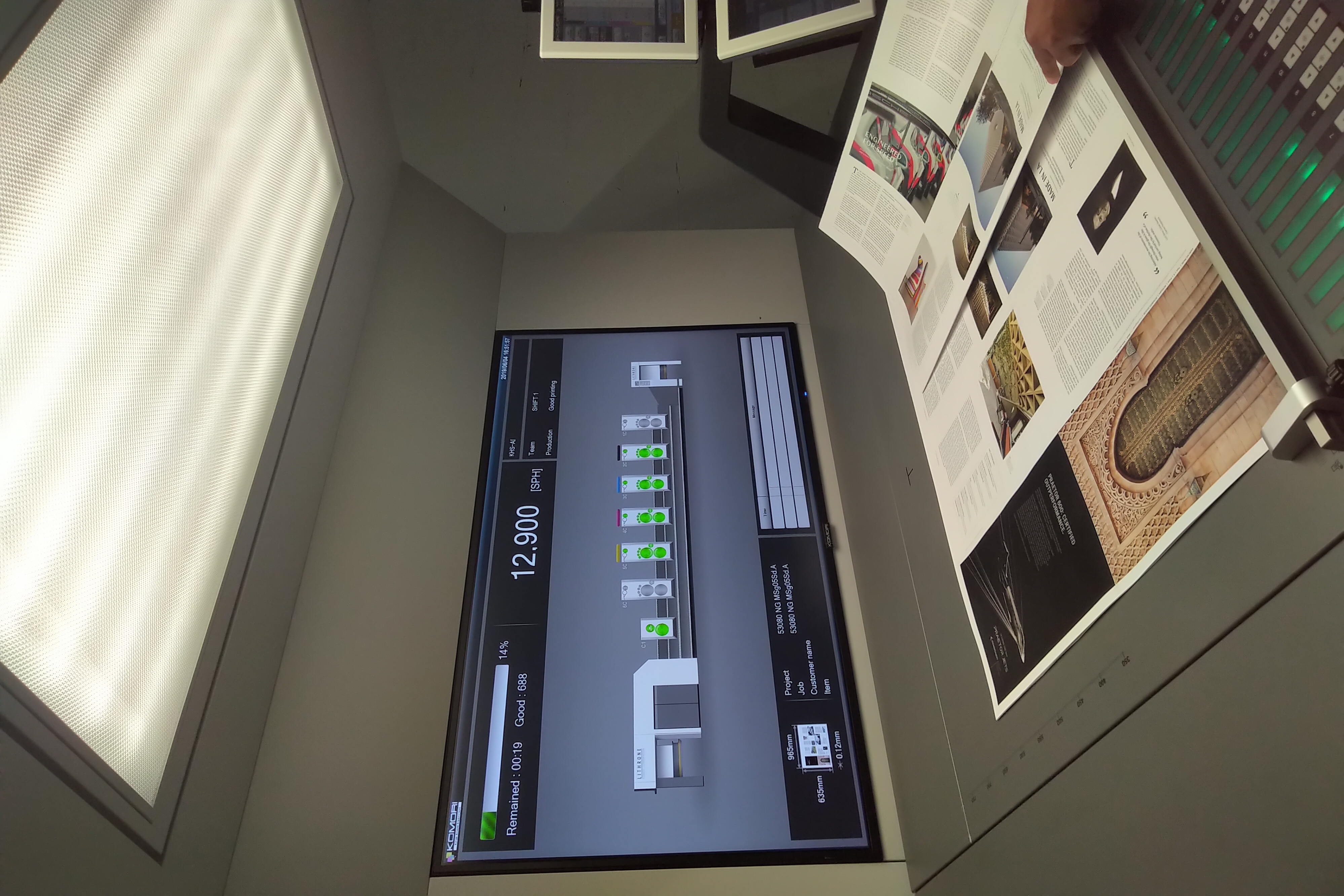
Quality Control and Printing Standards
Premium magazine production requires rigorous quality control at every stage. Color proofing ensures accurate reproduction, while press checks allow for real-time adjustments during printing runs.
High-end publications typically employ sheet-fed offset printing for superior quality, though digital printing technology continues improving for shorter runs. The choice depends on quantity, timeline, and quality requirements.
- Color-managed workflows ensure consistency from design to final print
- Press approvals allow for last-minute quality adjustments
- Paper grain direction affects how pages turn and lay flat
- Binding specifications must accommodate paper thickness and page count
Special Effects and Enhancements
Selective use of special printing effects can elevate premium publications without appearing ostentatious. Spot UV coating adds subtle texture contrast, while embossing creates tactile interest that reinforces luxury positioning.
Die-cutting, though expensive, can create memorable covers or section dividers that enhance the overall user experience. These techniques work best when integrated thoughtfully into the overall design concept rather than applied as afterthoughts.
How to Choose the Right Design Elements
Selecting appropriate high-end magazine design elements requires balancing brand objectives, audience expectations, budget constraints, and production timelines.
Brand Alignment Assessment
Begin by evaluating how design choices support brand positioning and communication goals. Premium design elements should reinforce rather than compete with brand identity, creating cohesive experiences that strengthen brand perception.
Consider audience expectations and industry standards while identifying opportunities for differentiation. What design elements will surprise and delight readers while maintaining professional credibility?
- Audit existing brand materials for design themes and quality standards
- Research competitor publications to identify differentiation opportunities
- Define success metrics beyond aesthetic appeal
- Establish budget parameters for each design element category
- Create approval processes that maintain quality while meeting deadlines
Implementation Strategy
Successful implementation requires coordinating multiple vendors and specialists while maintaining design integrity throughout production. Establish clear communication protocols and quality checkpoints to prevent costly revisions or reprints.
At Rethink Publishing, we’ve found that early collaboration between editorial, design, and production teams prevents many common issues that compromise final quality. This integrated approach ensures design elements support rather than hinder content goals.
Pro Tip: Create physical mockups using actual paper samples and binding methods before finalizing design decisions. Digital proofs can’t replicate the tactile experience that defines premium publications.
Frequently Asked Questions
1. What are the 10 key elements of a magazine layout design?
Understanding high-end magazine design elements is essential. The essential elements include cover design, typography hierarchy, grid systems, high-quality imagery, strategic white space, cohesive color schemes, clear visual hierarchy, consistent layout patterns, premium paper selection, and professional binding. Each element must work harmoniously to create a premium reading experience that reflects brand quality.
2. How does paper quality affect magazine design perception?
Paper weight, texture, and finish directly impact how readers perceive publication quality and brand credibility. Heavier papers (120-200 GSM) feel more substantial and premium, while appropriate finishes enhance color reproduction and tactile experience. The paper choice communicates brand values before readers engage with content.
3. What’s the difference between high-end and standard magazine design?
High-end magazines prioritize generous white space, custom or premium typography, original photography, superior paper quality, and refined color palettes. Standard publications often maximize content density, use stock imagery, employ basic paper grades, and rely on standard fonts to control costs while sacrificing perceived value.
4. How important is typography in premium magazine design?
Typography serves as the foundation of premium design, establishing hierarchy, readability, and brand personality. Quality publications invest in carefully selected typefaces with proper spacing and sizing, creating sophisticated layouts that enhance rather than compete with content. Poor typography immediately signals amateur production values.
5. What role does white space play in luxury magazine layouts?
Strategic white space creates visual breathing room, signals luxury positioning, and guides reader attention through content naturally. Premium magazines often dedicate 40-60% of page space to white space, demonstrating confidence in content quality and creating calm, sophisticated layouts that encourage longer engagement.
6. How do you maintain design consistency across magazine issues?
Develop comprehensive style guides covering typography, color usage, grid systems, image treatment, and layout principles. Create template libraries for common page types while allowing flexibility for special content. Regular design reviews and approval processes ensure consistency while accommodating creative variation within established parameters.
Sources & References
- Yes I’m a Designer, “Anatomy of a Magazine Layout”, 2024
- Turn One Studio, “10 Essential Elements: The Blueprint to a Perfect Magazine Layout”, 2024
- Columbia Journalism Review, “Guide to Journalism and Design”, 2023
- MIT CSAIL, “Automatic Design of Colors for Magazine Covers”, 2013
- Outsource2India, “The Anatomy of a Perfect Magazine Layout – 10 Key Elements”, 2024
High-end magazine design elements work together to create publications that transcend mere information delivery, becoming treasured brand assets that strengthen relationships and build lasting value. The investment in premium design pays dividends through enhanced brand perception, increased reader engagement, and the tangible credibility that only quality print can provide.
Success requires understanding that every design choice communicates brand values and reader respect. From typography selection to paper finish, each element contributes to an overall experience that either elevates or diminishes brand perception. In 2026’s increasingly digital world, the companies that invest in premium print design create meaningful differentiation that digital channels cannot replicate.
Ready to take your results to the next level? Discover what Rethink Publishing can do for you and see why businesses trust us to deliver real, measurable outcomes.
{“@context”:”https://schema.org”,”@type”:”Article”,”headline”:”High-End Magazine Design Elements That Create Lasting Impact”,”description”:”Discover the essential high-end magazine design elements that transform ordinary publications into premium brand assets that readers treasure and keep.”,”author”:{“@type”:”Person”,”name”:”Rethink Publishing Editorial Team”,”jobTitle”:”Publishing & Marketing Specialists”,”worksFor”:{“@type”:”Organization”,”name”:”Rethink Publishing”}},”publisher”:{“@type”:”Organization”,”name”:”Rethink Publishing”},”datePublished”:”2026-04-02T22:04:37.128Z”,”dateModified”:”2026-04-02T22:04:37.128Z”,”mainEntityOfPage”:{“@type”:”WebPage”},”keywords”:”high-end magazine design elements”,”about”:{“@type”:”Thing”,”name”:”high-end magazine design elements”},”image”:”https://ciczdkailhqqntlorwkp.supabase.co/storage/v1/object/public/article-asset/generated-images/cmlqwjyxs0002jx0auio0hx12/1775167475150-0.png”}
{“@context”:”https://schema.org”,”@type”:”FAQPage”,”mainEntity”:[{“@type”:”Question”,”name”:”1. What are the 10 key elements of a magazine layout design?”,”acceptedAnswer”:{“@type”:”Answer”,”text”:”Understanding high-end magazine design elements is essential. The essential elements include cover design, typography hierarchy, grid systems, high-quality imagery, strategic white space, cohesive color schemes, clear visual hierarchy, consistent layout patterns, premium paper selection, and professional binding. Each element must work harmoniously to create a premium reading experience that reflects brand quality.”}},{“@type”:”Question”,”name”:”2. How does paper quality affect magazine design perception?”,”acceptedAnswer”:{“@type”:”Answer”,”text”:”Paper weight, texture, and finish directly impact how readers perceive publication quality and brand credibility. Heavier papers (120-200 GSM) feel more substantial and premium, while appropriate finishes enhance color reproduction and tactile experience. The paper choice communicates brand values before readers engage with content.”}},{“@type”:”Question”,”name”:”3. What’s the difference between high-end and standard magazine design?”,”acceptedAnswer”:{“@type”:”Answer”,”text”:”High-end magazines prioritize generous white space, custom or premium typography, original photography, superior paper quality, and refined color palettes. Standard publications often maximize content density, use stock imagery, employ basic paper grades, and rely on standard fonts to control costs while sacrificing perceived value.”}},{“@type”:”Question”,”name”:”4. How important is typography in premium magazine design?”,”acceptedAnswer”:{“@type”:”Answer”,”text”:”Typography serves as the foundation of premium design, establishing hierarchy, readability, and brand personality. Quality publications invest in carefully selected typefaces with proper spacing and sizing, creating sophisticated layouts that enhance rather than compete with content. Poor typography immediately signals amateur production values.”}},{“@type”:”Question”,”name”:”5. What role does white space play in luxury magazine layouts?”,”acceptedAnswer”:{“@type”:”Answer”,”text”:”Strategic white space creates visual breathing room, signals luxury positioning, and guides reader attention through content naturally. Premium magazines often dedicate 40-60% of page space to white space, demonstrating confidence in content quality and creating calm, sophisticated layouts that encourage longer engagement.”}},{“@type”:”Question”,”name”:”6. How do you maintain design consistency across magazine issues?”,”acceptedAnswer”:{“@type”:”Answer”,”text”:”Develop comprehensive style guides covering typography, color usage, grid systems, image treatment, and layout principles. Create template libraries for common page types while allowing flexibility for special content. Regular design reviews and approval processes ensure consistency while accommodating creative variation within established parameters.”}}]}