| Key Insight | Explanation |
|---|---|
| Editorial spine comes first | Every luxury publication needs a clear editorial concept before any design work begins. Strategy drives aesthetics, not the other way around. |
| Typography signals brand caliber | Font selection, spacing, and hierarchy communicate luxury faster than any photograph. Precision here separates premium from mediocre. |
| Paper and finish are brand ambassadors | Tactile quality determines whether a publication feels like a keepsake or a throwaway. Stock weight, coating, and binding all matter. |
| White space equals confidence | Luxury brands use generous margins and breathing room to convey exclusivity. Crowded pages undermine premium positioning. |
| Photography must be intentional | Every image should serve the editorial narrative. Stock photography and filler shots erode trust with discerning audiences. |
| End-to-end management prevents costly errors | From concept to delivery, a single team overseeing the entire process ensures consistency, quality control, and on-brand results. |
A luxury brand’s printed publication is often the single most tangible expression of its identity. Not a website. Not a social post. A physical object someone holds, keeps, and remembers. Yet most editorial design for luxury brands falls short because the process starts in the wrong place: with aesthetics instead of substance. That’s exactly why a comprehensive editorial design for luxury brands guide is essential for any team serious about producing world-class print work.
This editorial design for luxury brands guide walks you through the full process of creating a high-end print publication, from defining an editorial concept to managing final production. Whether you’re producing a brand magazine, a coffee-table book, or a seasonal lookbook, these steps reflect what actually works in practice after two decades and 80+ luxury publications.
Expect this guide to take 15 to 20 minutes to read. The full production process it describes typically spans 8 to 16 weeks, depending on scope. Difficulty level: intermediate to advanced, though the principles apply whether you’re a brand manager commissioning your first publication or a creative director refining your tenth.
What Is Editorial Design for Luxury Brands?
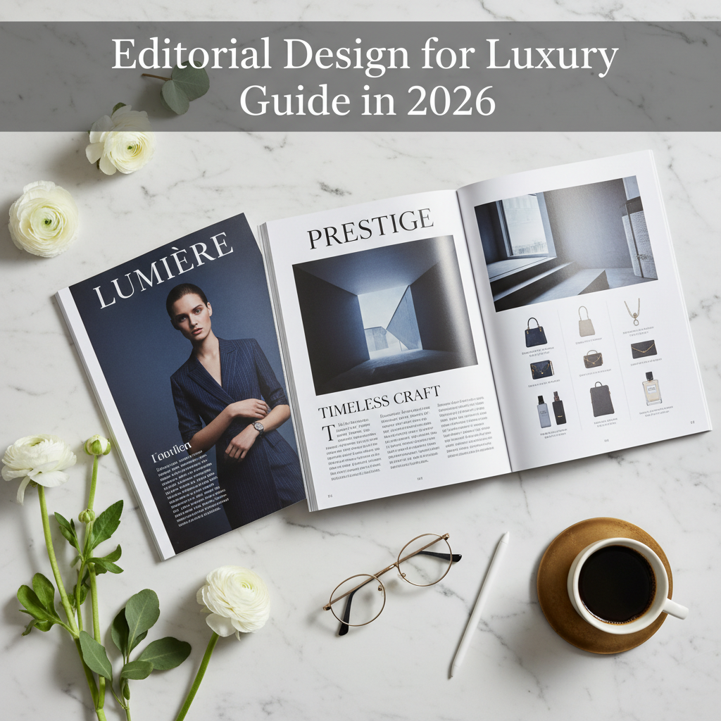
Editorial design for luxury brands is the discipline of structuring, styling, and producing print publications that communicate a brand’s identity through carefully orchestrated words, images, and physical materials. It differs from standard graphic design because it prioritizes narrative, pacing, and tactile experience over simple visual impact.
Why It Matters More Than Ever in 2026
Digital fatigue is real. A 2023 Deloitte study on digital media trends found that 73% of consumers feel overwhelmed by digital content, and that figure has only grown as AI-generated material floods every channel. Print, by contrast, demands attention in a way screens cannot. Research from Temple University’s neuroscience research center and the U.S. Postal Service found that physical media generates stronger emotional responses and more vivid memory encoding than digital formats.
For luxury brands specifically, a printed publication serves as a brand artifact. It sits on a coffee table, in a hotel suite, or in a private club lounge. It doesn’t disappear in an algorithm. People don’t scroll past it. They pick it up, flip through it, and form an impression that lasts.
Who Benefits Most From This Approach
Not every business needs a luxury editorial publication. If you’re chasing quick leads or rapid conversions, there are faster tools. But brands in hospitality, architecture, real estate, private aviation, design, and professional services (including fields like cybersecurity and law) benefit enormously when they’re committed to long-term brand building.
- Hotels and resorts that want guests to feel the brand before they arrive
- Private clubs seeking to reinforce exclusivity and member loyalty
- Architecture and design firms showcasing portfolio work with editorial depth
- Real estate developers positioning properties as lifestyle destinations
- Professional services firms building authority and trust over time
The brands that get the most from this process understand something fundamental: a well-made magazine isn’t a brochure with better paper. It’s an editorial product that carries your voice into the world.
Your Editorial Design for Luxury Brands Guide: What You’ll Need Before You Start
Creating a luxury editorial publication requires clear brand positioning, a realistic budget, and the right team. Without these foundations, even beautiful design will fall flat.
Brand and Strategic Foundations
Before a single page gets designed, you need clarity on your brand’s voice, audience, and objectives. This isn’t about having a 50-page brand guidelines document. It’s about knowing who you’re speaking to and why they should care.
- Brand positioning statement: A concise articulation of what makes your brand distinct
- Target reader profile: Who will hold this publication, and what do they value?
- Publication objective: Brand awareness, client retention, thought leadership, or a combination
- Budget range: Print production costs vary widely; expect $15,000 to $150,000+ depending on page count, print run, and finishing
- Timeline: Allow 10 to 16 weeks minimum for a quality publication in 2026
Tools and Team Requirements
Luxury editorial design demands specialized expertise. You’ll need access to professional layout software (Adobe InDesign remains the industry standard as of 2026), high-resolution photography, and experienced editorial talent.
| Requirement | In-House Option | Outsourced / Studio Option |
|---|---|---|
| Editorial direction | Requires experienced editor-in-chief | Boutique publishing studio provides end-to-end |
| Art direction & layout | Senior designer with print expertise | Design-led studio handles typography, grids, pacing |
| Photography | Commission shoots + manage image rights | Studio coordinates shoots, licensing, retouching |
| Writing | Freelance journalists or in-house copywriters | Curated stable of writers matched to brand voice |
| Print production | Source and manage printer relationships directly | Full production management including press checks |
| Quality control | Internal review process | Swiss-precision QC at every stage |
From experience, the brands that achieve the best results work with a single studio that manages everything, from editorial strategy through delivery. Fragmented teams create fragmented publications.
Step 1: Define Your Editorial Spine
The editorial spine is the conceptual backbone of your publication: a single organizing idea that gives every page purpose and coherence. Without it, you have a collection of pretty pages. With it, you have a story. Any thorough editorial design for luxury brands guide will emphasize this as the most critical starting point.
How to Build an Editorial Spine
Think of the editorial spine as the answer to one question: “What is this publication really about?” Not your brand. Not your products. The bigger idea that connects your brand to your reader’s world.
- Identify the intersection between your brand’s values and your reader’s aspirations. A luxury hotel group might land on “the art of unhurried travel.” A private club might choose “the craft of belonging.”
- Draft a one-sentence editorial mission that captures this intersection. Write it down. Pin it to the wall. Every content decision flows from here.
- Map content pillars (3 to 5 recurring themes) that support the spine. These become your sections and give the publication rhythm across issues.
- Create a flat plan (a page-by-page map) that sequences content for pacing. Alternate long-form features with shorter pieces, interviews, and visual essays.
Pro Tip: The strongest editorial spines are never about the brand itself. They’re about the world the brand inhabits. A cybersecurity firm’s magazine might explore “the architecture of trust.” A law firm’s might center on “the future of fairness.” The brand becomes the lens, not the subject.
Why Most Luxury Publications Skip This Step
In practice, this is where most projects go wrong. Teams jump straight to visual moodboards and typeface selections without establishing what the publication is actually saying. The result? Beautiful pages that feel hollow. Readers sense the difference immediately.
An editorial-first approach means words and ideas lead. Design amplifies. This sequence matters enormously, and it’s the single biggest differentiator between a publication that gets kept and one that gets recycled.
Step 2: Establish Your Typographic Hierarchy
Typography is the fastest signal of quality in any printed publication. Before a reader processes a single word, the typefaces, spacing, and hierarchy have already communicated whether this is a premium experience or a generic one. This is a cornerstone principle in any editorial design for luxury brands guide worth following.
Selecting Typefaces for Luxury
Luxury editorial design typically relies on a restrained type palette: one serif and one sans-serif, occasionally supplemented by a display face for covers or section openers. The goal is quiet confidence, not novelty.
- Serif body text: Faces like Freight Text, Garamond Premier Pro, or Tiempos convey heritage and readability
- Sans-serif accents: Neue Haas Grotesk, Founders Grotesk, or Suisse International provide clean counterpoints
- Display faces: Used sparingly for headlines or covers. Consider Canela, Noe Display, or bespoke lettering
In 2026, there’s a notable trend toward variable fonts in print preparation, allowing designers to fine-tune weight and width with greater precision during layout. This doesn’t change the fundamental principle: restraint communicates luxury.
Spacing, Leading, and Margins
Where amateur publications cram text, luxury publications let it breathe. Generous leading (line spacing), wide margins, and careful tracking (letter spacing) are non-negotiable.
- Set body text leading at 130% to 145% of the font size. For a 9.5pt body, that’s approximately 12.5pt to 14pt leading.
- Define margin ratios using classical proportions. Inner margins should be narrower than outer margins, and bottom margins should be the most generous.
- Establish a clear hierarchy with at least four levels: headline, subhead, body, and caption. Each level should be immediately distinguishable without relying on bold alone.
- Test readability by printing sample spreads at actual size. Screen proofing isn’t sufficient for luxury print work.
Research from the MIT AgeLab has shown that typographic choices significantly affect reading comprehension and emotional response. For luxury audiences accustomed to quality, poor typography is the fastest way to lose credibility.
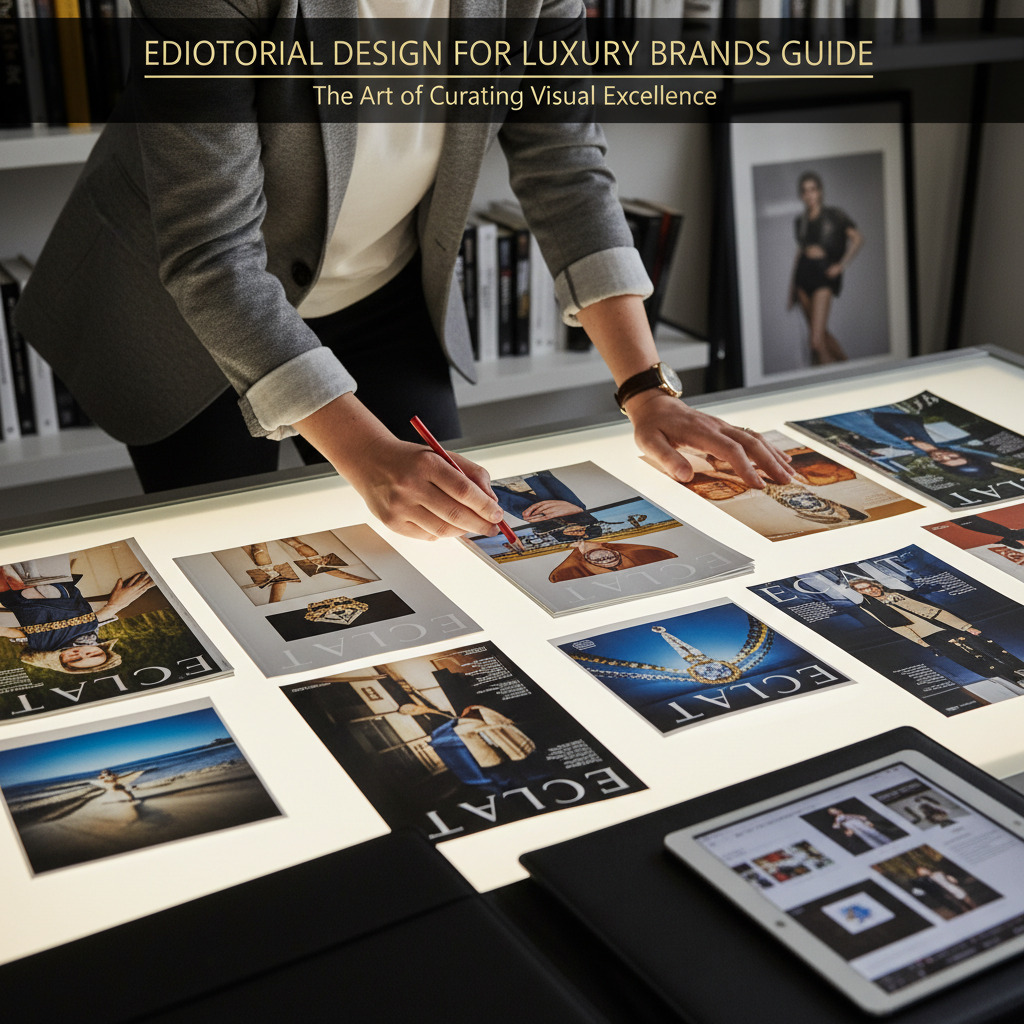
Step 3: Curate Photography and Imagery With Intention
Every image in a luxury publication must earn its place. Photography isn’t decoration. It’s narrative infrastructure that carries emotional weight and communicates brand values faster than any paragraph.
Commissioning vs. Licensing
Original photography almost always produces better results for luxury editorial work. Licensed images can fill gaps, but they rarely achieve the specificity and emotional resonance that custom shoots deliver.
- Commission photography when the subject is unique to your brand (properties, products, people, spaces)
- License selectively from premium agencies (Trunk Archive, Gallery Stock) for lifestyle and conceptual imagery
- Avoid stock photography from mainstream libraries. Discerning readers recognize generic imagery instantly
- Secure image rights for all intended uses, including reprints and digital adaptations
Art Direction for Photography
Strong art direction ensures visual consistency across an entire publication. This means creating detailed shot lists, mood references, and lighting guidelines before any shoot begins.
- Define a visual tone for the publication: warm or cool, natural or controlled, intimate or expansive.
- Brief photographers with specific references, not vague adjectives. Show them exactly what “elevated” or “authentic” means in your context.
- Edit ruthlessly. A luxury publication might shoot 2,000 images and use 40. The editing process is where quality emerges.
- Sequence images for narrative flow. A full-bleed landscape followed by a tight portrait creates rhythm. Two similar compositions back-to-back create monotony.
Pro Tip: Pair every commissioned photo shoot with a written brief that references the editorial spine. When photographers understand the story you’re telling (not just the product you’re showing), the results are transformative. This is the difference between a catalog and a magazine.
Industry experts at the Society of Publication Designers have noted that the most awarded editorial work in recent years consistently demonstrates tight alignment between photographic vision and editorial concept. The image and the word serve the same idea.
Step 4: Design Your Grid and Master White Space
The grid is the invisible architecture of every great publication. It determines where elements sit, how content flows, and how much breathing room exists on each page. For luxury editorial design, the grid must be flexible enough for variety yet disciplined enough for elegance.
Building a Modular Grid
Most luxury publications use a modular grid with 6 to 12 columns, allowing designers to create varied layouts while maintaining underlying consistency.
- Choose a column count based on content types. A 9-column grid offers excellent flexibility for mixing text widths, image sizes, and caption placements.
- Set horizontal modules (rows) to create a complete modular system. This prevents elements from floating arbitrarily on the page.
- Define hanging lines (consistent vertical positions where key elements align) to create visual rhythm across spreads.
- Build master templates for recurring page types: feature openers, text-heavy spreads, photo essays, and department pages.
The Strategic Use of White Space
White space isn’t empty space. It’s active space. In luxury editorial design, generous margins and open areas communicate confidence, exclusivity, and calm. Crowded pages suggest desperation to fill every inch, which is the opposite of a luxury sensibility. Understanding this principle is central to any editorial design for luxury brands guide.
- Outer margins: Allow at least 18mm to 25mm on a standard magazine trim size
- Image padding: Give photographs room to breathe. Don’t butt images against text blocks
- Section breaks: Use full or half blank pages between major sections to create pacing
- Cover design: Resist the urge to fill the cover with coverlines. One strong image, one headline, and the masthead is often enough
According to research published in the International Journal of Design, white space increases comprehension by up to 20% and significantly improves the perceived value of the content it surrounds. For luxury brands, this perception of value is everything.
Step 5: Select Paper Stock and Finishing Techniques
Paper is where editorial design becomes a physical, sensory experience. The weight, texture, and finish of your paper stock communicate brand quality before the reader processes a single word or image. Selecting the right materials is a step that every editorial design for luxury brands guide must address in detail.
Paper Stock Options for Luxury Publications
As of 2026, sustainable paper options have expanded significantly without sacrificing quality. FSC-certified stocks from mills like Fedrigoni, Munken, and Mohawk now offer the same tactile luxury as conventional alternatives. The Forest Stewardship Council (FSC) provides certification standards that help luxury brands align sustainability commitments with premium print quality.
| Paper Type | Best For | Weight Range | Luxury Signal |
|---|---|---|---|
| Uncoated matte | Text-heavy publications, understated brands | 120–170 gsm | Tactile warmth, literary feel |
| Silk/satin coated | Photography-heavy magazines | 150–200 gsm | Sharp image reproduction, subtle sheen |
| Soft-touch matte | Covers, special inserts | 250–350 gsm | Velvety texture, immediate premium feel |
| Mixed stock | Publications with distinct sections | Varies by section | Surprise and tactile variety |
Finishing Techniques That Elevate
Finishing is where a publication transforms from “very nice” to “extraordinary.” These techniques add cost, so use them strategically rather than everywhere.
- Foil stamping: Hot foil on covers or section dividers adds a metallic or tonal accent
- Spot UV varnish: Creates contrast between matte and gloss areas on a single page
- Debossing/embossing: Adds dimensional texture to covers, particularly effective on thicker stocks
- Edge painting: Colored or gilded page edges create a striking visual when the publication is closed
- Swiss binding (exposed spine): Allows the publication to lie flat while showcasing the binding as a design element
Pro Tip: Always request paper dummies from your printer before committing. A paper dummy is an unprinted mock-up using your exact paper specifications and binding method. It tells you how the publication will feel in hand, how the spine behaves, and whether the weight is right. This small step prevents expensive surprises.
Step 6: Manage Production and Quality Control
Production management is where luxury editorial projects succeed or fail. The gap between a beautiful PDF and a beautiful printed object is enormous, and it’s bridged only by meticulous quality control at every stage.
Pre-Press and Proofing
- Prepare print-ready files with correct bleed (typically 3mm to 5mm), CMYK color profiles, and embedded fonts. RGB images will print incorrectly.
- Request wet proofs (actual printed proofs on your specified paper) rather than relying solely on digital proofs. Color accuracy can only be verified on the actual substrate.
- Review imposition plans to ensure page order, crossovers (images spanning two pages), and color consistency across forms.
- Conduct a final editorial review at proof stage. Typos in a luxury publication are more damaging than in any other context because readers expect perfection.
Press Checks and Delivery
For high-value print runs, attending a press check is standard practice. This means being present at the printing facility when your job runs, approving color and registration in real time.
- Check color consistency against your wet proofs and original photography
- Inspect registration (alignment of color plates) on detail-heavy pages
- Verify finishing quality on the first bound copies off the line
- Plan distribution logistics well in advance, including packaging that protects the publication during shipping
From experience, the brands that invest in a fully managed production process (where one team oversees everything from concept to delivery) consistently achieve better results than those who coordinate multiple vendors independently. A calm, transparent process with clear milestones prevents the chaos that derails quality.
Common Mistakes to Avoid in 2026
Even well-resourced luxury brands make predictable errors in editorial design. These mistakes are preventable, but they require awareness and discipline to avoid. This editorial design for luxury brands guide wouldn’t be complete without addressing the pitfalls that derail even the most promising projects.
Strategic Mistakes
Recommended Articles
Explore more from our content library: