
| Key Insight | Explanation |
|---|---|
| Narrative design is the foundation | Every layout decision — grid, typography, image placement — should serve the editorial story, not decorate it. |
| Visual hierarchy controls reading flow | Readers scan before they read. A clear hierarchy of headlines, subheads, and body text guides attention in a deliberate sequence. |
| Pacing is a design tool | Alternating dense text spreads with full-bleed imagery gives readers breathing room and sustains engagement across an entire issue. |
| Editorial spine precedes design | Without a clear editorial idea running through the issue, design becomes decoration. Story first, layout second. |
| Brand magazines are kept, not discarded | A well-designed narrative layout transforms a publication into a keepsake. People display it, share it, and return to it for months. |
| End-to-end craft separates great from average | Typography, colour profiles, paper choice, and print quality all contribute to whether a magazine feels premium or merely printed. |
Narrative design magazine layout is the practice of organizing every visual and editorial element — typography, imagery, white space, grid structure, and pacing — so that the layout itself tells a coherent story from the first spread to the last. It isn’t decoration. It’s a discipline. A well-executed narrative layout guides the reader through content with intention, building meaning and emotional response as each page turns. This article covers the principles, mechanics, common pitfalls, and best practices that separate a publication people keep from one they discard.
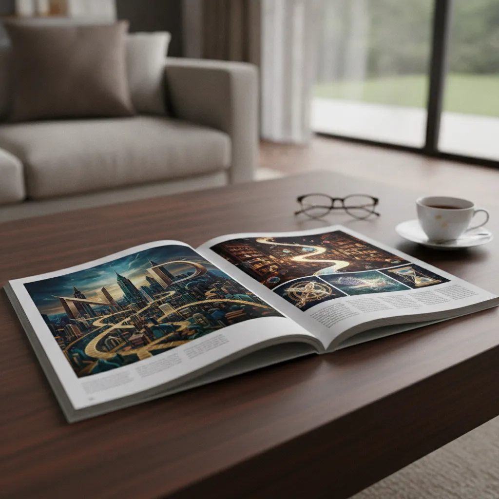
What Is Narrative Design in Magazine Layout?: narrative design magazine layout
Narrative design in magazine layout is the deliberate use of visual and editorial structure to move a reader through a story — not just a sequence of pages, but a purposeful arc with a beginning, a middle, and a conclusion that leaves an impression. This is particularly relevant for narrative design magazine layout.
A Working Definition
Narrative design magazine layout is the integration of editorial strategy and visual design so that layout decisions reinforce storytelling. Where a standard layout organizes content for readability, a narrative layout organizes content for experience. The difference is significant. One produces a functional document. The other produces something worth keeping. [1]
The concept draws from editorial journalism, where designers and editors have long understood that a reader’s eye movement across a page is not random. It follows cues. A dominant image pulls focus. A pull quote interrupts and rewards. A short deck (the introductory paragraph beneath a headline) sets expectations. Every element is a narrative signal. [2]
As Columbia Journalism School has noted in its work on digital storytelling, the relationship between journalism and design has always been about controlling how a story unfolds — the layout is not separate from the story, it is part of it. [3]
Why It Matters for Brand Publications
For companies producing custom magazines, this distinction is especially important. A brand magazine that reads like a brochure with layout has failed at the fundamental level. Readers sense the absence of intention immediately. They may not articulate it, but they feel it — and they put the publication down.
A magazine built on genuine narrative design does the opposite. It earns attention, page by page, because every spread feels considered. That feeling is what builds brand trust. It signals that the company behind the publication thinks carefully, operates with precision, and respects its audience’s time.
The stakes are measurable: according to the Content Marketing Institute’s 2024 B2B Content Marketing report, 73% of the most successful content marketers use print or physical formats — including magazines — as part of their strategy, precisely because well-designed physical publications generate higher trust signals than digital-only content. Meanwhile, research by Two Sides North America found that 70% of consumers prefer reading print over digital when they want to engage deeply with content, underscoring why narrative design magazine layout decisions directly affect how much of a publication’s story actually reaches the reader. And a 2023 study published in the Journal of Marketing Communications found that branded print publications generate up to 3x higher brand recall compared to equivalent digital content — a figure that rises sharply when the publication demonstrates strong visual coherence and editorial intentionality.
- Narrative layout transforms a publication from a content container into an editorial experience
- Readers respond emotionally to design decisions even when they can’t name them
- Brand perception is directly shaped by the quality of the publication’s visual storytelling
- Publications with strong narrative design are kept, shared, and remembered — publications without it are recycled
How Narrative Design Works in a Magazine
Narrative design in a magazine works by establishing a clear editorial spine first, then translating that spine into a visual system — grid, typography, imagery, and pacing — that reinforces the story at every turn.
The Editorial Spine: Story Before Layout
Before a single spread is designed, the editorial spine must be defined. This is the central idea that gives the entire issue coherence. It’s the answer to: what is this magazine actually about, and why does it matter to this reader? Every article, image, and design choice either supports that spine or undermines it. [4]
In practice, this means the editorial and design teams work together from the beginning, not sequentially. A content proposal and flatplan (a page-by-page map of the issue) are developed before writing begins. This ensures the narrative architecture is sound before any visual decisions are made. When considering narrative design magazine layout, this point stands out.
The process follows a clear sequence:
- Define the editorial idea and the audience’s emotional journey through the issue
- Build a flatplan that maps article types, image ratios, and pacing across all pages
- Establish a visual system: grid, typefaces, colour palette, and image treatment rules
- Write and design simultaneously, with editors and art directors in dialogue throughout
- Review spreads as a sequence, not as individual pages, to ensure the narrative holds
Visual Hierarchy as Narrative Control
Visual hierarchy is the mechanism by which narrative design controls the reader’s attention. According to design researchers at the University of North Carolina’s Media Design Center, effective magazine layouts use scale, contrast, and spatial relationships to create a reading path that feels intuitive but is actually engineered. [5]
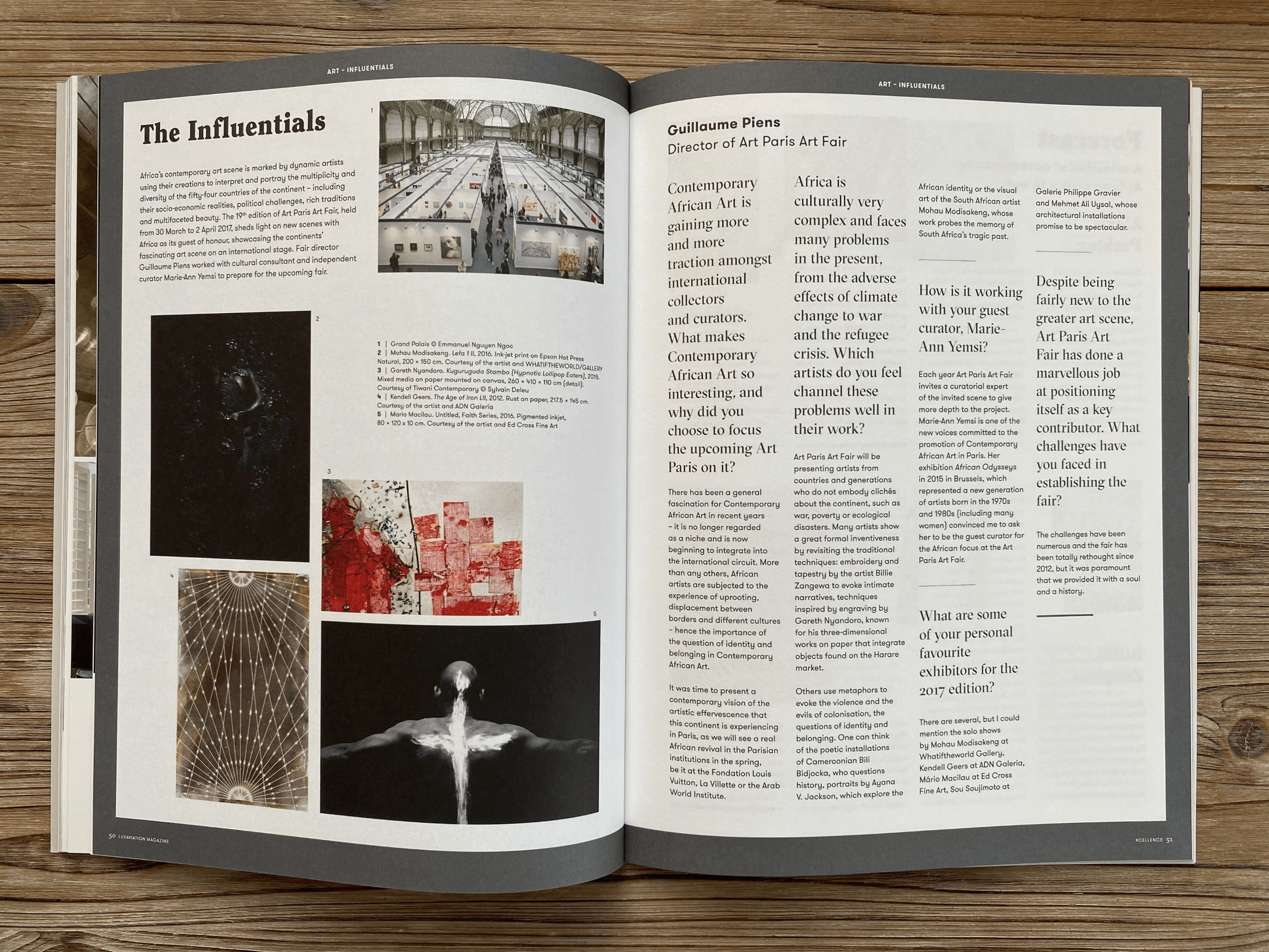
A dominant headline at a large scale draws the eye first. A subhead provides context. The body text delivers the substance. Pull quotes interrupt the flow deliberately, offering a reward that encourages the reader to continue. Images anchor the emotional register of each spread.
Pro Tip: Review every spread as a two-page unit, not as individual pages. The gutter (the inner margin where pages meet) is part of the composition. A strong narrative layout treats the spread as a single canvas, not two separate frames.
Pacing is equally important. Dense, text-heavy spreads require visual relief. Full-bleed photography gives the reader a moment to breathe and absorb before the next chapter of content begins. This rhythm — tension and release, density and openness — is what keeps a reader engaged across 60 or 80 pages. [6]
Key Elements of a Narrative-Driven Layout
A narrative-driven magazine layout is built from several interdependent elements. Each one contributes to the story. None of them works in isolation.
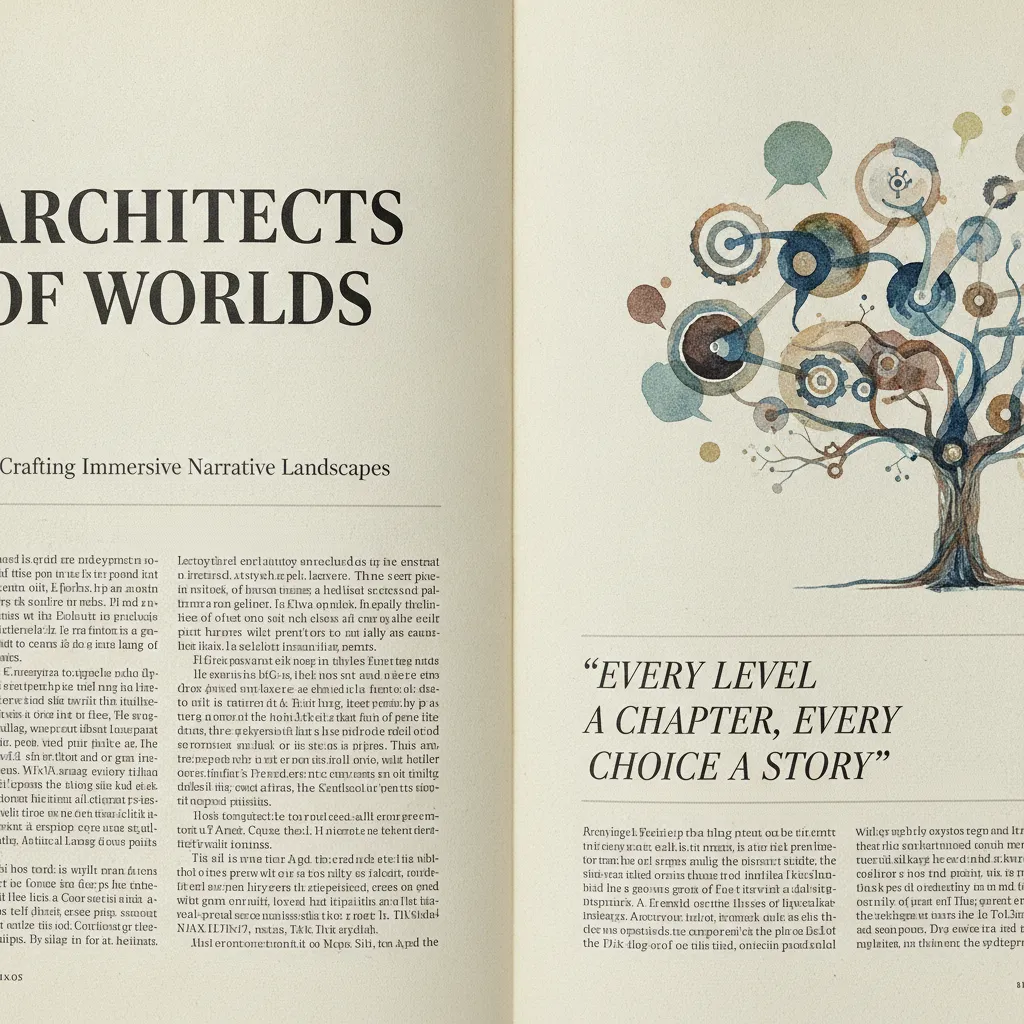
The Core Structural Components
Understanding the anatomy of a magazine layout is the starting point for applying narrative design principles effectively. [7] The following elements form the foundation:
| Element | Narrative Function | Design Consideration |
|---|---|---|
| Headline | Sets the story’s promise and emotional register | Scale, typeface, and placement must signal importance |
| Deck (standfirst) | Bridges headline to body; sets reader expectations | Typically 2-3 sentences, set at a mid-weight between headline and body |
| Body copy | Delivers the substance of the story | Column width, leading, and typeface affect readability and perceived quality |
| Pull quote | Interrupts flow with a reward; sustains engagement | Must be genuinely compelling, not a throwaway line |
| Lead image | Anchors the emotional tone of the spread | Image quality, cropping, and colour treatment must be intentional |
| White space | Creates breathing room; signals confidence and quality | Generous margins are a mark of premium design, not wasted space |
| Grid system | Provides the underlying structure that makes variation feel intentional | A strong grid allows creative flexibility without visual chaos |
Typography as Narrative Voice
Typography is one of the most underestimated narrative tools in magazine design. The typefaces chosen for a publication communicate personality before the reader processes a single word. A serif headline reads differently from a grotesque one, not just visually but emotionally. [8] For those exploring narrative design magazine layout, this matters.
Industry analysts consistently note that premium publications invest heavily in typographic systems — custom typefaces, carefully tuned leading (the vertical space between lines), and precise kerning — because these details are what separate a magazine that feels like a lifestyle title from one that feels like a corporate newsletter.
In practice, a strong typographic system for a narrative layout includes:
- A primary display typeface for headlines that expresses the publication’s personality
- A secondary serif for body text, chosen for readability at small sizes in print
- A supporting sans-serif for captions, pull quotes, and functional text
- A consistent scale ratio between headline sizes to create visual rhythm across spreads
Pro Tip: Never choose typefaces in isolation. Test them together in a full spread mock-up at actual print size, on the actual paper stock you plan to use. A typeface that looks refined on screen can lose legibility entirely when printed on uncoated paper. This is where digital proofing misleads and physical print proofs are essential.
Common Mistakes That Break the Narrative
The most common mistake in narrative magazine layout is treating design as a final step applied to finished content, rather than as a discipline that shapes content from the beginning.
Starting With Design Before Editorial
A common pattern in in-house or under-resourced publishing projects is this: articles are written, handed to a designer, and the designer arranges them on a template. The result looks like a magazine. It doesn’t read like one. There’s no throughline. The spreads don’t speak to each other. The pacing is accidental rather than engineered.
This is the difference between a publication with an editorial spine and one without. Without a spine, even beautiful individual spreads fail to cohere into a meaningful whole. Readers sense the absence of intention, even if they can’t name it. They put the magazine down. [9]
In one project we worked on for an enterprise technology brand, the client arrived with 12 articles already written by their internal team. The articles were technically sound. But there was no editorial thread connecting them, no sense of what the issue was actually about. The first step was stepping back entirely, reframing the issue’s central idea, and restructuring the content around that idea. Only then did the layout work.
Overcrowding and Under-Breathing
Another frequent mistake is filling every square centimeter of the page. This comes from a misguided instinct to deliver value through volume. In reality, white space is not empty space. It’s a design decision that signals quality, confidence, and editorial restraint. This directly impacts narrative design magazine layout outcomes.
- Overcrowded layouts: Make the reader feel anxious rather than engaged. The eye doesn’t know where to land.
- Insufficient image scale: Small images scattered across a spread fail to create the emotional impact that a single dominant image would achieve.
- Inconsistent grid use: Breaking the grid without reason creates visual noise rather than intentional tension.
- Weak pull quote selection: Using a pull quote that doesn’t actually compel the reader to continue reading wastes the most powerful re-engagement tool in a spread.
- Ignoring the spread as a unit: Designing pages individually rather than as two-page compositions breaks the narrative flow at every turn. [10]
One limitation worth acknowledging: even the most disciplined narrative layout can be undermined by poor print quality. Colour that isn’t properly profiled for the press, paper that doesn’t suit the image content, or insufficient proofing rounds can destroy the effect that careful design was intended to create. The layout is only as good as the production behind it.
Best Practices for Narrative Magazine Layout in 2026
The strongest brand magazines produced in 2026 share a common discipline: they treat the entire issue as a single editorial object, not a collection of individual articles.
Build the Flatplan Before You Write
A flatplan is a page-by-page map of the entire issue, showing article placement, image ratios, feature versus short-form content, and the overall pacing arc. Building it before writing begins is the single most effective practice for ensuring narrative coherence. [11]
The flatplan answers questions that no individual article can answer on its own:
- Does the issue open with enough visual impact to earn the reader’s commitment?
- Are dense, text-heavy features balanced by visual relief — full-bleed spreads, infographic pages, or short-form content?
- Does the issue build to something? Is there a climax, a resolution, a sense of arrival?
- Are there thematic threads that connect disparate articles into a coherent whole?
At Rethink Publishing, we’ve found that clients who engage with the flatplan process early produce significantly stronger issues than those who treat it as a back-office production step. The flatplan is an editorial tool, not an administrative one.
Treat Photography as a Narrative Asset, Not Illustration
Photography in a narrative layout isn’t decoration. Each image must earn its place by contributing something to the story that words alone cannot deliver. This means commissioning or sourcing images with intent — knowing in advance what emotional note each spread needs to hit, and selecting or directing photography accordingly.
Proper colour work matters enormously here. Softproofing (the process of simulating how colours will appear in print using calibrated monitors and print colour profiles) ensures that the emotional register of an image survives the journey from screen to paper. An image that reads as warm and intimate on screen can print cold and flat without this step. [12] This is particularly relevant for narrative design magazine layout.
Pro Tip: Request a physical print proof before approving the full print run. A PDF proof on a calibrated screen is useful, but it doesn’t replicate the experience of holding the paper, seeing the ink density, and feeling the weight of the stock. The physical proof is where you catch what the screen hides.
Research from publishing design practitioners consistently shows that image quality is the single factor readers cite most often when describing why a magazine feels premium. Scale, sharpness, colour accuracy, and the relationship between image and text are all variables that can be controlled — but only if the production process is rigorous enough to control them.
Sources & References
- Publitas, “How To Design A Magazine Layout: Structure & Hierarchy,” 2024
- YesImaDesigner, “Anatomy of a Magazine Layout,” 2023
- Columbia Journalism School, “Digital Storytelling: A Marriage Between Journalism and Design,” 2022
- Writing with Light, “Magazine — Print Forward Design,” 2023
- UNC Media & Design Center, “Creating a Magazine Article,” 2024
- Outsource2India, “The Anatomy of a Perfect Magazine Layout — 10 Key Elements,” 2023
- YesImaDesigner, “Anatomy of a Magazine Layout,” 2023
- Marq, “30 Magazine Design & Layout Ideas to Spark Your Creativity,” 2024
- Publitas, “How To Design A Magazine Layout: Structure & Hierarchy,” 2024
- Walsworth, “How To Design a Magazine Layout: A Practical Guide,” 2024
- University of Missouri, “Master InDesign Magazine Layout: Stunning Templates & SEO Tips,” 2024
- University of Florida Career Hub, “InDesign CC: Designing a Magazine Layout,” 2023
Frequently Asked Questions
1. What is narrative design in a magazine layout?
Narrative design in a magazine layout is the practice of using every visual element — grid, typography, imagery, white space, and pacing — to guide a reader through a coherent editorial story. It means design decisions are made in service of the narrative, not independently of it. The result is a publication that feels intentional from first page to last, rather than a collection of articles that happen to share a cover.
2. How is narrative design different from standard magazine layout?
Standard magazine layout organizes content for readability and visual appeal. Narrative design magazine layout goes further: it engineers the reader’s emotional journey through the issue. Pacing, sequencing, and the relationship between spreads are all deliberate choices. A standard layout asks “does this look good?” A narrative layout asks “does this move the reader forward in the story?” The difference is felt immediately, even by readers who can’t articulate why one publication feels more compelling than another.
3. What is an editorial spine, and why does it matter for layout?
An editorial spine is the central idea that gives an entire magazine issue its coherence — the thread that connects every article, image, and design decision. Without one, even beautiful individual spreads fail to add up to a meaningful whole. The spine is defined before writing or design begins, and every subsequent decision is tested against it. For brand magazines, the editorial spine is also the mechanism by which a company’s values and voice are consistently expressed throughout the publication.
4. What are the most important elements of a narrative magazine layout?
The core elements are headline, deck (standfirst), body copy, pull quotes, lead imagery, white space, and the underlying grid system. Each element carries a specific narrative function. Headlines set the story’s promise. Pull quotes reward and re-engage. White space signals editorial confidence. The grid provides structure that makes creative variation feel intentional rather than chaotic. In a strong narrative design magazine layout, none of these elements is treated as optional or purely decorative.
5. How does pacing work in a magazine layout?
Pacing in a magazine layout is the rhythm created by alternating between dense and open spreads. A text-heavy feature article earns more reader attention when it follows a full-bleed photographic spread that gave the reader a visual rest. Short-form content between long features provides relief and variety. This rhythm — tension and release — is what keeps a reader engaged across 60 or 80 pages. Pacing is planned at the flatplan stage, before a single word is written or image selected.
6. Can a brand magazine use narrative design without a professional publishing team?
Technically, yes. In practice, the results are rarely competitive with publications produced by teams that specialize in editorial design. Narrative design magazine layout requires editorial strategy, typographic expertise, image direction, colour management, and print production knowledge working together from the start. A design team that handles day-to-day brand assets — social graphics, brochures, presentations — typically doesn’t have the editorial publishing discipline to execute a narrative-driven print magazine at a quality level that builds brand perception rather than undermining it.
7. How does narrative layout affect brand perception?
Directly and measurably. A publication with strong narrative design signals that the brand behind it thinks carefully, operates with precision, and respects its audience. Readers extend that impression to the brand itself. A magazine that feels considered and premium makes the company feel considered and premium. Conversely, a publication that feels rushed or generic — even if the content is strong — communicates exactly the opposite. In brand publishing, the quality of the object is inseparable from the quality of the message it carries.
8. What should I look for when evaluating a magazine layout for narrative strength?
Read through the entire issue in sequence without stopping. Ask yourself: do I know where I am in the story at all times? Does the pacing feel deliberate? Do the spreads build on each other, or do they feel disconnected? Is there a sense of arrival at the end? Then look at individual spreads: is the visual hierarchy clear? Do the images earn their scale? Is white space used with confidence? A narrative design magazine layout answers yes to all of these questions — not because it follows a formula, but because every decision was made with the reader’s experience in mind.
Narrative design magazine layout is ultimately about respect. Respect for the reader’s time, attention, and intelligence. And respect for the brand’s story — treating it as something worth telling well, in a format built to last.
At Rethink Publishing, this is the work. Over 20 years and 80+ high-end publications, the constant has been this: design that serves the story, editorial decisions made before layout begins, and production standards that ensure the physical object matches the intention behind it. The result is magazines that people don’t throw away. They keep them. They share them. They bring them up in meetings months later.
If you’re considering a brand magazine and want to understand what genuine narrative design looks like in practice, visit rethink-publishing.com to see the work and start a conversation.
Recommended Articles
Explore more from our content library: