
| Key Insight | Explanation |
|---|---|
| Photography direction is a strategy, not a shoot | In a custom brand magazine, every image is chosen or commissioned to serve a specific editorial purpose, not filled in after copy is written. |
| Intentional pairing drives brand trust | When words and images are paired with intention, readers feel a coherent brand voice, and that coherence builds credibility faster than any single headline. |
| Editorial spine comes first | A clear editorial spine, the overarching theme and point of view of an issue, must exist before a single image brief is written or a photographer is hired. |
| Stock photography undermines premium positioning | Generic stock images signal a generic brand. Custom-directed photography signals a company that takes its own story seriously enough to show it properly. |
| Art direction and photography direction are distinct roles | Art direction governs the overall visual language of a publication. Photography direction is the specific, shoot-level execution of that language across each story. |
| Print demands higher image standards than digital | A screen forgives a lot. Print does not. Colour, resolution, and mood must be calibrated for paper, which is why proper softproofing and colour profiling are non-negotiable. |
Custom photography direction magazines are print publications in which every image is strategically briefed, directed, and placed to serve a specific editorial and brand purpose. The photography isn’t incidental. It’s a core part of how the magazine communicates. Done well, it transforms a branded publication from a glossy brochure into something people genuinely read, keep, and remember.
Most companies that commission a custom magazine underestimate how much the photography direction determines the final result. The writing can be sharp. The design can be clean. But if the images feel generic, disconnected, or visually inconsistent, the whole thing falls flat. Readers feel it immediately, even if they can’t name exactly why.
This article explains what photography direction actually means in the context of a custom brand magazine, how the process works from brief to print, and what separates publications that earn a place on a client’s coffee table from ones that end up in the recycling bin.
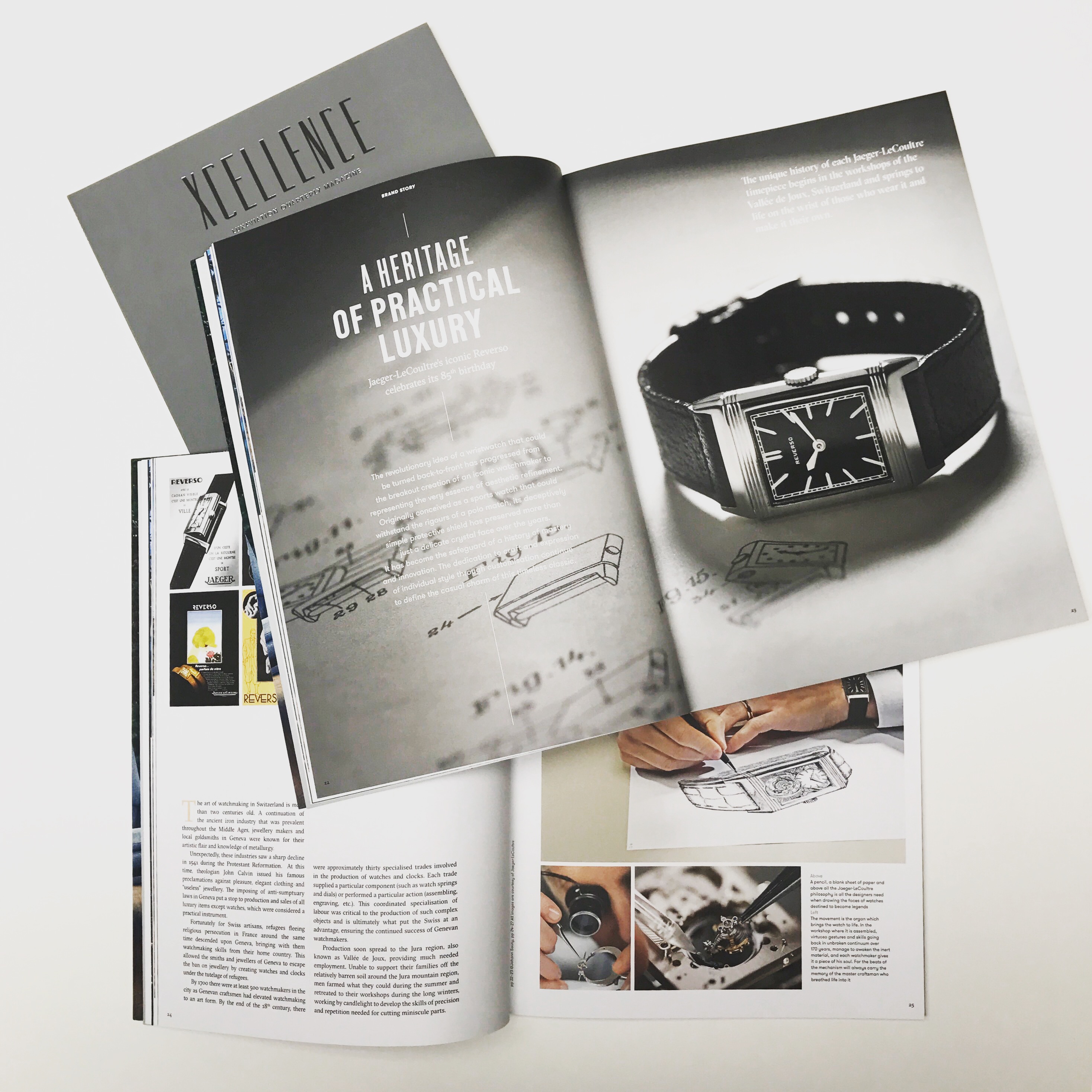
What Is Photography Direction in a Custom Magazine?
Photography direction in a custom brand magazine is the deliberate process of defining, commissioning, and placing imagery so that every visual element reinforces the publication’s editorial spine and the brand’s identity. It is not simply hiring a photographer. It is a discipline that sits at the intersection of editorial strategy, visual storytelling, and brand communication.
The Difference Between Photography Direction and Art Direction
These two roles are frequently confused, and the confusion costs brands real money. Art direction (the overall visual language of a publication, its typography, colour palette, layout grid, and tone) is the macro level. Photography direction is the micro level: the specific brief for each shoot, the selection of photographers whose style fits each story, the on-set or remote guidance of how subjects, light, and composition should feel.
The Society of Publication Designers describes the relationship between editorial and visual direction as one of “pairing stories with the right artists” [1]. That pairing is not accidental. It requires someone who understands both the brand’s voice and the visual language of photography well enough to translate one into the other.
In a custom photography direction magazine, that translation happens at every stage:
- Before the shoot, through written briefs that describe mood, reference images, and the emotional response the image should trigger
- During the shoot, through active direction of composition, light, and subject behavior
- After the shoot, through image selection and editing that prioritizes editorial coherence over individual technical perfection
Why It Applies to Brand Magazines Specifically
Consumer magazines have editorial teams and photo editors whose full-time job is exactly this. A brand magazine doesn’t have that infrastructure by default. The company commissioning the publication is usually expert in its own industry, not in editorial photography. That gap is precisely where poor image decisions happen: stock libraries get raided, internal PR photos get repurposed, and the resulting magazine looks exactly like what it is, a company trying to look like a magazine without understanding what makes magazines work.
Custom photography direction magazines close that gap by building the photographic strategy into the publication process from the start, not as an afterthought once the articles are written.
How Photography Direction Works in Practice
Photography direction in a custom brand magazine follows a structured sequence that begins well before any camera is picked up and continues through print production. The sequence is not linear in the sense that everything feeds back on itself, but it has a clear logic.
From Editorial Spine to Visual Brief
Every well-made publication starts with what we’d call an editorial spine: a clear, articulated point of view that runs through every article, every image, and every design decision in the issue. The photography direction brief is a direct expression of that spine in visual terms.
In practice, the process looks like this:
- Define the editorial spine. What is this issue about, at the level of feeling and theme, not just topic? A real estate developer’s magazine might be about the idea of permanence. A law firm’s publication might be about the idea of clarity. That theme shapes every image choice.
- Map the visual needs by story. Each article has different photographic requirements. A profile piece needs portraiture. A destination feature needs atmosphere. A product story needs detail shots. The photography direction plan maps all of these before anyone is commissioned.
- Write individual shoot briefs. Each brief specifies mood, reference images, technical requirements (resolution, colour profile, aspect ratios for print), and the specific story the image must tell.
- Select and commission photographers. The photographer’s existing body of work must match the brief, not just be generally good. A photographer known for stark minimalism may be wrong for a story that needs warmth and texture.
- Direct the shoot. Whether on-set or via detailed remote direction, the photography director ensures the images produced match the brief, not just the photographer’s instincts.
- Edit and select for editorial coherence. From a shoot of several hundred frames, the selection prioritizes images that work together across the publication, not just the strongest individual frames.
- Prepare for print. Colour work, softproofing against the chosen paper stock, and resolution checks ensure that what prints matches what was intended. A screen and a printed page render colour differently, and that difference must be managed deliberately [2].
Pro Tip: Never brief a photographer with “we want something beautiful.” That instruction produces images the photographer finds beautiful, which may have nothing to do with your brand. Write briefs that describe the emotional response you want the reader to have when they see the image, then let the photographer solve for that.
The Role of Image Curation Alongside Commissioning
Not every image in a custom brand magazine needs to be commissioned from scratch. Archival photography, licensed fine art images, and carefully selected documentary photography can all serve editorial purposes. The discipline of photography direction applies equally to curated images: each one must be assessed for how it serves the specific story and the overall visual consistency of the issue.
Anderson University’s editorial photography team describes their process as “capturing diverse stories from fun events to powerful moments,” noting that the variety of stories requires a deliberate range of photographic approaches rather than a single visual style [3]. That principle applies directly to brand magazines: visual variety must serve editorial variety, not contradict it.
Why Photography Direction Matters for Brand Magazines in 2026
Photography direction matters because a print magazine is a physical object that competes for attention against everything else on a reader’s desk, coffee table, or waiting room. In 2026, that competition is not just other print publications. It’s the entire digital environment, which is why the physical quality of a custom magazine, including its photography, has to be genuinely high to justify its existence.
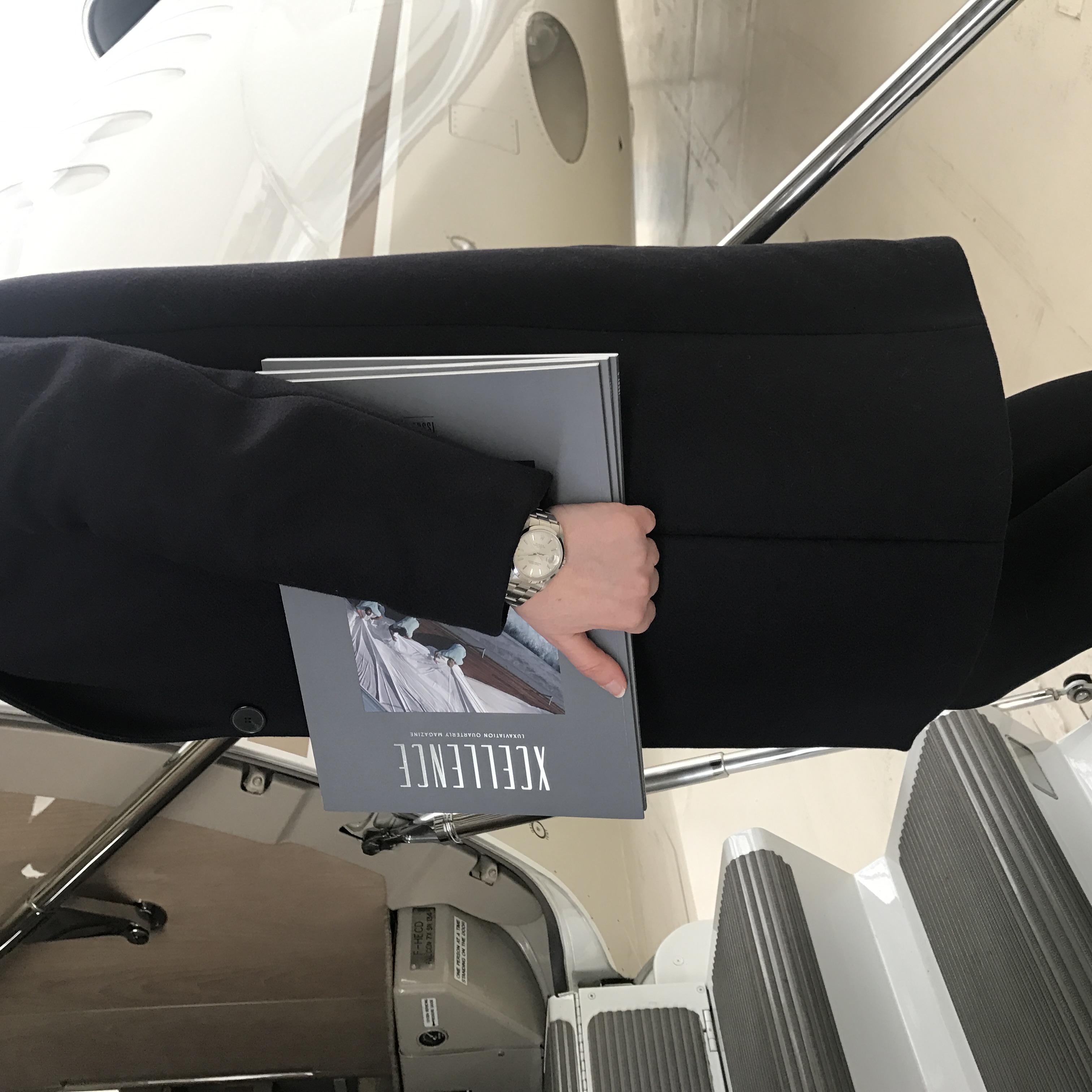
Visual Quality as a Proxy for Brand Quality
People make quality judgments about brands based on the materials those brands produce. A publication with flat, generic photography signals a flat, generic company. A publication with sharp, intentional, beautifully directed imagery signals a company that takes care of things. That inference is automatic and largely unconscious, but it’s real.
Research in visual communication consistently shows that image quality is processed before text content in print media. Readers form an impression of a publication within seconds of opening it, and that impression is driven primarily by the visual experience. The writing can be outstanding, but if the images undermine the quality signal, the reader’s trust in the content is already compromised.
The pioneering fashion magazines i-D, Jill, and The Face built their cultural authority largely through their photography direction, fostering careers of major photographers and stylists through a consistent, distinctive visual language [4]. That model, building brand authority through visual consistency and photographic ambition, applies directly to custom brand magazines across every sector.
The Competitive Advantage of Owning Your Visual Story
Most companies rely on a combination of stock photography, PR imagery, and whatever their marketing team can produce in-house. The result is visual inconsistency: different styles, different moods, different levels of quality, all assembled into a single publication. Readers feel the incoherence even when they can’t articulate it.
Custom photography direction magazines solve this by building a consistent visual identity across every page. That consistency is itself a brand asset. It signals intentionality. It signals confidence. And it signals that the company behind the publication is serious enough about its own story to invest in telling it properly.
| Approach | Visual Consistency | Brand Signal | Reader Experience |
|---|---|---|---|
| Generic stock photography | Low | Commodity | Forgettable |
| Repurposed PR/marketing imagery | Variable | Corporate brochure | Transactional |
| Commissioned without direction | Medium (photographer-led) | Inconsistent quality | Uneven |
| Custom photography direction | High | Premium, intentional | Compelling, kept |
Common Mistakes That Undermine Custom Photography Direction
The most common failure in custom photography direction magazines is treating photography as a production task rather than an editorial one. The images get sourced after the articles are written, briefed generically, and placed wherever there’s space. The result is a publication that looks assembled, not made.
Briefing Photographers Without an Editorial Context
A photographer hired without understanding the editorial spine of a publication will produce images that are technically competent but editorially irrelevant. They’ll shoot what they know how to shoot, not what the story needs. This is one of the most expensive mistakes in custom magazine production, because by the time the images come back wrong, there’s often no budget or time to reshoot.
From experience, the briefing stage is where most of the value in photography direction is created or lost. A detailed brief that includes the specific emotional response the image should trigger, reference images from publications with a similar visual language, and clear technical specifications for print will consistently produce better results than a longer shoot with a looser brief.
Ignoring Print-Specific Technical Requirements
Digital photography is optimized for screens. Print has different requirements entirely. Colour profiles, resolution minimums, and the behavior of different paper stocks under different ink densities all affect how an image looks on the printed page. An image that looks stunning on a monitor can print flat, oversaturated, or with detail loss in shadows if the colour work isn’t done properly.
This is a technical area where many custom magazine projects cut corners, and the results are visible to anyone who has seen a well-produced publication beside a poorly produced one. Softproofing (the process of simulating how an image will print before it goes to press) is not optional in premium magazine production. It’s the difference between a publication that looks considered and one that looks careless [2].
Pro Tip: When commissioning photography for a print magazine, always specify the colour profile (typically ISO Coated v2 or similar CMYK profile for the intended paper stock) in the shoot brief. Photographers who shoot primarily for digital may not have this as a default, and correcting it in post-production is time-consuming and sometimes impossible without a reshoot.
Treating Every Story With the Same Visual Approach
A common mistake in less experienced custom magazine production is applying a single visual style across every story in an issue. The result is visual monotony: every spread looks like every other spread, and the reader’s eye stops being engaged. Good photography direction uses visual variety, different scales, different moods, different compositional approaches, to give each story its own visual identity while maintaining overall coherence.
One pitfall to watch for is confusing brand consistency with visual uniformity. Your brand should be consistent. Your visual storytelling should be varied. Those are not contradictions. They’re the difference between a magazine and a brochure.
Best Practices for Custom Photography Direction Magazines
The best custom photography direction magazines are built around a few principles that separate publications people keep from publications people discard. These aren’t abstract ideals. They’re practical disciplines that apply at every stage of production.
Build the Visual Plan Before the Editorial Plan Is Finalized
Most publications are planned editorially first and visually second. The articles are assigned, the photographers are booked, and then someone figures out what images are needed. The better approach is to develop the visual plan in parallel with the editorial plan, so that the photography brief informs the writing and the writing informs the photography brief simultaneously.
This parallel development produces publications where images and text genuinely complement each other rather than illustrating each other. The difference is significant. When an image illustrates a text, it’s redundant. When it complements the text, it adds meaning that the words alone couldn’t carry.
- Assign a photography direction lead at the same time as the editorial lead, not after
- Hold joint editorial and visual planning sessions before any briefs are written
- Map the flatplan (the page-by-page layout of the issue) with placeholder visual concepts, not just article titles
- Review the visual plan as a whole before any individual shoot is briefed, to ensure visual variety and coherence across the full issue
Invest in Photographer Selection, Not Just Photographer Access
There’s a tendency in brand magazine production to hire photographers based on availability and rate rather than on fit. A photographer with a strong documentary style may be technically excellent but wrong for a story that needs controlled, atmospheric portraiture. Matching the photographer’s existing visual language to the specific story’s needs is one of the highest-leverage decisions in the entire production process.
The editorial design field has long understood this principle. As Lars Harmsen’s course on editorial design demonstrates, the visual language of a publication is built through the cumulative effect of many individual decisions, each of which must be made with the whole in mind [5]. Photographer selection is one of those decisions.
Pro Tip: Before finalizing photographer selection for a custom brand magazine, ask to see three to five images from each candidate that they would select as most representative of the specific story you’re commissioning, not their general portfolio. The selection itself tells you whether they understand the brief.
At Rethink Publishing, we’ve found that the investment in photographer selection, including the time spent reviewing portfolios, briefing candidates, and assessing fit, pays back in reduced post-production corrections and stronger final spreads. Over 80+ magazines produced, this is one of the most consistent patterns we’ve observed.
Sources & References
- Society of Publication Designers, “1:1,” 2024
- October Custom Publishing, “Creative direction, redesign, and photography for The Absolute Sound,” 2024
- Anderson University, “About the Photography,” 2024
- Aperture Foundation, “i-D, Jill, and The Face: Fashion’s Maverick Magazines,” 2024
- Domestika, “Editorial Design: How to Make a Magazine (Lars Harmsen),” 2024
- Mixam, “Magazine Printing Services,” 2026
- Reddit Photography Community, “How Do You Get Your Shoots in Mags and Work with High-End Clients,” 2024
Frequently Asked Questions
1. What exactly is photography direction in the context of a custom brand magazine?
Photography direction in custom photography direction magazines is the practice of strategically briefing, commissioning, and selecting images so that every visual element serves the publication’s editorial spine and the brand’s identity. It’s distinct from simply hiring a photographer. It involves defining the mood, emotional response, and technical requirements for each image before any shoot takes place, then actively guiding the process through selection and print preparation.
2. How is photography direction different from art direction in a magazine?
Art direction governs the overall visual language of a publication: typography, colour palette, layout grid, and the general aesthetic tone. Photography direction is a subset of that, focused specifically on the commissioning, briefing, and selection of photographic imagery. Both roles must work together, but they operate at different levels of specificity. In a well-run custom magazine production, the art director sets the visual framework and the photography director executes it at the shoot level.
3. Can a company use stock photography in a custom brand magazine?
Stock photography can be used selectively, particularly for archival, documentary, or contextual imagery where commissioning a shoot isn’t practical. The risk is that stock images carry generic associations that can undermine a premium brand’s positioning. In high-end custom photography direction magazines, stock is typically a last resort, used only when it genuinely serves the editorial purpose and is selected with the same rigor as commissioned photography, not as a cost-saving default.
4. How many photographers does a typical custom brand magazine issue use?
It varies by publication size and editorial scope, but most high-end custom brand magazines work with between three and eight photographers per issue. Different stories benefit from different photographic styles, and using multiple photographers, each selected for their fit with a specific story, produces more visually varied and editorially coherent results than assigning one photographer to the entire issue. The photography direction process ensures that variety reads as intentional, not inconsistent.
5. What technical specifications matter most for photography in a print magazine?
For print, the key specifications are resolution (minimum 300 dpi at final print size), colour profile (CMYK, typically ISO Coated v2 or the profile specified by the printer), and colour depth (16-bit files preferred for post-production flexibility). Beyond these technical minimums, softproofing against the actual paper stock is critical for premium publications, because matte, uncoated, and coated papers render colour differently, and an image optimized for one stock can look wrong on another.
6. How long does the photography direction process take for a custom magazine issue?
In a well-managed production cycle, photography direction spans most of the production timeline, from the initial visual planning sessions through to final print-ready image preparation. At Rethink Publishing, the full production cycle for a custom magazine issue runs approximately 17 weeks. Photography direction is active through roughly the first two-thirds of that timeline, from brief writing and photographer selection through shoot execution, editing, and colour preparation for print.
7. Does photography direction apply to coffee-table books as well as magazines?
Yes, and the stakes are arguably higher for coffee-table books because the format places even greater emphasis on visual impact. In a coffee-table book, the photography is often the primary content, with text playing a supporting role. The same principles of custom photography direction apply: editorial spine first, visual planning in parallel with editorial planning, photographer selection based on story fit, and rigorous print preparation. The difference is that errors in a coffee-table book are harder to forgive because the format invites closer, longer visual attention.
8. What should a company look for when choosing a partner for custom photography direction magazines?
Look for a partner who treats photography direction as an editorial discipline, not a production task. They should be able to articulate an editorial spine for your publication before discussing image style. They should have a verifiable portfolio of print publications, not just digital content. And they should demonstrate familiarity with print-specific technical requirements, including colour profiling and softproofing, as well as a process for briefing and selecting photographers based on editorial fit rather than availability alone.
The Standard Worth Holding
Custom photography direction magazines aren’t a category of publication. They’re a standard of practice. They represent the decision to treat every image in a brand publication as a deliberate editorial choice rather than a visual placeholder.
Most companies that commission a custom magazine will never think this carefully about their photography. That’s precisely the opportunity. In a field where most branded publications look assembled, a publication where every image has been briefed, directed, and placed with genuine editorial intent stands apart immediately. Readers feel it. They keep it. They bring it up in conversations months later.
That’s the outcome worth building toward. Not a magazine that looks like a magazine, but one that reads like one, because the photography was treated with the same seriousness as the writing, the design, and the strategy behind it.
Rethink Publishing has spent over 20 years building exactly this kind of publication for companies across hospitality, real estate, architecture, law, and enterprise technology. The process is end-to-end, from editorial spine to print delivery, and photography direction is embedded in it from the first planning session. If you’re considering a custom brand magazine and you want to understand what that process looks like in practice, the place to start is a conversation at rethink-publishing.com.
Recommended Articles
Explore more from our content library: